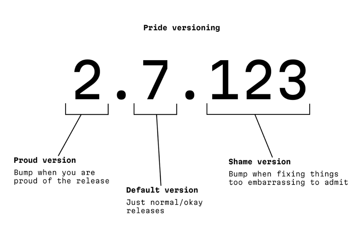
The author says:
This is a parody and a homage to the awesome Semantic Versioning.
…but I think it stands on its own. You can’t have craft without being at peace with pride and embarrassment existing.
]]>The author says:
This is a parody and a homage to the awesome Semantic Versioning.
…but I think it stands on its own. You can’t have craft without being at peace with pride and embarrassment existing.
]]>Stone Tools is a project by Christopher Drum where he grabs old productivity apps, spools up the correct emulator, and writes a review from today’s perspective. I like the emulation part – Drum even provides specific instructions so you could do it, too – and the fact he’s actually putting the tools through their paces.
Anyway, Drum reviewed VisiCalc a few months ago, and Lotus 1-2-3 yesterday.
The reviews can probably be a bit intense if you are unfamiliar with the territory, but you will be rewarded with a lot more detail than just casual understanding of these apps. Reading about VisiCalc first and 1-2-3 second really drives home how “VisiCalc walked so 1-2-3 could run” and it’s fun to see the beginnings of spreadsheet conventions that we take for granted today, for example $ absolute addressing:
In VisiCalc I’m prompted for a “relative or fixed?” decision for every cell reference in every target cell. Replicate a formula with 5 cell references across a column of 100 cells and be ready to answer 5 x 100 prompts. Unfortunate and unavoidable.
Like always, one can find inspiration in surprising places. In the review of Lotus 1-2-3, there’s this interesting tidbit:
The more I encounter [the horizontal menu-bar], the more I wonder if we gave up on it too soon. This could be “blogger overly immersed in their subject matter” brain, but I’m growing to oftentimes prefer two-line horizontal menus over modern GUI menus. […]
It also provides something GUI menus don’t: an immediate explanation of a menu item before committing its action to the document. If a menu item is not a sub-menu, line two describes it. It’s easy to audit features in an unknown program.

I have just been pondering that maybe we moved away from status bars and question mark (Windows)/balloon (Mac) help too soon – pretty much everything these days relies on tooltips – and this slotted right into that.
Anyway. Drum seems to be having fun with the project, and I appreciate that. There are little custom visuals and jokes in every post. Also, as an example, you can download an absolutely delightful recreation of VisiCalc called PicoCalc and run it on your Mac. I have never expected a spreadsheet to be so cute:
And it’s not just most well-known tools. What astonished me in the review of Scala Multimedia in January is how absolutely gorgeous the software (which I’ve never seen before) looked:
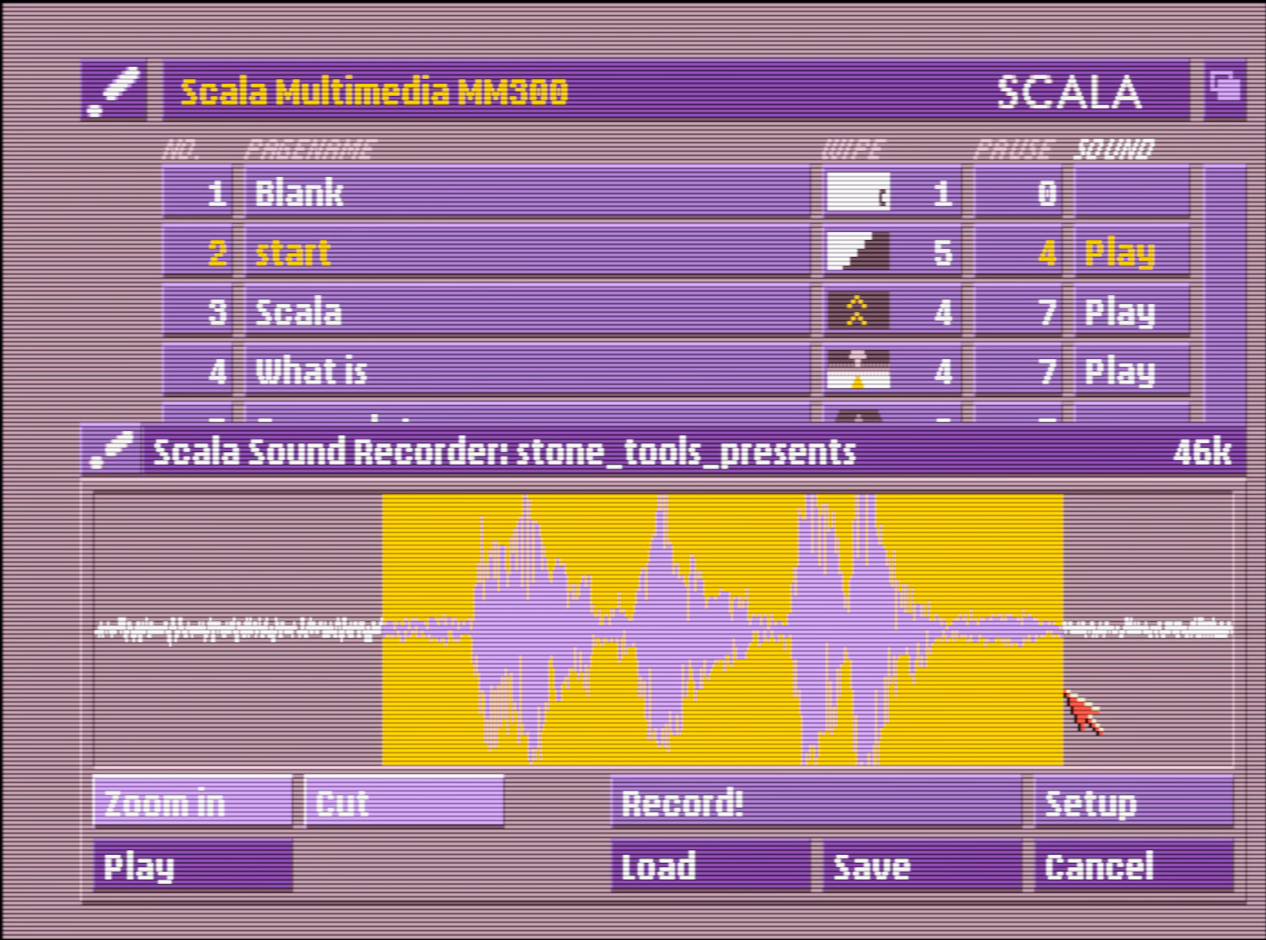
This ain’t Windows 3.1; just that palette alone is worth bringing back.
Not going to excerpt more, but there is a lot more. Check out Stone Tools and the 13 programs reviewed so far!
]]>⌘T is right next to ⌘R, which reloads Slack. Occasionally, on the way to ⌘T, my fingers graze ⌘R. Fingers being fingers, I immediately realize something went wrong and wince, and within a second or two I witness Slack completely reloading. It’s not a big deal – no data is lost, and the reload is only 5 to 10 seconds, but when you move fast, it feels like eternity.
⌘O is a very important shortcut in Finder. It opens the selected file in the correct app. I use it probably dozens, if not hundreds of times a day.
⌘O is right next to ⌘P, which prints the file I’m pointing to. Curiously, and in contrast with most apps, the print function is not gated in any way by a confirmation dialog box, or an intermediate print settings window.
So, occasionally, on the way to ⌘O, my fingers graze ⌘P. Fingers being fingers, I immediately realize something went wrong and wince, and within a few seconds, the lights in my old apartment dim for a second. Then, far away, I hear the recognizable sound of my laser printer spitting out a page.
Gamers used to deride Windows key for automatically ejecting them from the game to the desktop, before an option to disable it started appearing in gaming keyboards. (Some of the professional gaming leagues were very strict about how a player could use their keyboard.)
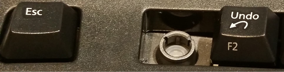
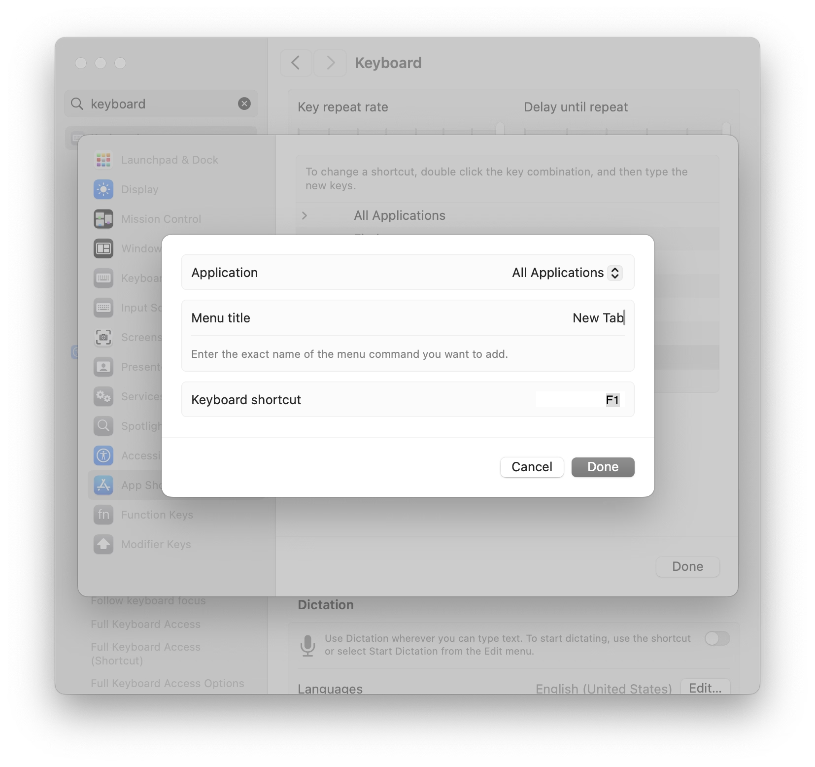
Similarly, professional Excel champions and players started physically removing keys: In Excel, F1 (right next to an often-used F2) opens the help dialog and slows you down.
I served as a judge for the ModelOff Financial Modeling Championships in NYC twice. On my first visit, I was watching contestant Martijn Reekers work in Excel. He was constantly pressing F2 and Esc with his left hand. His right hand was on the arrow keys, swiftly moving from cell to cell. F2 puts the cell in Edit mode so you can see the formula in the cell. Esc exits Edit mode and shows you the number. Martijn would press F2 and Esc at least three times every second.
But here is the funny part: What dangerous key is between F2 and Esc? F1.
If you accidentally press F1, you will have a 10-second delay while Excel loads online Help. If you are analyzing three cells a second, a 10-second delay would be a disaster. You might as well go to lunch. So, Martijn had pried the F1 key from his keyboard so he would never accidentally press it.
I enjoyed this essay that presents prying off the key as a rite of passage:
Removing the F1 key from the equation is just the beginning. By embracing the keyboard-centric approach, you have the opportunity to become an Excel Wizard!! Okay, maybe that’s not a technical term, but it perfectly captures the essence of those who navigate Excel solely using the keyboard.
And I particularly liked this tongue-in-cheek answer telling people they could construct their own homemade molly guard to protect against “fat-fingering”:
Here’s an alternative snippet that can be used:
- Use bits of plastic or cardboard to make a tiny box that fits around your F1 key.
- Affix this box with duct tape, so that the F1 key is guarded.
- Fool-proof, works on any key, and can easily be reversed if needed!
Obviously, none of this can help me with my ⌘R and ⌘P woes, so, two final thoughts:

It’s a great case study of how something seemingly really simple – deducting health from the player as they fall from height – can be a complicated thing to figure out in all the detail.
I never played Overwatch and rarely play videogames anymore, but many of the lessons here more universal for any sort of UI and system design:
Also, it’s just a really well-made video, filled with little presentation and storytelling details that elevate it. I wish more videos like this existed for UI mechanics.
But maybe the most important takeway? You don’t have to choose between rigor and fun. You can have both.
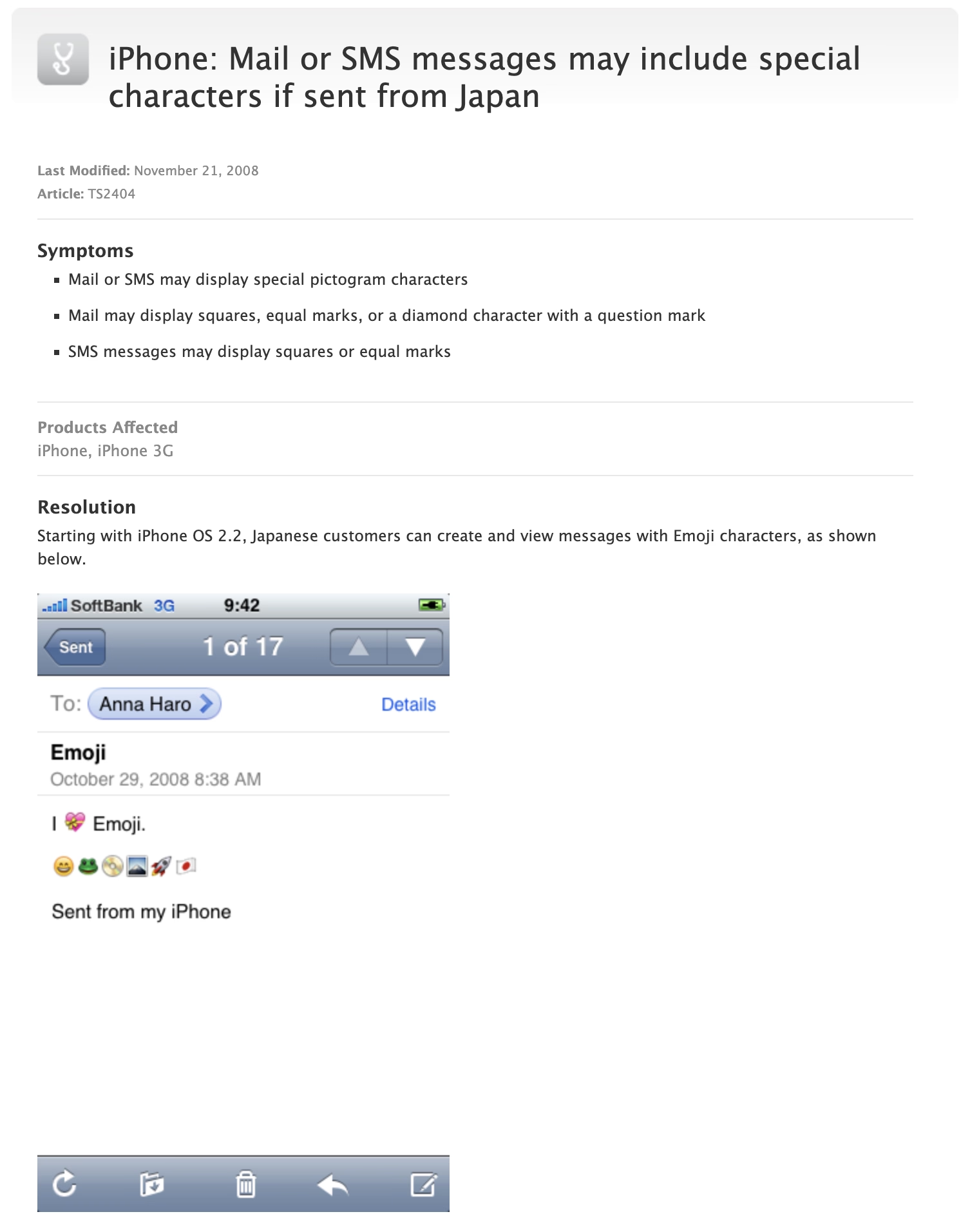
]]>But in between 2008 and 2011, there existed a peculiar interregnum where emoji were only available on Japanese iPhones. The situation had to be carefully explained and caveated:
Eventually, an enterprising developer realized that emoji outside Japan was as easy as toggling a UI-less preference with a great name KeyboardEmojiEverywhere, hiding inside the innards of the iPhone:
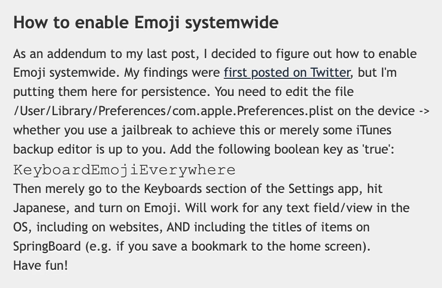
Except, “easy” is in the eye of the beholder. This was still a few too many hoops to jump for an average iPhone user. So, developers figured out that there could be an app for that: the above preference incantation wrapped inside an application with an easy UI, and put in the burgeoning App Store.
The interesting part is that Apple initially fought some of these efforts, by rejecting a Freemoji app and likely a few others. (Not sure if this was about emoji specifically, or more principally about losing control.)
The developers had to get sneaky, and started hiding emoji enablers inside other apps. A $0.99 “RSS reader for a Chinese Macintosh news site” called FrostyPlace unlocked emoji by “simply pok[ing] around in it for a minute or so by tapping in and out of an article and playing with the two buttons at the bottom of its screen. That part is important, so be sure to do some genuine tapping.”
Then there was the free Spell Number (you can still see its old App Store page), where punching in a certain secret number would give you the same.
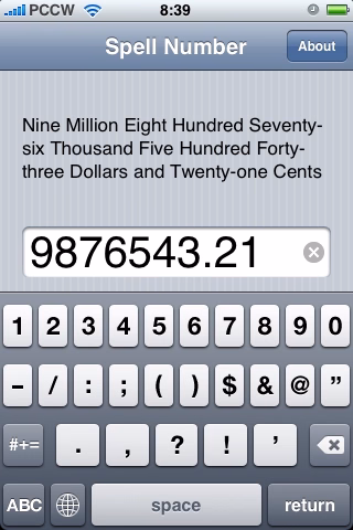
The author called it an “easter egg” and even wrote candidly at the end of instructions that “you can also delete Spell Number if you don’t want it, the setting will still be here.” (The number also had to change from 9876543.21 to 91929394.59 at some point, perhaps to evade… something?)
Eventually, Apple seemingly gave up – Ars Technica has a fun interview from 2009 from someone who renamed their app from Typing Genius to “Typing Genius – Get Emoji” and got away with it:
Ars: As the screenshot at the start of this post shows, you haven’t been shy about advertising the Emoji support over at App Store. Are you worried that adding Emoji to your application might have negative consequences? Are you worried about Apple pulling it from App Store?
Fung: I’m obviously taking a risk here by advertising Emoji directly on iTunes. That being said, I’m not the first. Worst case scenario, I’ll update the application with Emoji support removed. I’m hoping that Apple will turn a blind eye to this because I can’t see any harm done in allowing users to use Emoji.
Not quite “I am ready to do some time for the good cause,” but close enough.
Yet, it still took until 2011 for emoji support to be universally available with iOS 5, and even then you had to enable the keyboard in settings.
I like this little story of a mysterious latent cool new thing hiding inside your device, a thing that you could unlock only if you followed some seemingly nefarious instructions that never fully made sense but that actually worked.
An interesting tidbit: At least early on in 2008, for emoji to work both the sender and the recipient had to follow the instructions. So the toggle wasn’t just about adding a keyboard, but also enabling the decoding and rendering. (And complicating things further, iPhone’s Japanese keyboard had emoticons, and that keyboard was widely available without any hacks. The difference between emoji and emoticons was not obvious to many people, leading to a lot of extra confusion.)
Lastly, a fun sidebar: I asked about all this an old internet buddy, Steven Troughton-Smith, whom I remembered back from my GUIdebook days, and who still routinely posts fun hacks and discoveries about Apple platforms on Mastodon. I thought “Steven might remember that story; he seems like the kind of person who’d at least know how to find an answer.” Turns out, my hunch was better than I thought: Steven was the enterprising developer who actually discovered how to give emoji to any iPhone, all the way back in 2008.
]]>In Safari, and previously in Chrome, when editing CSS properties, you’d get a usual editing typeahead for the property name, and then the same on the other side for the property value.
In newer versions of Chrome, the typeahead menu works as before on the right side. However, the menu on the left side also includes the right side.
I think this is really clever in this context – not just to speed you up, but also to aid understanding. Just like the inert mouse up and down in the previous post could serve as a safe “peek” into the values, this new interaction can quickly allow you to explore the CSS space if you are curious, or if you only lightly remember part of the name, or even just one of the values.
This blog is authored in Apple Notes, and some time ago Notes added quick linking via typing >>, and that has a similar effect: The interactions are so nimble and precise that it is very easy to link to something, but a nice side effect is that it also feels very welcoming just to type a few letters to remind yourself of a title of an article, and then cancel out.
The downside of the Chrome change is, well, more stuff matching, but I think the audience for this UI is going to be okay with that.
]]>This is macOS Sequoia (the pre-Tahoe release) and a typical pop-up button:
One clever thing macOS has been doing since basically the dawn of GUIs is that upon clicking on a button like this, the currently selected row will be in the same place as before you clicked. (As opposed to, for example, the entire menu appearing below like it would from a top menu bar.)
This has interesting and often underappreciated consequences. It allows you to orient yourself quicker since you don’t have to find the selected option again. And, it saves you movement overall: the next or previous option will always be at the absolutely shortest possible distance. (Of course, the approach also has some challenges, for example if the button is positioned close to the top or bottom of the screen.)
There’s another clever thing that happens throughout macOS: All the menus work using a classic click-to-open and click-to-select sequence, but they are also usable via the slightly more advanced, but faster mousedown-drag-mouseup gesture.
These building blocks work together and mean that selecting the next option can be as simple as a little flick of a mouse.
Now, check out macOS Tahoe (current release):
You will notice that iCloud Drive, upon clicking, is now misaligned both horizontally and vertically.
On the surface, this feels just like a visual blemish – slighly embarrassing, but without much consequence. But check out what happens if you hold your mouse button at a certain position, and then release it without moving:
The stability of macOS’s interface and the thoughtful set of aforementioned rules allowed for an emergent fast behaviour: mouse down and up meant you could “peek” into a menu safely, or you could change your mind right after seeing what’s inside. In a bigger sense, it created a certain trust between you and the operating system: it’s worth learning those gestures, as they will be rewarded.
In Tahoe, some of that learned behaviour – by the way, I see it in all of these buttons, not just this one – will now work against you. Now, you can accidentally change an option without intending to do so.
Is it a big deal? No, not really. This likely – hopefully! – simply fell through the cracks in a rush to get Liquid Glass out the door, rather than no one being there to care, or no one understanding that all these gestures add up in aggregate, creating a GUI that feels fast, trustworthy, and catering to your motor memory in a way that elevates your experiences with the interface in the long run.
But I’d feel better if it wasn’t almost half a year since the release, and if we hadn’t already seen other things exactly like it.
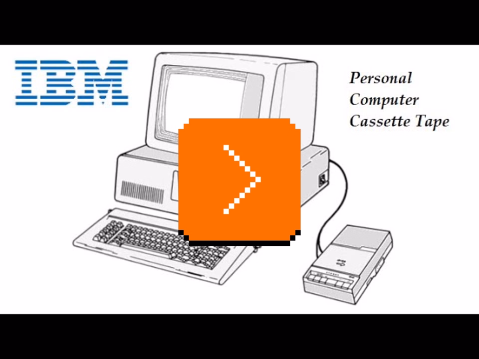
]]>You can’t afford a sound card and besides, sound cards for your PC have not been invented yet. You can’t even afford a floppy drive, so you’re one of the rare people who actually uses an audio cassette player as a storage device – a technique usually reserved for more primitive machines that have half the bits your new PC does.
But there’s a silver lining. Your cassette player has a little relay that controls its motor. You can engage and disengage the relay at will.
So, someone figured out that toggling the relay kind of sounds like a metronome. Like percussion. It’s a hack, but in the sonic landscape inhabited solely by your sorry speaker, it’s a breath of fresh air (scroll to 7:26 if you don’t land there automatically):
The year is 2026. Your computer itself is the size of an audio cassette, fits in your pocket, has better storage, graphics, sound, pretty much everything compared to a 1981 PC. It even has a special haptic motor. Except, that motor can only be controlled by native apps, and there is no official API to do it from a browser.
But there’s a silver lining. Tapping any checkbox on a site generates a haptic pulse. And that apparently works even if the checkbox is hidden and if the computer is doing the tapping.
So, someone figured out a way to use that to build a library that gives websites powers to provide haptic feedback. It’s a hack, but damn if it’s not one someone took to its logical conclusion.
I love these kinds of hacks, and I wonder what’s going to happen to this one. Will it fly under a radar, or will some websites start abusing it? If so, will Safari clamp it down, or will it actually give people a proper API for haptics?
]]>This is a thoughtful post by Anil Dash about Apple’s recent announcement of introducing video podcasting, warning how the conditions set up right now will lead to enshittification, and proposing changes:
This will also start to impact content. You don’t hear podcasters saying “unalive” or censoring normal words because there is no algorithm that skews the distribution of their content. The promotional graphics for their shows are often downright boring, and don’t feature the hosts making weird faces like on YouTube thumbnails, because they haven’t been optimized to within an inch of their lives in hopes of getting 12-year-olds to click on them instead of Mr. Beast — because they’re not trying to chase algorithmic amplification.
It’s worth reading even if you don’t care much about podcasts.
]]>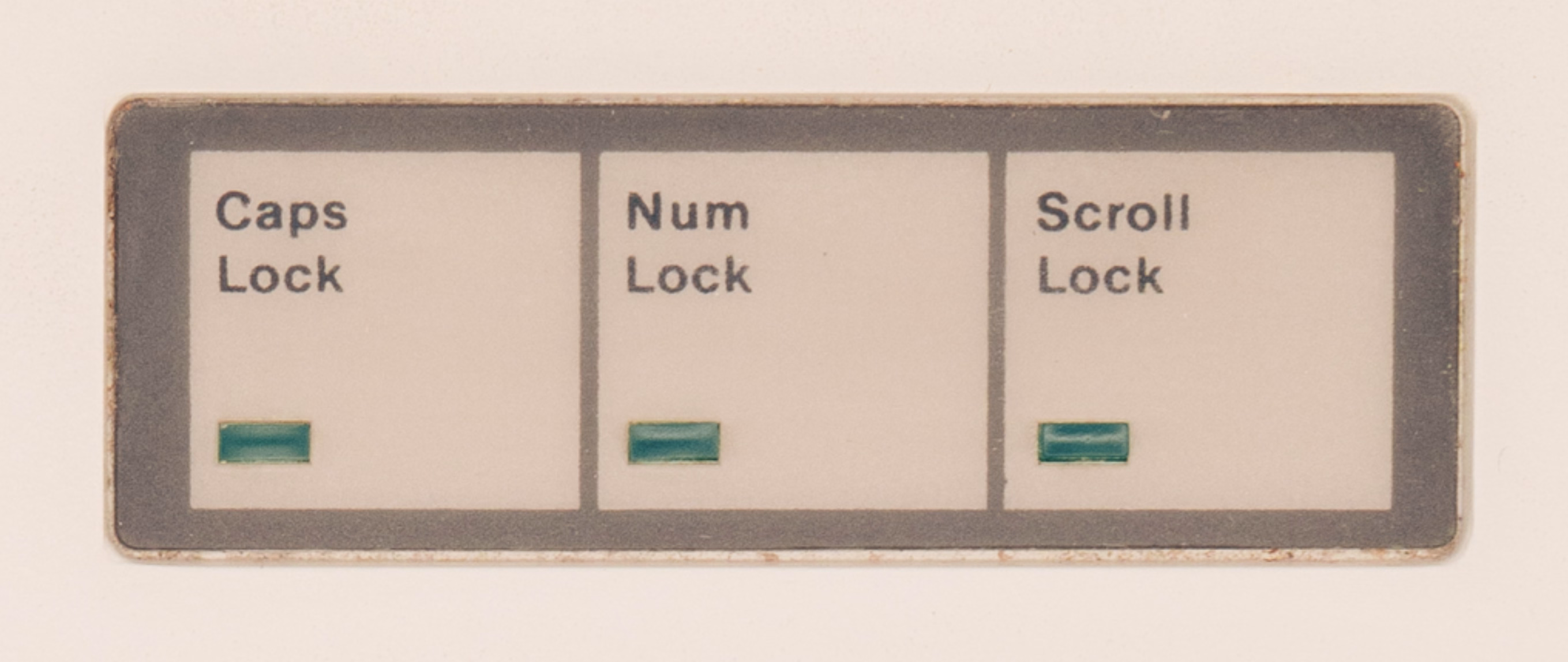
Scroll Lock was reportedly specifically added for spreadsheets, and it solved a very specific problem: before mice and trackpads, and before fast graphic cards, moving through a spreadsheet was a nightmare. Just like Caps Lock flipped the meaning of letter keys, and Num Lock that of the numeric keypad keys, Scroll Lock attempted to fix scrolling by changing the nature of the arrow keys.
This is normal arrow key usage in Lotus 1-2-3, doing what you’d expect, if likely a bit slower:
And this is Lotus 1-2-3 with Scroll Lock enabled. Here, the arrows do not move the cursor, but move the spreadsheet:
(You can play with it yourself!)
In time, scrollbars helped with the problem, then mice with wheels solved it in one direction, and then trackpads in both. (Although even though my 2025 Windows laptop doesn’t have a Scroll Lock key, its onscreen keyboard does, and the key still works in Excel.)
But, I grew to believe that UI problems never fully die, and often come back dressed up in new clothes.
This is the TV app on my Apple TV, doing movement as you’d expect:
But Netflix a while back picked a different approach – scrolling almost as if Scroll Lock was on:
More recently, I saw that approach spread to HBO Max and YouTube apps as well:
Is this good? To me personally, the Scroll Lock-esque approach feels strange and claustrophobic. I see the (hypothetical) value of keeping the selection in one place, but the downsides are more pronounced: things feel lopsided, going back in this universe is flying blind, and the system creates strange situations at the edges, where Scroll Lock struggled as well.
And yet, given I just dated myself by reminiscing Lotus 1-2-3, I’m curious how it feels to others.
]]>This one is from Sean Wing from 2023:

And this older one is from Tim and Eric Awesome Show, Great Job!, from 2009:
Speaking of Tim and Eric, this one was also funny and ostensibly on topic for this blog!
(And re: previous post – I had to cut a new version of University font with the Ü glyph just for TAARGÜS in the title.)
]]>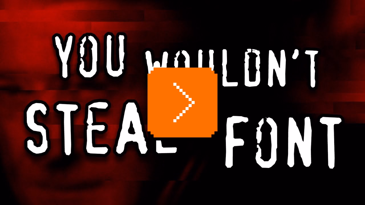
The nuances of what separates font piracy from non-pirated revivals or general inspiration are too much even for me, but I liked how the video moved on from the obvious and cheap “haha, you wouldn’t pirate a font” story to cover a few of the more complex issues with panache.
My small contribution to the discourse is that I just scanned an interesting booklet from 1979 called Typeface Analogue, which catalogs various names different phototypesetting manufacturers used for their “replica” fonts – a sort of a translation table between once-relevant parallel type ecosystems.
Some are pretty uninspired: CS for Century Schoolbook, OP for Optima, Eurostyle for Eurostile, and so on. Others are more interesting: a version of Palatino called Patina, American Classic becoming Colonial, or Futura renamed to Twentieth Century. Absolute fav? Helvetica becoming Megaron.
The display fonts you see on this blog are my vector conversion and slight improvement (kerning pairs!) over a bitmap PC/GEOS font called University, which itself was inspired by the original Macintosh’s Geneva. Inspired or downright stolen? You decide:
Or, in short:
This might be confusing. Outside of LLMs, computers are supposed to be deterministic, no? They’re famously bad at random numbers; if you memorize a pattern, you can beat Pac-Man every single time.
But “deterministic” in UI design might mean something more specific. Let’s take pressing ⌘B to bold, for example:
Every time you press ⌘B on an identical selection, it will behave the same. But, pressing ⌘B doesn’t guarantee something will get bold. If it already is bold, the command will reverse its meaning. In this sense, ⌘B is non-deterministic.
It’s not hard to imagine a determistic version of bolding. Make ⌘B bold the text, and make another shortcut – say, ⌘U – unbold it. This way, you can always press either and be absolutely confident you will get a predetermined result without worrying about anything else. It’s a boon for motor memory, but it is more complex to explain, and it adds more UI surface.
There is also another, more interesting way: you can make ⌘B always bold first, and unbold second. This way, your fingers can remember ⌘B is for bolding, and ⌘BB is for unbolding. But this also gets tricky: for already fully bolded text, it might seem the feature is broken, because the first keystroke does nothing!
Only the second of these three approaches is idempotent, meaning you can invoke it many times and it will always give the same result:
One of my favorite idempotent concepts is the Clear key present on many calculators, and still on some larger Mac keyboards.

The idea behind Clear is simple. Let’s say you’re a professional keypad user – maybe an accountant? – typing in numbers for hours a day. You just made a mistake. Pressing Backspace will remove the last digit, but are you sure you only made a mistake on that last digit? What if your fingers brushed another key and you typed in two digits by accident?
Instead of using the non-idempotent Backspace key where you’d have to look at the screen to confirm, it’s easier just to press the idempotent Clear which will always remove the entire number, and then start from scratch without even having to look anywhere (as gamers would say, “no scope!”).
And, for people who are moving fast, it feels safe just to press the shortcut or a button instinctively, for ease of their mind, even if nothing has to be done. Some people might choose to press it a few times, just in case. The Esc key often has that property – isn’t it just nice to slam Esc many times? – and Jeff Jarvis in his 2014 essay talked about another shortcut that felt that way:
Since I don’t need ⌘S anymore, I can now appreciate how much it had become a part of my ritual of writing and even of thinking. I used to hit ⌘S not just as data insurance — hell, I’d often hit it after having not made a single change in my text since the last time I’d hit it. I hit ⌘S as a break, a psychic, semiotic semicolon. It gave me a moment to search for the right word, to plan the structure of where I would go next, to commit to what I’d written, or to wonder whether I had the courage to erase what I’d written and try again.
(In Figma, where ⌘S wasn’t necessary, we used to show this – but we only showed it once every fortnight, since some people would press the shortcut instinctively like Jarvis, and find the message distracting and maybe even patronizing.)

All of these options have pros and cons. The beauty of determinism and idempotence is that they free you from paying attention. I always get a bit nervous when someone tells me that in their country, you can press the elevator button again to unset it. Even if you don’t make a button a toggle, visually disabling it or showing a message (“Nothing to delete!”) when it has nothing to do could feel like a friendly gesture toward newcomers, but its non-idempotence will grate people who know what they’re doing. Determinism and idempotence are good for motor memory to develop, but – just like the above bolding example – might be initially more confusing.
The approaches can coexist; browsers give you ⌘⌥←→ to move between tabs (non-deterministic, non-idempotent) and ⌘1/2/3 to switch to a specific tab (deterministic, idempotent). Some places even offer a choice. In macOS, you can say whether you want clicking on a scrollbar chute to be deterministic or not:
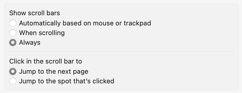
…although usual choice-giving caveats should apply.
I think it’s good to think about those things, especially for interfaces used professionally. Magical things happen if you can trust your fingers and sometimes, if you worry too much about novice users, that might make it hard for pro users to emerge.
]]>
What I appreciate about The Serial Port is that they always seem to actually test the vintage hardware or rebuild the old software they’re commenting on, and this time was no exception: they grabbed a classic unsung hero of ISPs, a Cisco Catalyst 6500-series router, and then recreated “The 512K Day” in their studio.
This was a nice comment under the video:
Have absolutely no knowledge about networking, but watched this video as if a thriller movie. Thanks for opening my world of tech to networking.
Yeah, the video is kind of nerdy and intense, but maybe you’ll enjoy it; even a classic aging piece of hardware with an arbitrary ticking-bomb limit deserves some respect.
Also, the funniest comment:
]]>I had a 2.4k day a couple days ago when I realized Farm Sim 22 only allows a max of 2400 bales. Couldn’t load into my saved game. Had to go into items.xml and temp remove a hundred bales.
The questions can be asked in person or over the phone, or distributed on paper or collected online. The proliferation of online survey platforms has made it possible for anyone to create a survey in minutes.
This is not a good thing.
Surveys are the most dangerous research tool — misunderstood and misused. They frequently blend qualitative and quantitative questions; at their worst, surveys combine the potential pitfalls of both. […]
If you ever think to yourself, “Well, a survey isn’t really the right way to make this critical decision, but the CEO really wants to run one. What’s the worst that can happen?”
Brexit.
Hall highlights that surveys are much harder to debug than other methods:
It’s much harder to write a good survey than to conduct good qualitative user research—something like the difference between building an instrument for remote sensing and sticking your head out the window to see what the weather is like. Given a decently representative (and properly screened) research participant, you could sit down, shut up, turn on the recorder, and get useful data just by letting them talk. But if you write bad survey questions, you get bad data at scale with no chance of recovery. It doesn’t matter how many answers you get if they don’t provide a useful representation of reality. […] Surveys are the most difficult research method of all.
[…] Bad code will have bugs. A bad interface design will fail a usability test. A bad user interview is as obvious as it is uncomfortable. […] A bad survey won’t tell you it’s bad.
And that they might be seductive because they feel like hard data:
Designers often find themselves up against the idea that survey data is better and more reliable than qualitative research just because the number of people it is possible to survey is so much larger than the number of people you can realistically observe or interview. [… But] unless you are very careful with how you sample, you can end up with a lot of bad, biased data that is totally meaningless and opaque.
There’s also this hilarious bit:
Managers love NPS because it was designed to be loveable by managers. It’s simple and concrete and involves fancy consultant math, which makes it seems special. But is this metric as broadly applicable and powerful as it claims to be?
Nah.
NPS is not a research tool. I shouldn’t even be talking about NPS in a research book.
The entire book is worth a read, with a lot more to offer than the pithy quotes I excerpted above. I really liked its pragmatic approach to research that understands the realities of the industry.
]]>
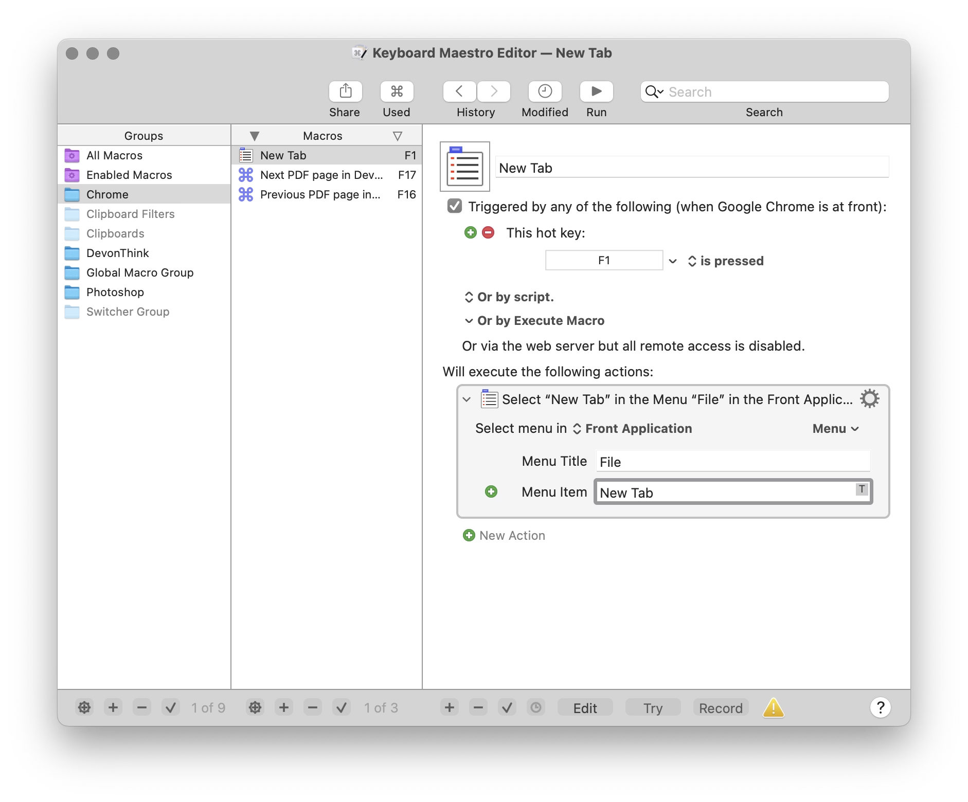
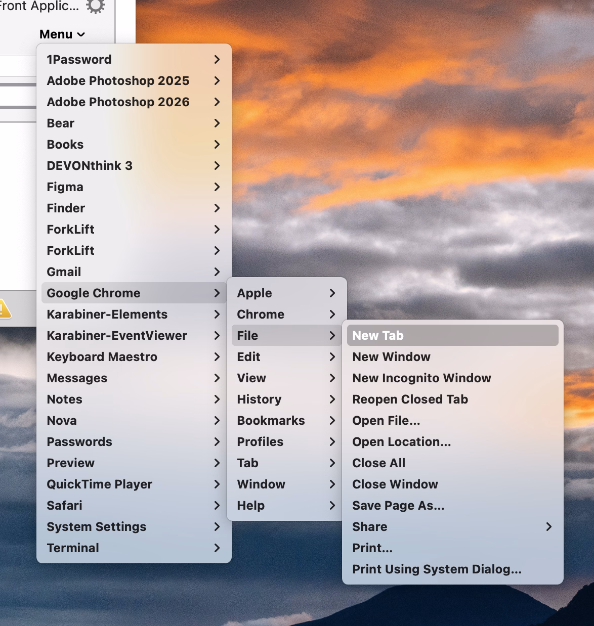
Other tools, like Keyboard Maestro, do something similar. You either have to type it again, or you can point to it, but in a replica of the menu of the app shown in a very different style and orientation:
But this week I learned of another app, KeyCue, that approaches this differently. You simply point to the menu item and hold the desired key for a while:
Okay, this is not a universal endorsement. The feature works clunkily, and KeyCue as a whole is way too comfortable adding itself to login items without asking.
But as far as singular interactions go, this is great and eye-opening. It made me realize that the previous things I’ve shown – System Settings, Keyboard Maestro – are really not GUIs, and they don’t practice direct manipulation. They’re still partially command line interfaces dressed up in GUI clothing.
We kind of lightly made fun of Jonny Ive going angelic on “staying true to the material” and things being “beautifully, unapologetically plastic.” And there is, of course, value in command line and those kinds of approaches. But this part of KeyCue at least is unapologetically a graphical user interface, and it is nice to still be surprised in this space.
]]>
Turns out, videogames do something similar, except the result is called a skybox, since it has to encompass the player from all sides. It’s another way to use cheap trickery to pretend the world is larger than it is.
This 9-minute video by 3kliksphilip shows a few more advanced skybox tricks from Counter Strike games using the Source engine:

I particularly liked two discoveries:
On the other hand, seeing clouds as flat bitmaps was really disappointing.
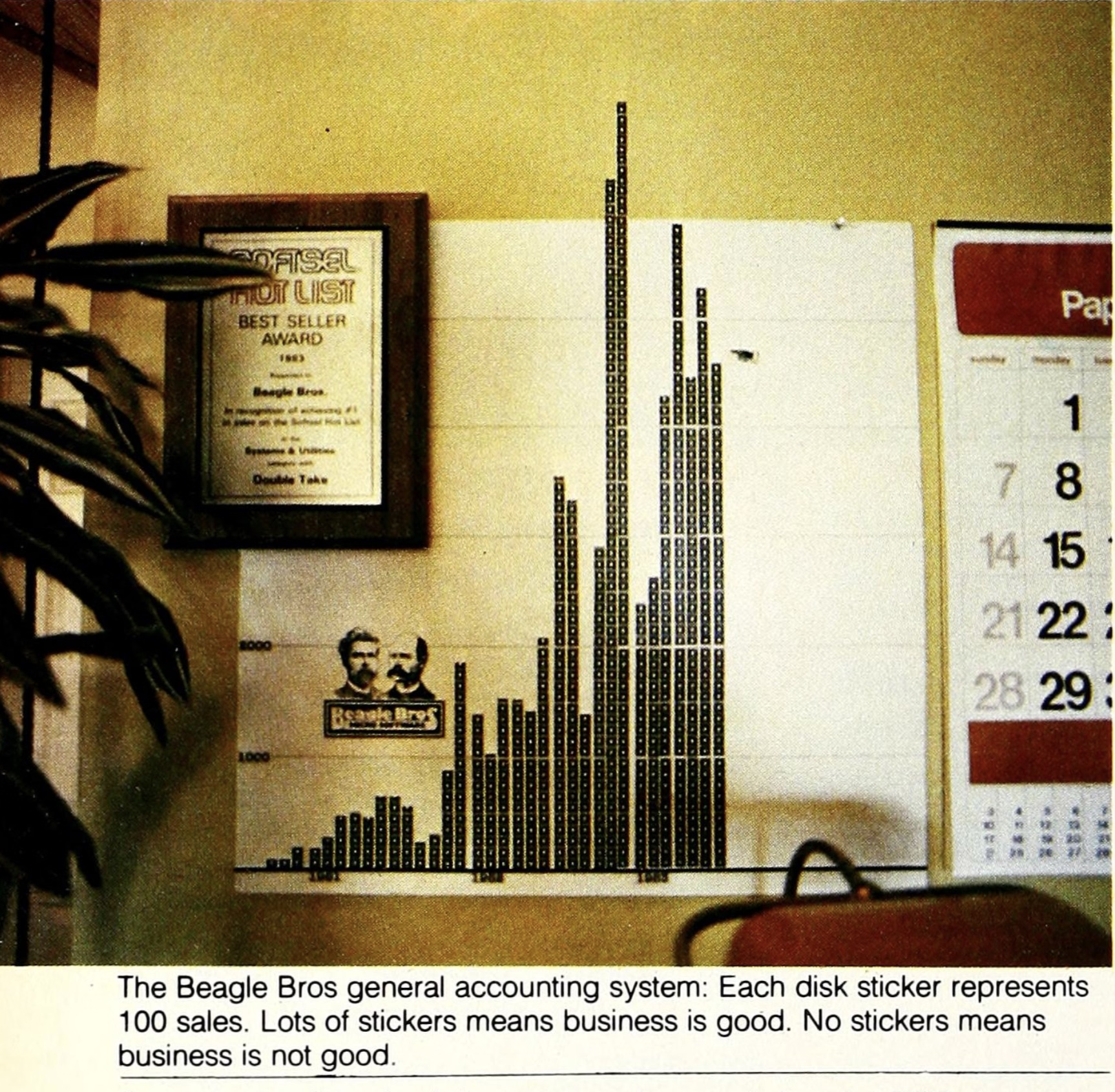
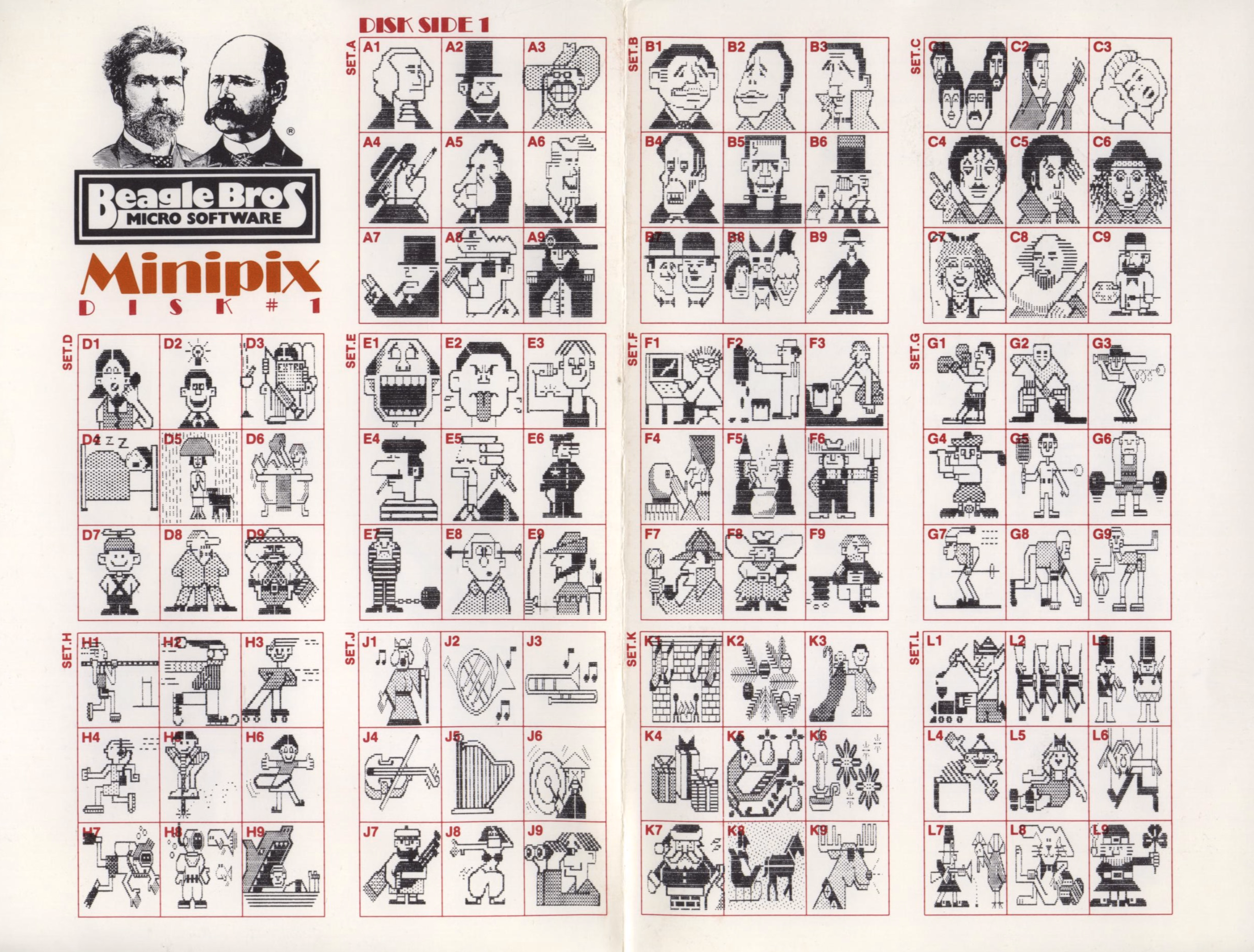
]]>The company had a hobbyist slant, selling various small tools and collections with fun names like Beagle Bag (in the “Indoor Sports” collection) and DOS Boss and Utility City – similar perhaps to Norton Utilities on the PC side, but with a lot more fun and charisma. This is one of their loading screens, also showing both their recognizable logo and their endearing quirkiness:
The fun and well-photographed interview in Softalk in 1983 starts like this:
How do you understand a man who has three clocks on his wall, showing the time in three different cities-San Diego, Fresno, and Seattle-all, of course, showing the same time (″If anything changes in those cities, we’ll know about it”)?
…and has images like these:
Beagle Bros catalogs and manuals were filled with old-timey woodcut illustrations repurposed to tell jokes:

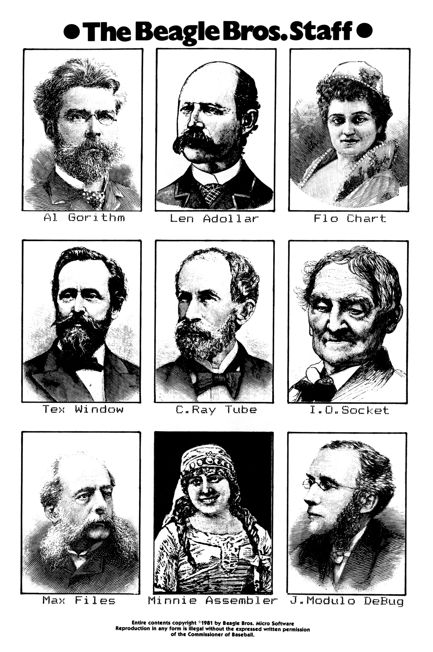
(I find the anachronistic combination of hedcuts and dot matrix printer typography particularly fascinating.)
Some of their software was more serious; Beagle Bros released many useful tools and even text editing and presentation apps. They also made practical posters:
But other stuff…? It was just goofing off:
How does this relate to craft and quality?
There is this interesting question about how much product and marketing and vibes and lore correlate. Did we forgive Sierra On-Line the numerous flaws of their games because we liked the company? Do we love Panic because we like what they do, or because of how they do it? Did Google put doodles on its homepage to distract people from more nefarious things, or because it just felt like a fun way to celebrate things? Is there such a thing as pure selflessness? What is the nature of free will?
Those are, perhaps, topics for future posts.
But Beagle Bros must have been doing something right if there is still a living, elaborate catalog of their works online, 40+ years later. Jeff Atwood also argued in 2015 that it was more than just fun – or that “fun” itself can give back in great ways:
Here were a bunch of goofballs writing terrible AppleSoft BASIC code like me, but doing it for a living – and clearly having fun in the process. Apparently, the best way to create fun programs for users is to make sure you had fun writing them in the first place.
But more than that, they taught me how much more fun it was to learn by playing with an interactive, dynamic program instead of passively reading about concepts in a book. […]
One of the programs on these Beagle Bros floppies, and I can’t for the life of me remember which one, or in what context this happened, printed the following on the screen: “One day, all books will be interactive and animated.”
I thought, wow. That’s it. That’s what these floppies were trying to be! Interactive, animated textbooks that taught you about programming and the Apple II! Incredible.
Steven Frank, the co-founder of Panic, wrote this in 1999, with similar themes:
You never knew exactly what you were going to get. I remember one program listing printed on the side of a bird that, when run, produced a series of wild chirping noises from the Apple’s speaker. And this was from a program that was only five to ten lines long. As a neophyte BASIC programmer myself, I was stunned and amazed. How could you make something this cool with this small amount of code? […]
Beagle Bros’ tools were fantastic. They literally let you do the (allegedly) impossible, like change the names of operating system commands. And they always packed the disks full with extra stuff. Demos of their other products, and strange graphics hacks that existed for no reason other than the fact that they were cool, and because there was spare room on the disk. Beagle Bros. had a lot to do with why I ever wanted to learn programming in the first place. […]
I’ll never forget the book. […] The book was a huge compilation of all around interesting stuff. Weird Apple II tricks that were pointless, but endlessly fascinating. Like the fact that there were extra offscreen pixels of lo-res graphics memory that you could write to, that never got displayed. Or how to put “impossible” inverted or flashing characters into your disk directory listing. Or how to modify system error messages. Not very useful, but really fun to know and really, really cool to mess with. My dad was convinced I was going to somehow break the computer with all this hacking, but a simple reboot always fixed everything.
(I swear I did think of Panic above as a spiritual successor to Beagle Bros without knowing that their work literally inspired one of the Panic’s founders!)
Frank’s essay provoked more emails, and this excerpt caught my attention:
The subtlety: They had utilities which would produced formatted Basic listings and they would give example output of these utlities in their ads and catalogs. It was quite a while before I realized that most of those examples were not program excerpts, but complete programs which of course contained the Beagle Bros signature weirdness. And then there were the seemingly innocent hex dumps. My favorite was from the cover of one of their catalogs, which had a classic picture of this fellow sitting in a chair. On the floor next to him is a handbag with a piece of tractor paper sticking out. On the paper is a hex dump: 48 45 4C 50 21 20 and so on, which are ASCII codes that spell out the message: “HELP! GET ME OUT! I’M TRAPPED IN HERE!----SOPHIE”

Toward the end of the prolific 1980s, Beagle Beos tried to strike it big by making an integrated office suite:
After the work the company had done on AppleWorks 3.0, Simonsen felt ready to jump into the Macintosh market with a “Mac AppleWorks” of their own – they called it Beagle Works. Unfortunately, other companies – giants in the Mac market such as Microsoft, Claris, and Symantec – had the same idea. Their resources were far greater than Beagle Bros had imagined, and the race was costly.
The gamble killed the company. It’s likely that the changing software market would anyway.
But the years before seem to still inspire some people. Check out the Beagle Bros Repository – the homepage is a bit confusing (I think it prominently shows last-updated or last-added things for some reason?), but just use the nav at the top. Maybe it will inspire you, too.
]]>In short, the way I think about software quality is the amount of meaningful problems. […]
There are problems in Finder — resizing columns, renaming or deleting files synced with a FileProvider-based app, and different views not reflecting immediate reality. There are problems with resizing windows. AirPlay randomly drops its connection. AirDrop and other “continuity” services do not always work or, in an interesting twist I experienced a couple days ago, work fine but display an error anyway. The AirPlay and AirDrop menus shuffle options just in time for you to tap the wrong one. […]
These are the products and features I actually use. There are plenty others I do not. I assume syncing my music collection over iCloud remains untrustworthy. Shortcuts seems largely forgotten. Meanwhile, any app augmented by one of Apple’s paid services — Fitness, News, TV — has turned into an upselling experience.
As I’m reading this and thinking about my own Apple usage patterns and a similar litany of problems, I keep returning to Apple TV, which feels by far like the most stable and least troubled platform. I wish I had a better explanation for it: Is Apple magically really good at TV interfaces? Are their benefitting from it being a “hobby project”? But I think the Occam’s Razor here is this: tvOS is just a lot simpler.
And just like that, a thought appears: Is what we’re seeing overall is really just Apple losing the battle with complexity?
Apple won once, in the late 1990s, when on the hardware side all the Performas and Newtons and LaserWriters were cut ruthlessly, and on the software front Mac OS X pushed Classic away as the operating system. The situation was different then, however, because there was no other choice. Today, Apple seems successful on paper, so the pressure needs to come from inside, from someone high up enough to recognize that what Apple is doing vis-a-vis software quality is not sustainable and hasn’t been for some time now. That the bill already came due on all of the decisions where systems thinking and deep testing and focus and preventative maintenance and paying off design debt have been deprioritized in favour of another shiny launch event that stretches the teams and platforms even thinner.
When thinking about complexity, a different go-to framework I have is “can I explain a situation in a short paragraph?” This can help separate regular bugs (where the explanation is typically: I am doing the thing that used to work and it’s no longer working, so something broke), from bigger problems that require some serious long-term system-thinking approach. Off the top of my head, there are many things I can no longer explain:
Of course, it’s not me who should be explaining those things. And I haven’t done this exercise before so I don’t know for sure if things are getting worse here. It feels like it, though. I wonder if Apple just hit a limit of some sort of being able to deal with complex things, and first course of action should be: don’t throw even more complex things on your plate.
A good thought from Dr. Drang, too:
]]>It’s probably impossible to tell the upper echelon of Apple that it’s breaking revenue records in spite of its software design, not because of it. I hope the next regime knows better.
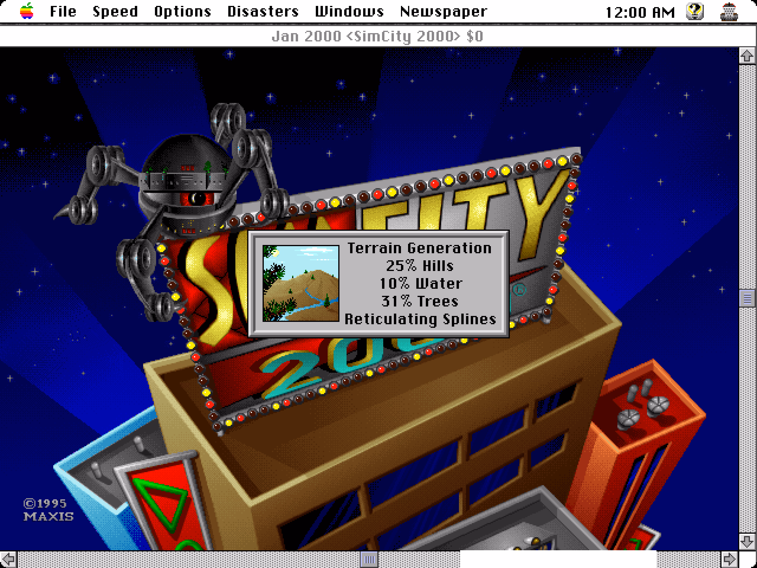
If it was not obvious from seeing Smoothing followed by More Smoothing and then Yet More Smoothing, the phrase is a joke. From The Official SimCity 2000 Planning Commission Handbook:
“Reticulating splines” is a giant pulling of our legs. Will and some others made up the phrase because they thought it looks and sounds as if it means something. It might: the word “reticulate” means to divide something so that it looks like, or appears to be, a net or a network generating, perhaps, from a single point; a “spline” can be an irregular curve or the approximation of a curve. Individually the terms have meaning. Together – in the case of SimCity 2000 – they don’t. It’s just a prank and a joke.
In some versions of the game, there was also a seductive woman’s voice saying the phrase out loud, which presumably made it even more memorable.
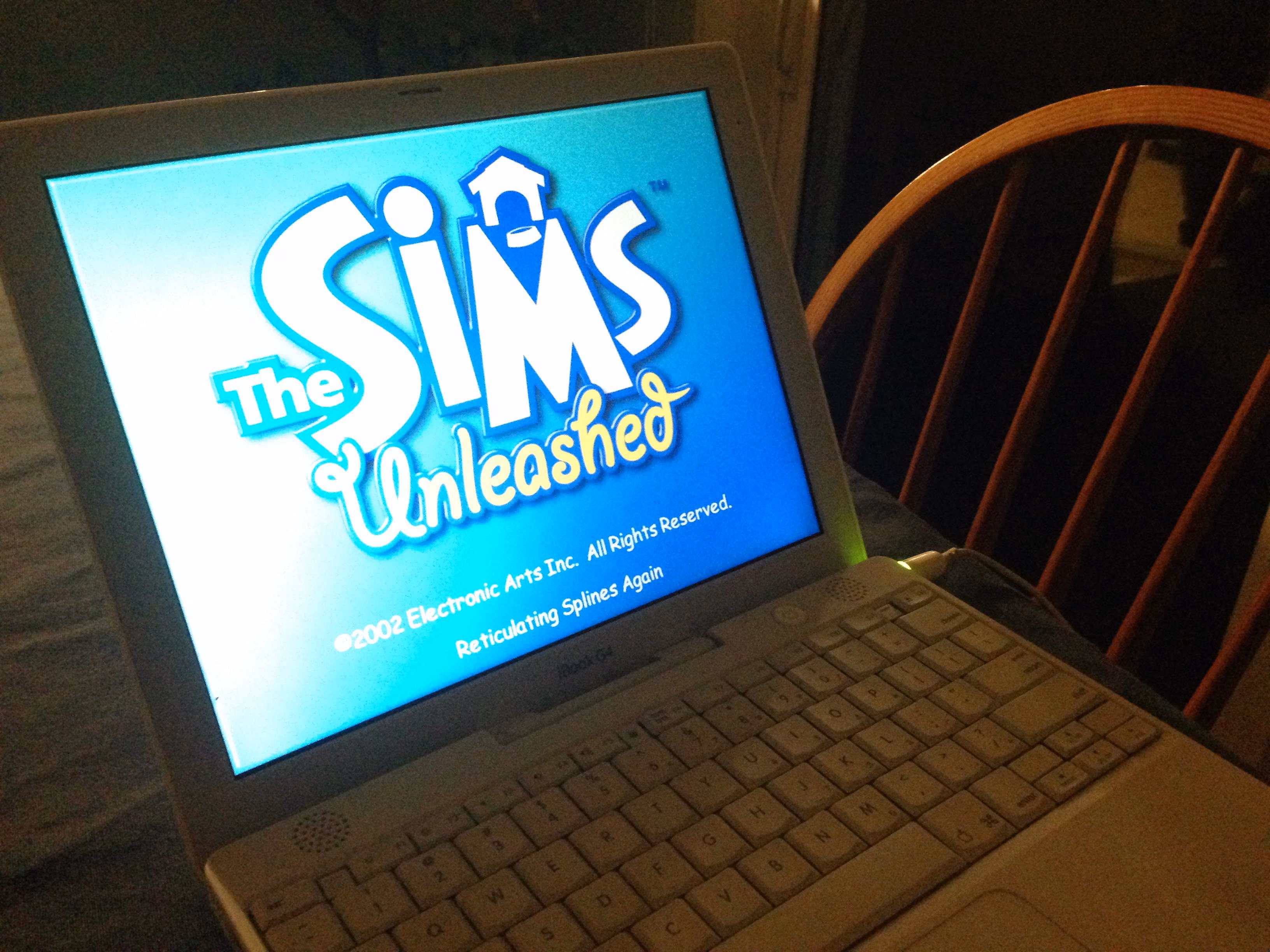
The phrase moved to other Maxis games, notably The Sims…
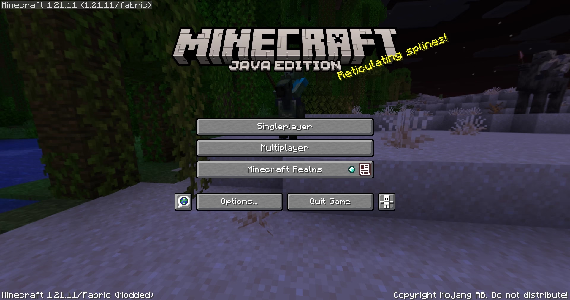
…and subsequently Minecraft…
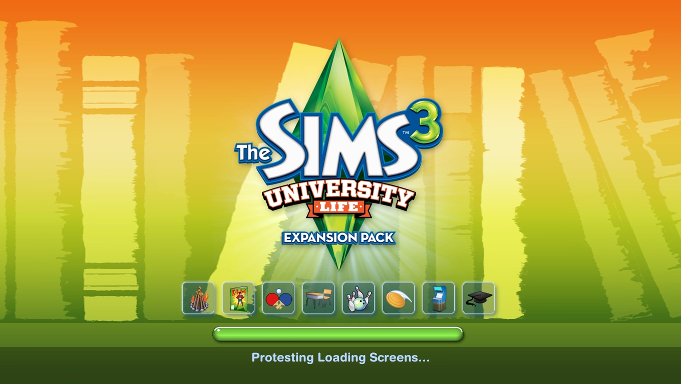
…and then tons of other places.
I’ve heard the argument that it wasn’t just Reticulating Splines – that Will Wright’s joke was the beginning of the habit of putting “cute” loading messages in apps, including actual not-game and definitely-not-cute applications. I am 100% sure there are some earlier examples of “funny” loading or error states, but I also see how this one attained a certain critical mass and influence.
I hate these cute loading strings with passion. I think I’m in the minority. It’s a topic for a future time, but it was fun at least to trace some part of its history, sifting through hundreds of pages earnestly explaining the concept of “reticulating splines” to people. Whether they’re in on the joke, I am not sure.
Also, okay. Fair enough. I chuckled just now when I saw this:

One interesting lesson here is that the famous “less is more” was actually – surprise! – perverted from the original poem, where it meant “less technical perfection means more emotional impact.”
I wasn’t fully sure why Hicks decided to incorporate a commentary to his own story this way – maybe he was afraid that the sarcasm of “steel wanting to share its joy” and “lessness” and “simplificity” wouldn’t land well? Or perhaps it was just the introduction that didn’t quite work for me, as it confused the entire joke.
But it was fun to watch it twice anyway. Those stories are never easy. I am not ready to draw too many parallels between architecture and UX design, even if Hicks lightly does so at the end. There’s no gentrification and displacement when Liquid Glass takes over Aqua, although I think a lot of people would love to see a Apple’s recent design decisions meeting the business end of a wrecking ball.
My favourite recent saying to replace “less is more” is this, by Paul Valéry (another poet!):
Everything simple is false. Everything complex is unusable.
You can see it as unsolvable, cynical, maybe even nihilistic. I do too, on a dark day. But more often, I see it as a great challenge. “Less is more” has this simplistic seductiveness that feels naïve. “More” is not an option, but often in my work on complex systems “less” is neither, and a lot of UX design is finding the perfect shade of gray.
]]>The truth is that many drivers will not slow down because of signs or speed limits. They’ll slow down either because they don’t feel safe, or because they’re afraid of damaging their car.
The only answer is redesigning the street for the desired speed limit – narrowing the lanes or joining them, creating choke points and speed bumps, adding posts and planting trees close to the road, and even adding visual cues like “dragon’s teeth.”

One of the great thing about driving in the Netherlands is that it’s rarely necessary to look at the speed limit. The road design takes care of that for you.
There is an app I use a lot called Forklift, a suped up Finder, with one of its functions being syncing files to a remote server.
In its version 3, the syncing window looked like this:
This is a pretty straightforward and dependable function – and I’ve depended on it for years.
I recently updated to version 4 to check it out, particularly since it promised faster syncing. But I was thrown aback by how it randomly deteriorated:
It’s not that there seem to be some UI challenges: the new icons make it harder to understand hierarchy, and one of the switches starts with “Don’t” in contravence of rules of avoiding double negatives.
No, the worst part is this:
This is a new temporary state that meant to help me understand the details of what’s changing.
On the surface, it’s a thoughtful thing. But it’s done in the worst possible way for this kind of a power-user interface: It’s very slow to invoke and slow to cancel. I often activate it by accident – it makes large swaths of UI a minefield where you can no longer rest your cursor safely. It also changes the hierarchy of the output in a way that’s confusing – and it even animates the text wrapping in a distracting way. Then, if you press Esc instinctively to get rid of whatever happens, the window closes altogether.
It’s a “delightful,” luscious transition that is completely out of place. I think this is how many people misunderstand craft – that it’s only about “high polish” without any thought underneath. Here, the effort was spent on executing something that couldn’t be saved this way and needed a more serious rethink. It seems like its creators forgot who’s using the app and for what, and embarked on accidental UI calming.
There are other challenges along the same lines, both downgrades from version 3:
In version 3, I could invoke Sync, immediately press Enter, and get on my merry way, with syncing continuing in the background. It was exactly what I wanted. Version 4 slows me down by requiring me to pay constant attention to the interface: it matters where I rest my mouse, it matters when I click the button, it matters what input device I use to commit.
It’s okay to think of friction and sometimes transitions are indeed very helpful for UI calming to avoid drastic movements or accidental activations. But here, this isn’t great at all; the creators of Forklift promised me faster syncing and achieved the opposite.
]]>
It’s doubly funny if you are aware of Fleishman’s extensive experience in printing.
Also, this:
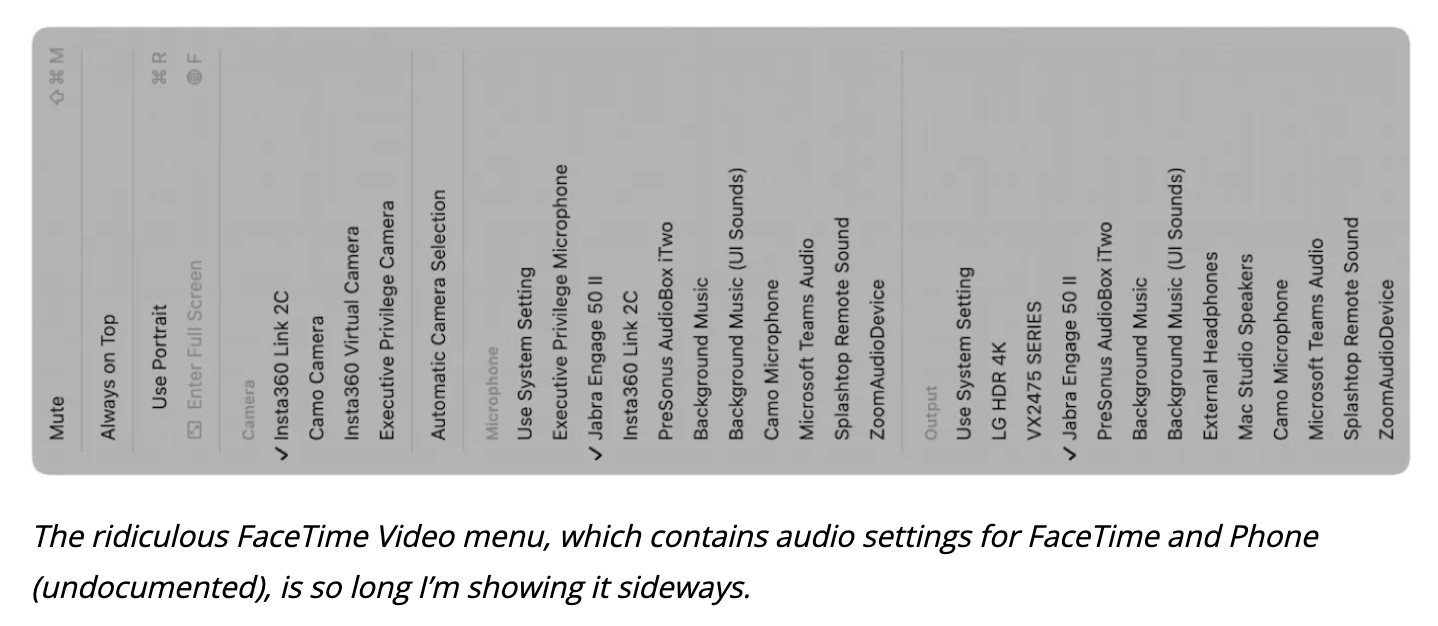
]]>I guess this is how I keep humble. Despite decades of using a Mac, I can still miss a Video menu in an audio app.
I wish either MDN or Can I use… integrated them in some way (and, of course Chrome’s and Firefox’s as well), so that looking up a certain feature or property – for example, will-change – would show you the recent changes in browsers in reverse chronological order, which could help you understand the details of the feature evolving, and help with debugging.

I found watching it strangely enthralling and even nerve racking. The creator keeps adding stuff that seemingly has no chance of fitting into such a small space – textures! sounds effects! music! his own language! – and somehow finds a way to squeeze them all in.
This is inspiring, but also practically useful: even though you and I are maybe never likely to need such high optimization, some of these techniques alone could be useful in some tight quarters like a load-bearing CSS file, or embedded software.
As an example, the author wrote his own “music tracker,” which is a clever way to reduce the weight of music: instead of the tune being one big audio file, only the instruments are sampled, and then arranged in repeating patterns.
Except in his case, there were no instruments… just audio effects already existing in the game. And audio effects themselves were generated in a similar way, by combining smaller waves and effects.
The same was done for textures: the creator wrote a bespoke text editor that saves each texture as smaller pieces and combination instructions – a sort of a “PDF” of a texture rather than a more costly scan of the printed page – and re-generates it on entry.
Lastly, this debug view of “cost” was really interesting. (Good debug views, in my opinion, are generally underrated.)
I was reminded of one of those today: how do you sort items in a bottom-aligned menu?
One school of thought is to keep it in the same order as you would a regular top-aligned menu:
On the positive side, this allows to build consistent understanding of how menus are structured: the most important thing is at the top, Quit is always at the bottom. But the downsides are obvious, too – now the most important item is furthest away from where you cursor started, and you have to awkwardly cross all the other items on the way to it.
iOS’s springboard went, literally, the other way:
Here, the bottom aligned menu reverses its item order. This tripped me up today. The dock in macOS was actually more defensible upside down because there, every menu was always going the same way. Here, the inconsistency starts rearing its ugly head.
Of course, the best way to not face an impossible choice is to avoid it altogether. Not sure how one could accomplish it here, though. Placing the menus consistently below would make some of them scrollable, or basically invisible for bottommost icons. You could also slide the entire screen up to make room for the menu, but that would probably feel disorienting.
So, I can’t say this is a wrong solution. The inconsistency might only bother people who use this often, and maybe no one uses this often? Or, perhaps, it was really important to allow to resize widgets and make that item as easy to tap as possible? But still, I think I would have done it the other way – align as needed, but items always in the same order.
]]>
I wonder how much of a chance of succeeding this has. The issue has been open since 2018, and was reopened in 2023. It has over 5,100 stars. Those dates seem old and the numbers seem huge, but I don’t have a full frame of reference. Casual search shows there are only two more bugs that have been starred by more people.
]]>But even with that in mind: this happened literally right after the reboot, with nothing much happening and no other signs of the system in distress.

It’s hard for me to even understand what would make this kind of thing pop up. Trash feels like one of the core tenets of a GUI – like undo, or copy/paste, or windows gaining focus. You don’t expect it to just… stop working, especially with a circular error message like the above.
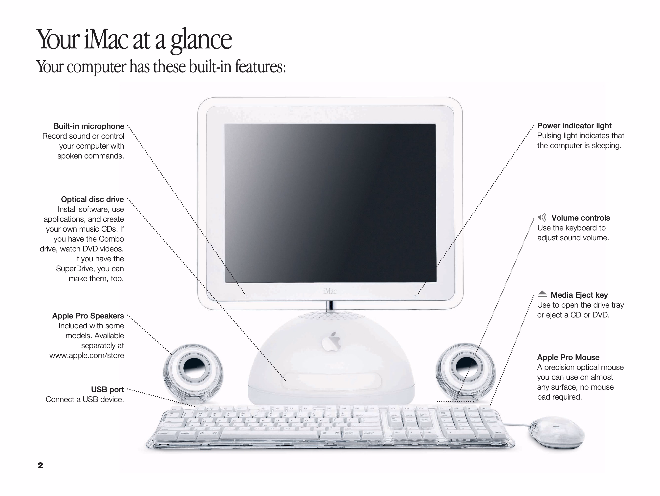
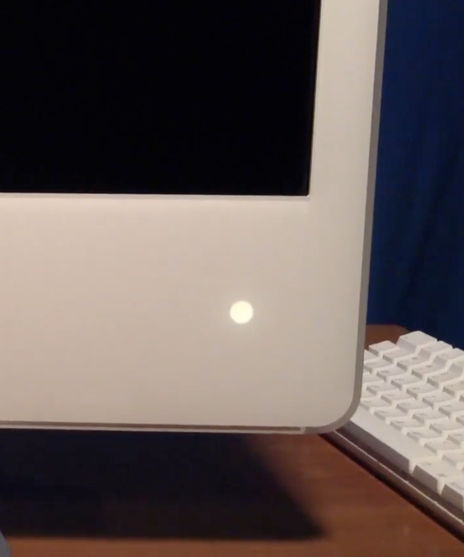
]]>It was originally placed in the hinge, but soon was moved to the other side for laptops, and eventually put in desktop computers too: Power Mac, the Cube, and the iMac.
The green LED was replaced by a white one, but “pulsating light indicates that the computer is sleeping” buried the nicest part of it – the animation was designed to mimic human breathing at 12 breaths per minute, and feel comforting and soothing:
Living through that era, it was interesting to see improvements to this small detail.
The iMac G5 gained a light sensor under the edge of the display in part so that the sleep indicator light wouldn’t be too bright in a dark room (and for older iMacs, the light would just get dimmer during the night based on the internal clock).
In later MacBooks, the light didn’t even have an opening. The aluminum was thinned and perforated so it felt like the sleep light was shining through the metal:
And, for a while, Apple promoted their own display connector that bundled data and power – but also bundled a bit of data, which allowed to do this:
Back when I had a Powermac G4 plugged into an Apple Cinema Display, I noticed something that was never advertised. When the Mac went to sleep, the pulsing sleep light came on, of course, but the sleep light on the display did too... in sync with the light on the Mac. I’ve tested that so many times, and it was always the same; in sync.
Just a little detail that wouldn’t sell anything, but just because.
Even years later, some people tried to recreate it on their own:
To do this I shifted the first gaussian curve to that its domain starts at 0 and remains positive. Since the time domain is 5 seconds total and the I:E ratio is known, it was trivial to pick the split point and therefore the mean. By manipulating sigma I was able to get the desired up-take and fall-off curves; by manipulating factor “c” I was able to control for peak intensity.
But at that point, in the first half of 2010s, the breathing light was gone, victim to the same forces that removed the battery indicator and the illuminated logo on the lid.
I know each person would find themselves elsewhere on the line from “the light was overkill to begin with” to “I wished to see what they would do after they introduced that invisible metal variant.”
I know where I would place myself.
This blog is all about celebrating functional and meaningful details, and there were practical reasons for the light to be there. This was in the era where laptops often died in their sleep – so knowing your computer was actually sleeping safe and sound was important – and the first appearance of the light after closing the lid meant that the hard drives were parked and the laptop could be moved safely.
The breathing itself, however, was purely a humanistic touch, and I miss that quirkiness of this little feature. If a save icon can survive, surely so could the breathing light.


By definition security and usability coexist wearily, so it was nice someone thought about allowing me to do this at an opportune time, rather than at a random moment that might be extremely untimely or stressful.
]]>At some point in my career I started fitting everything against two principles: “don’t make your app treat your user as if they’re dumb” and “don’t make your app itself feel dumb.”
To wit:
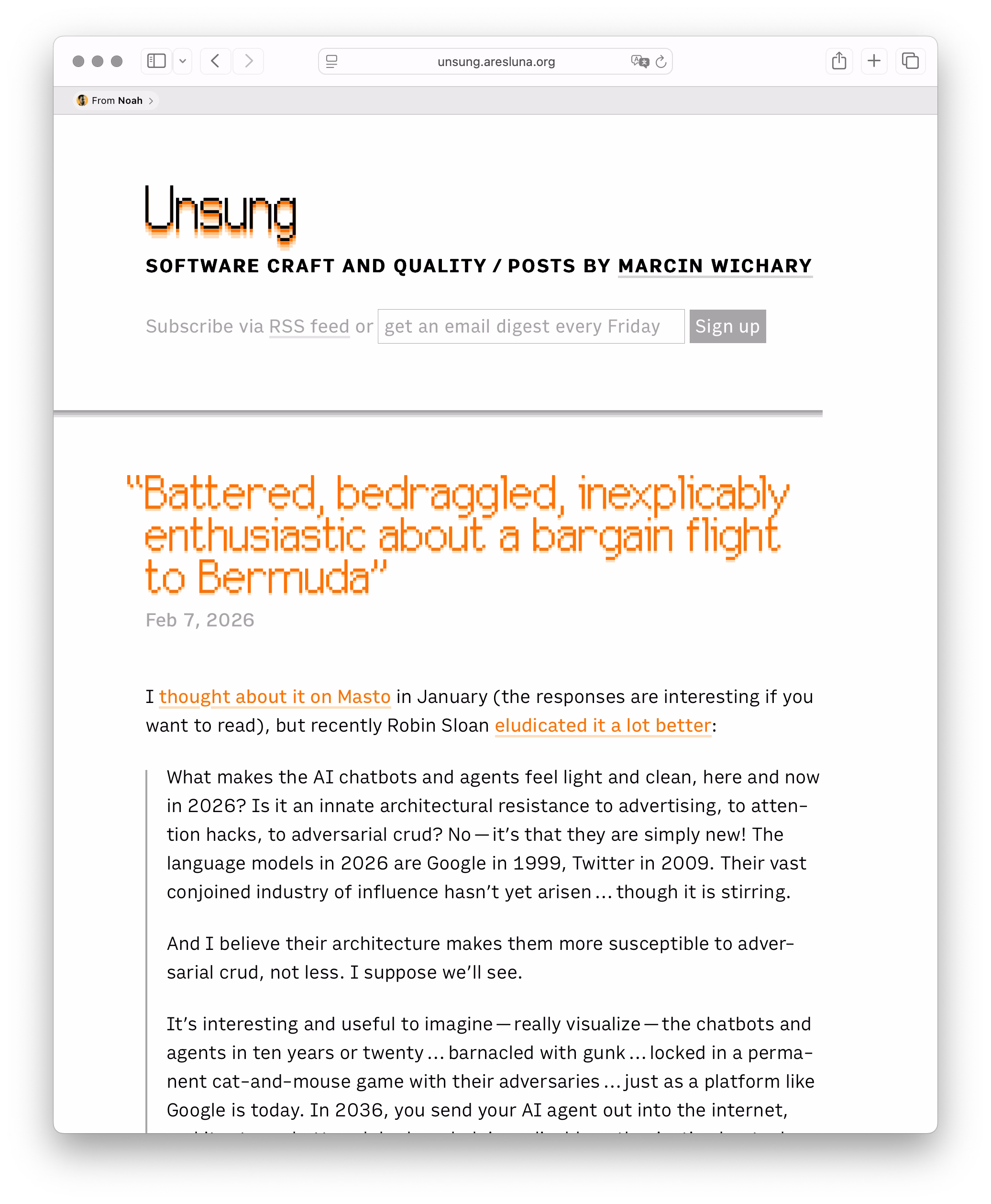
This is, very obviously, my website. I have made it from scratch. I have visited it a million times. And yet, at some point my friend Noah shared a link of it with me, so now Safari occasionally announces that with glee when I check it out.
Me having visited something many times should outweigh someone sharing it with me once.
There is a close box here, although you have to hover over the bar to see it. (And, after closing, it seems to come back after a few days!) I can also right click and choose Remove which does… absolutely nothing.
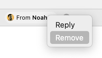
I believe this whole feature is called Shared With You. Elsewhere, on occasion, I find it useful. But its tentacle right here makes Safari appear just… kinda obtuse.
Also, speaking of obtuse: Can you spot a grave typographical mistake I made on this screenshot? (I already fixed it in production.)
]]>First is Kyle Chayka from October, in “TextEdit and the relief of simple software”:
Over the past few years, I’ve found myself relying on TextEdit more as every other app has grown more complicated, adding cloud uploads, collaborative editing, and now generative A.I. TextEdit is not connected to the internet, like Google Docs. It is not part of a larger suite of workplace software, like Microsoft Word. You can write in TextEdit, and you can format your writing with a bare minimum of fonts and styling. […]
I trust in TextEdit. It doesn’t redesign its interface without warning, the way Spotify does; it doesn’t hawk new features, and it doesn’t demand I update the app every other week, as Google Chrome does.
John Gruber at Daring Fireball responded to it in January:
But I get the feeling that Chayka would be better served switching from TextEdit to Apple Notes for most of these things he’s creating. Saving a whole pile of notes to yourself as text files on your desktop, with no organization into sub-folders, isn’t wrong. The whole point of “just put it on the desktop” is to absolve yourself of thinking about where to file something properly. That’s friction, and if you face a bit of friction every time you want to jot something down, it increases the likelihood that you won’t jot it down because you didn’t want to deal with the friction.
Part of me agrees with this vehemently – for casual text wrangling, Notes is by far the best iteration of what both the old Stickies app and TextEdit attempted.
But Notes are still evolving. The UI keeps changing. I’ve had a note shared by a friend hanging alongside my own notes for years, without me asking for it. I remember the moment when tags were introduced, and suddenly copy/paste from Slack started populating things in the sidebar. Then there was this scary asterisked dialog that slid so well into planned obsolescence worries that it felt like a self-own:
And the attendant warning, ostensibly well-intentioned, adorned my notes for months, just because I had an older Mac Mini I barely touch doing menial things in a dusty closet:

On top of that, the last version of Apple Notes on my macOS occasionally breaks copy/paste (!), which led to some writing loss on my part. (If you cut from one note intending to paste in another, and realize nothing was saved in the clipboard, you lost the text forever.)
These are not show stoppers. But they too are friction that has to be juxtaposed with what Gruber lists in his essay. They’re also friction of the unexpected, new, stochastic flavour. TextEdit’s challenges, on the other hand, are known knowns. In this context, TextEdit is in that rare – and maybe increasingly treasured – place where it no longer gets updates, but it doesn’t feel abandoned, or falling apart, or at the risk of outright cancellation. (I think on the inside of tech companies this is called being “maintenanced” – not actually staffed to be improved, but still eligible for breaking bug fixes and security updates.)
A user named Millie captured this feeling recently on Mastodon:
We need to normalize declaring software as finished. Not everything needs continuous updates to function. In fact, a minority of software needs this. Most software works as it is written. The code does not run out of date. I want more projects that are actually just finished, without the need to be continuously mutated and complexified ad infinitum.
And I saw another person, JP, sharing a similar sentiment:
Personally I would be very happy to live in a postcapitalist world where it was 100% FINE that desktop operating systems had “stopped evolving” because they were good enough to meet basically everyones’ needs, and there was no stock price to crash from an old monopoly having clawed its way to the top with nowhere else to go. “Let [certain] software be finished” has always felt to me like oblique pining for humanity to outgrow our current political-economic system.
Even on my crowdsourced list of well-made apps and sites, someone mentioned Bear – interestingly enough another note-taking app – this way:
The fact that in the 10+ years I’ve been using it, there’s only been a single major overhaul update is a feature, not a bug to me.
I have seen this sentiment grow in recent years, as AI is seemingly shoved into every crevice of everything whether or not it even had crevices to begin with. Liquid Glass on the Mac side and incessant ads plus bugs on the Windows side add to the malaise.
But I’ve also been in technology so long that even outside of tensions of capitalism, it’s hard for me to imagine software not changing. Code does run out of date even if you try very hard. So I don’t know yet how to square all this.
Bear is not finished/“maintenanced,” but it seems to not be changing the same way some other software is changing, either. I’m excited reading its blog – even if there are features or updates that do not pertain to me, they don’t bother me, and make me excited for others benefitting. Its innovation feels considered, not reckless.
In a week I’m praising products I didn’t expect to praise, I feel similarly about Lightroom Classic. When Adobe in 2017 forked Lightroom Classic out of the newly-refreshed Lightroom, a lot of us got worried about the “Classic” tag having “dead man’s walking” connotations. But nine years later, and Lightroom Classic is still being lightly updated with fixes, camera presets, and – occasionally – feature changes that largely feel welcome. Lightroom Classic appears, to once again use industry jargon, “stable.”
Maybe the answers are somewhere in this post: celebrate and fund “maintenanced” apps, fork apps into “stable” and “modern” paths, or encourage and practice slow, considered growth. I bet there are other approaches and altogether new ideas to try, too. (There used to be a tradition, when software was physical, to list all the new stuff at the back of the box. What if we started writing out the things we didn’t add?) But I like at least talking about it to begin with. There are apps in my life I want to feel like TextEdit, there are apps that I want to feel like Notes, and there are ones I’m happy to put on the cutting edge/beta/canary path, where bugs are a promise, and motor memory a distant dream.
I yearn for a software ecosystem that allows all of these types of apps to blossom.
]]>So let’s pick it up at random, with a post by Thom Holwerda with a great title “You can actually stop Windows Explorer from flashbanging you in dark mode”:
One of the most annoying things I encountered while trying out Windows 11 a few months ago was the utterly broken dark mode; broken since its inception nine years ago, but finally getting some fixes. One of the smaller but downright disturbing issues with dark mode on Windows 11 is that when Explorer is in dark mode, it will flash bright white whenever you open a new window or a new tab. It’s like the operating system is throwing flashbangs at you every time you need to do some file management.
I find the videogame-inspired nickname darkly – I’m sorry! – funny, but the problem is real. It looks like this (video via windowscentral.com):
It’s not a problem unique to Windows 11 – just the other night I saw this on Wikipedia on my iPhone, exacerbated by the delayed reaction of Liquid Glass buttons spastically adapting to the changing background:
But there is something about this that feels a notch more important than other visual and layout issues.
I think this is because dark mode is a contract – we’ll lower the brightness, and we’ll let your eyes rest. There’s a physiological part to it: a sudden flash of light when your eyes are not expecting to it can be actually physically painful. I think it’s worth thinking about it and futureproofing and sanding dark-mode views especially at their edges: loading states, error messages, signing in and logging off areas. The “flashbang” analogy is very apt, and especially so on bigger screens.
]]>Mind you, it’s not unconditional love. The execution feels a bit clunky, showing the edit values in a pop-up rather than in situ, with formatting that feels too heavy, and an awkward “No more edit history” state rather than just disabling the button.
But! Just its very presence here is delightful. Version history is often this huge, comprehensive, perhaps disorienting mode you enter that by design deals with the entire file. It always feels like a longer trip:
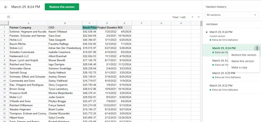
But edit history reimagines the feature from the perspective of the cell. You can just peek inside, quickly and effortlessly. Right click menu, a few arrows, I learned what I needed, and I barely even moved my hand. It’s a perfect example of the rule “to make something feel faster, make it smaller.” It’s like picking your newspaper at your doorstep in your pajamas rather than having to dress up to go to the newspaper store.
(…he said, dating himself and perhaps also thinking of The Sopranos for some reason.)
This kind of reimagining of something that already exists (see: undo send in Gmail) can be really hard, and I don’t even imagine Google Sheets was the first with this idea – but for me seeing this remix was eye-opening, and it inspires me to this day.
]]>
The video extends upon a 2001 Game Developer article by Gavin Dodd, but Tech Rules adds a good intro about PlayStation’s modchips, and then actually shows the piracy protection in action.
I’m not going to spoil the surprise. Am I fully supportive of the approach? Not sure. PlayStation’s region protection complicates my feelings, and any sort of DRM-esque approach eventually backfires when it comes to software preservation. But you can’t deny what Spyro developers did is a really fascinating and weird approach.
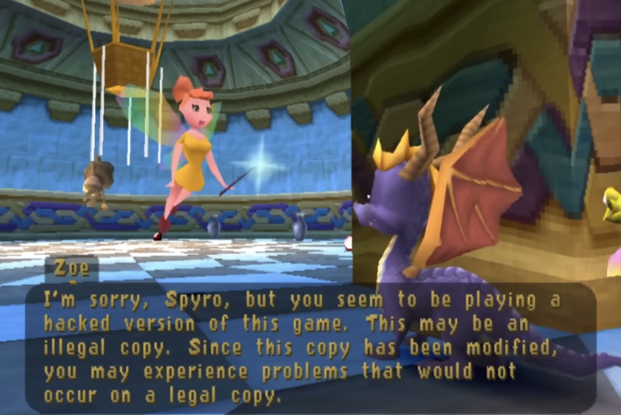
The quote in the title of this post refers to the hackers who eventually did conquer the Spyro’s copy protection system. I guess – and I apologize in advance – game recognize game.
]]>
But there was an interesting hybrid period in between then and now where you still were only allowed 4 or 8 or 16 or 256 color choices in total, but you could assign any of these at will from a much bigger palette.
So, as an example, each one of these three is made out of 16 colors, but each one is 16 different colors:
Moving pixels was slow. But palette swaps were so fast and easy, that it led to a technique known as palette cycling. This is probably the best-known example, from an Atari ST program called NEOchrome.
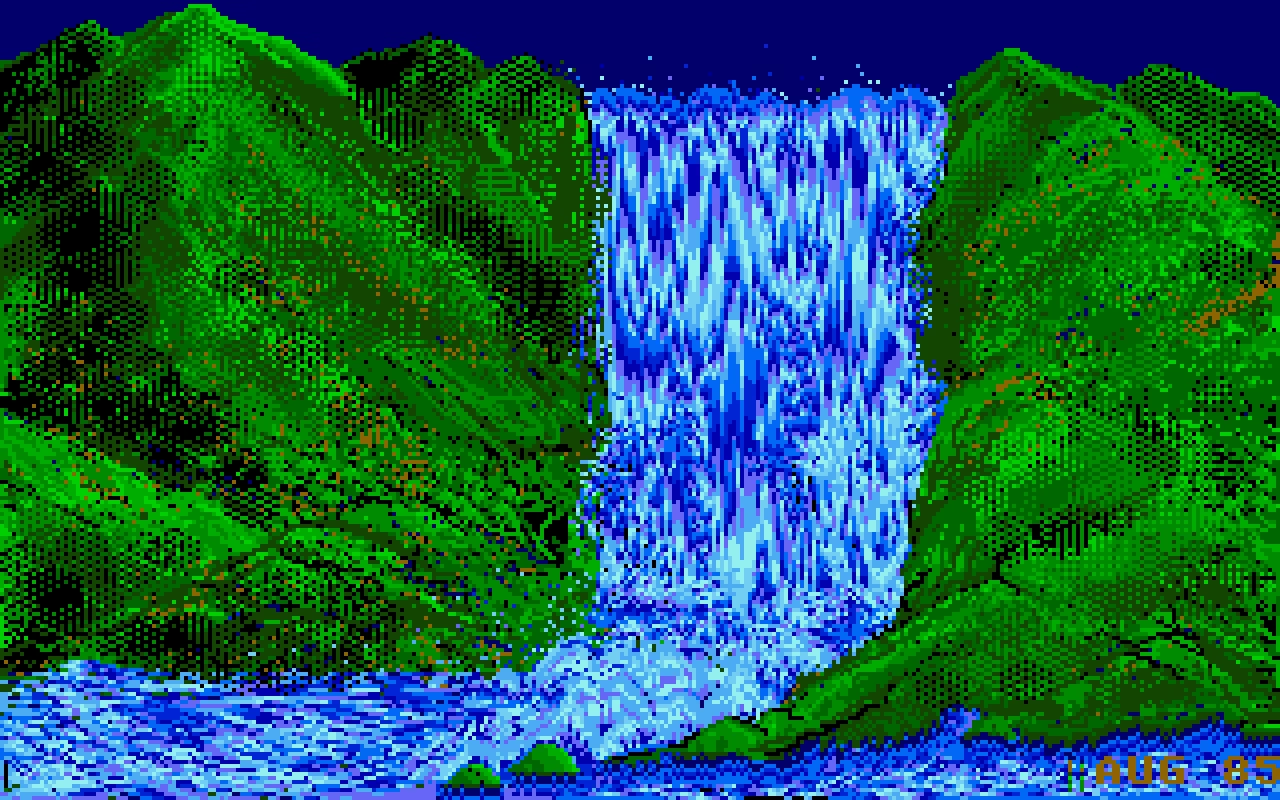
Despite so much apparent movement, no pixels are changing location, as that’d be prohibitively slow in 1985. Only the palette is changing. If you watch the same animation with the UI visible, you can clearly see which colors are “static,” and which are moving around:

But this was 1985, so why I am mentioning it 40 years later?
I like looking at old computers for a few reasons. Some of these seeminly-ancient techniques are inspiring and remind me that the limitations are often in the eye of the beholder. Seeing someone really good pushing a platform to its limits is just a good thing to load into your neurons – this could be you next time! And, believe it or not, some tips and tricks can still be relevant.
For example, this is a 9-minute video by Steffest from just earlier this year that walks through a modern attempt to make a palette cycling animation, including starting on an iPad:
The end result goes much harder than I expected. It was interesting to see again the technique of dithering to simulate transparency (we’ve seen it before, but this one is more advanced). But what particularly stood out to me here was the artist making his own little tools to aid in the creative process; I’ve always loved the notion that a computer is really just meant to be an accelerant, making it easy for you to avoid drudgery.
]]>One of the ways I like to do development is to build something, click around a ton, make tweaks, click around more, more tweaks, more clicks, etc., until I finally consider it done.
The clicking around a ton is the important part. If it’s a page transition, that means going back and forth a ton. Click, back button. Click, right-click context menu, “Back”. Click, in-app navigation to go back (if there is one). Click, keyboard shortcut to go back. Over and over and over. You get the idea.
It’s kind of a QA tactic in a sense, just click around and try to break stuff. But I like to think of it as being more akin to woodworking. You have a plank of wood and you run it through the belt sander to get all the big, coarse stuff smoothed down. Then you pull out the hand sander, sand a spot, run your hand over it, feel for splinters, sand it some more, over and over until you’re satisfied with the result.
This is a clever metaphor and I wish I thought of this before. What follows is a specific story of finding a few dead pixels in between related interface elements, which is an absolutely perfect example of something with non-linear frustration: It might not register at all on the first try, but it will bother you 1,000-fold on the 20th go.
I was just on Internet Archive earlier today, uploading some documents I scanned this weekend. Their UI is… how would I put this… let’s just say Internet Archive makes Teams feel like Linear. (I love Internet Archive and their work and mission, but let’s be honest here.)
Yet, I found something marvelous. Whoever put the upload form UI together knew there will be people like me who’ll be filling out 20 of these forms one right after another. So they made sure every pixel in their form is clickable to edit the nearest field. And I mean, every pixel.
Whoever you are, you have my nod of recognition. In at least this one respect, it’s clear someone spent a lot of time with the sander.
]]>Some people pointed out other good examples for inspiration. Chris Silverman:
The idea of URLs as user interface elements is such a good take. I’ve seen some people use URLs as design/communications elements as well, like Jessica Hische:
www.jessicahische.is/thinkingthoughtswww.jessicahische.is/workingjessicahische.is/anoversharerI love that approach. Modern browsers and preview cards often obscure URLs, but people still see these things; printed materials, links in emails, etc.
Matt Goldman:
I really like letterboxd’s urls these days:
- all the films in my diary in 2024?
letterboxd.com/robotmlg/diary/films/for/2024/- movies I’ve tagged as seeing at Film Forum?
letterboxd.com/robotmlg/tag/film-forum/films/- five star reviews that I wrote in 2021?
letterboxd.com/robotmlg/reviews/films/for/2021/rated/5/
Both Erin Sparling and Nelson Miner highlighted how much the craft of Flickr URLs related to the craft of its API:
Literally used to talk about how good this URL scheme was in class, it was so informative. The Flickr API still informs everything I do these days, URLs included.
There was some discussion about the pattern I suggested. Which one should it be?
flickr.com/mwichary/sets/72177720330077904/alishan-forest-railwayflickr.com/mwichary/sets/alishan-forest-railway-72177720330077904flickr.com/mwichary/sets/alishan-forest-railway/72177720330077904I will admit: I don’t know. Each has pros and cons – some are better for autocomplete, others better for conveying hierarchy or surviving “removing from the end.”
This note arrived via email:
Hey,
wwwis not redundant. In services like NextDNS it allows blocking only main site, without subdomains. So it gives more control and cost nothing :)
To which my answer is: I don’t think you’ll get to great user experience by prioritizing corner cases like this one.
Jim Nielsen shared some of his favourites, and Søren Birkemeyer suggested more evergreen reading on the subject, with more inspiration inside:
The middle one caught my attention because it talks about URLs that are not just user readable, but also user guessable. I think that’s a perfect word for something I tried to capture in my post: if a user successfully guesses a URL from your scheme, then you know you have something good on your hands.
Lastly, a few people mentioned the late 1990s classic written by a relatively unknown dude going by “Tim BL,” called Cool URIs don’t change.
]]>Historical note: At the end of the 20th century when this was written, “cool” was an epithet of approval particularly among young, indicating trendiness, quality, or appropriateness. In the rush to stake [out] DNS territory involved[, ] the choice of domain name and URI path were sometimes directed more toward apparent “coolness” than toward usefulness or longevity. This note is an attempt to redirect the energy behind the quest for coolness.
]]>It is incredible how far we have come for these barely-distinguished placements to be called “visually separated”. Google’s ads, for example, used to have a coloured background, eventually fading to white. The “sponsored link” text turned into a little yellow “Ad” badge, eventually becoming today’s little bold “Ad” text. Apple, too, has made its App Store ads blend into normal results. In OpenAI’s case, they have opted to delineate ads by using a grey background and labelling them “Sponsored”.
Now OpenAI has something different to optimize for. We can all pretend that free market forces will punish the company if it does not move carefully, or it inserts too many ads, or if organic results start to feel influenced by ad buyers. But we have already seen how this works with Google search, in Instagram, in YouTube, and elsewhere. These platforms are ad-heavy to the detriment and frustration of users, yet they remain successful and growing. No matter what you think of OpenAI’s goals already, ads are going to fundamentally change ChatGPT and the company as a whole.
So I opened the app on my Mac via iPhone Mirroring, and started clicking testing carefully. This is what I saw:
Turns out there was something wrong there – the touch targets are so vertically lopsided you’ll often end up tapping the item below by accident.
I reported the bug to Bluesky, and a few days later I saw Norbert Heger doing a similar thing vis-a-vis the macOS Tahoe rounded corner bug (previously):
Heger’s method is automated and a lot smarter than mine, but I enjoyed seeing these parallel efforts.
What’s the lesson here? I think it’s this: Trust your fingers, and occassionally speak for them as they can’t speak for themselves.
]]>After Liquid Glass specifically, we seem to be going through an interesting re-evaluation of whether “the content is the king; it should feel expansive and UI should get out of the way at all costs,” so seductive as a principle, is ultimately the right approach. Liquid Glass-sporting operating systems have so many contrast and blending and distraction issues that I wonder if they alone are radicalizing people, making them appreciate traditional rigid toolbars with solid backgrounds and fortified borders.
But here? Here letting contents shine and putting the UI atop feels like the absolutely right thing to do, since you are redesigning your reading experience.
Contrast this with Books:
It’s not even that the crossfaded transitions feel awkward. It’s mostly that the interface takes up so much room that the content preview slice becomes almost claustrophobic. And it’s even weirder when you tap the Customize button, and whatever was visible gets inexplicably replaced by a pop-up with… largely the same content anyway.
How will the entire page feel? For that you have to use your imagination – or keep tapping back and forth.
]]>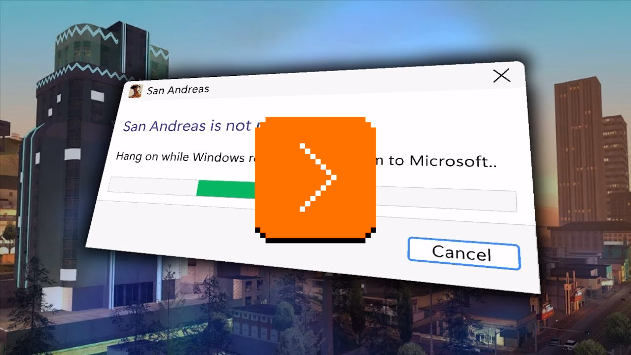
San Andreas was released in 2004, but the game started breaking only after Windows got updated… in 2024. Turns out the bug was sort of a ticking time bomb just waiting for the right set of conditions. We covered one similar bug before, in Half-Life 2 – but this investigation goes deeper, and shines a light on the difficulty of making Windows, whose backwards compatibility comes at a price.
]]>flickr.com/photos/mwichary/favorites
flickr.com/photos/mwichary/sets
flickr.com/photos/mwichary/sets/72177720330077904
flickr.com/photos/mwichary/54896695834
flickr.com/photos/mwichary/54896695834/in/set-72177720330077904
This was incredible and a breath of fresh air. No redundant www. in front or awkward .php at the end. No parameters with their unpleasant ?&= syntax. No % signs partying with hex codes. When you shared these URLs with others, you didn’t have to retouch or delete anything. When Chrome’s address bar started autocompleting them, you knew exactly where you were going.
This might seem silly. The user interface of URLs? Who types in or edits URLs by hand? But keyboards are still the most efficient entry device. If a place you’re going is where you’ve already been, typing a few letters might get you there much faster than waiting for pages to load, clicking, and so on. It might get you there even faster than sifting through bookmarks. Or, if where you’re going is up in hierarchy, well-designed URL will allow you to drag to select and then backspace a few things from the end.
Flickr allowed to do all that, and all without a touch of a Shift key, too.
Any URL being easily editable required for it to be easily readable, too. Flickr’s were. The link names were so simple that seeing the menu…
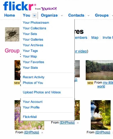
…told you exactly what the URLs for each item were.
In the years since, the rich text dreams didn’t materialize. We’ve continued to see and use naked URLs everywhere. And this is where we get to one other benefit of Flickr URLs: they were short. They could be placed in an email or in Markdown. Scratch that, they could be placed in a sentence. And they would never get truncated today on Slack with that frustrating middle ellipsis (which occasionally leads to someone copying the shortened and now-malformed URL and sharing it further!).
It was a beautiful and predictable scheme. Once you knew how it worked, you could guess other URLs. If I were typing an email or authoring a blog post and I happened to have a link to your photo in Flickr, I could also easily include a link to your Flickr homepage just by editing the URL, without having to jump back to the browser to verify.
Flickr is still around and most of the URLs above will work. In 2026, I can think of a few improvements. I would get rid of /photos, since Flickr is already about photos. I would also try to add a human-readable slug at the end, because…
flickr.com/mwichary/sets/72177720330077904-alishan-forest-railway
…feels easier to recall than…
flickr.com/photos/mwichary/sets/72177720330077904
(Alternatively, I would consider getting rid of numerical ids altogether and relying on name alone. Internet Archive does it at e.g. archive.org/details/leroy-lettering-sets, but that has some serious limitations that are not hard to imagine.)
But this is the benefit of hindsight and the benefit of things I learned since. And I started learning and caring right here, with Flickr, in 2007. Back then, by default, URLs would look like this:
www.flickr.com/Photos.aspx?photo_id=54896695834&user_id=mwichary&type=gallery
Flickr’s didn’t, because someone gave a damn. The fact they did was inspiring; most of the URLs in things I created since owe something to that person. (Please let me know who that was, if you know! My grapevine says it’s Cal Henderson, but I would love a confirmation.)
]]>Shadeed argues that this ugly responsive interregnum happens a lot more than people might assume, as part of natural window management on larger screens. If you un-maximize the window, use one of the many split-screen features, or something like link preview, it might push the browser into a width slice you might have thought was not actually realistically occupied.
Also, what caught my attention at the bottom of the post was this smart visualization. I wish the responsive design features in my browser’s web inspector did this kind of thing automatically:
I still remember Mac OS X arriving on the scene with icons that felt infinite in every possible way: in size, in color palette, in dimensionality. We got used to them over the last quarter century, but Michael Flarup’s books rekindled that feeling for me; the icons presented here are lavish, larger than life, and basically pixel-less.
I do not generally like coffee-table books. But I really liked these. The iOS App Icon Book came out in 2022, and the macOS App Icon Book followed two years later. They’re “almost-coffee-table” – which is a compliment! – extremely well-made but portable, and with soul, and thoughtful details, and inspiring evidence of being labours of love.
Each one has an almost-absurd amount of icons (I counted almost 1,200 in one book, and consequently didn’t even attempt counting in the other), but it’s not just the quantity that impresses. The icons are laid out carefully on gorgeous color-coordinated spreads. Many appear in variations so you compare their evolution over the years. Each one is big enough and printed so well you can study it in detail, and I have not noticed one technical flaw in their reproduction.
In addition to beautiful collections of beautiful icons, the book also veers a bit into history, and design advice, and adds ~10 interviews with icon designers each. Those are welcome additions that elevate the books from a boring coffee-table existence, but those are also its weakest parts – although “weakest” in a comparative sense. The things missing for me in the book are: more work in progress and rejected efforts, more specific advice and hard-learned lessons rather than general-interest interviews, a bit more about recognition of icons when reproduced small on screens, and some harder/cerebral conversations about iconography and its place in the universe.
On the other hand, I know that of all icons it’s app icons that get to be least concerned with semantics and semiotics, as they’re maybe the closest to just pure art and graphic design. I can understand how talking through it all would be an extremely hard task; all of the fantastic icon designers I know personally would struggle with explaining why their output is better than others. It’s possible the extra “left-brain” stuff I want from these books would also make them less desirable for those who just seek visual or artistic inspiration.
Both books are otherwise basically a love letter to app iconography, and awash in memorable details: delightful covers, colour-coordinated ribbon bookmarks, beautiful ex librissen, and a product index and an artist index.
The price – $84 without shipping (they’re printed in Denmark, so for once Europe gets an advantage) – might be a bit of a showstopper. The books are well-made, but you are definitely paying a premium for a short/bespoke print run. The volumes complement each other well on a shelf, but you’ll do no wrong with getting either one if two is too much for your budget. (There is also a half-price PDF version, if that’s of interest to you, but I cannot vouch for that.)
So the AI group didn’t finish meaningfully faster, but they understood meaningfully less. And the biggest gap was in debugging—the ability to recognize when code is wrong and figure out why. That’s the exact skill you need most when your job is to oversee AI-generated output.
Inside it, a quote from the Anthropic post that resonated with me:
Cognitive effort—and even getting painfully stuck—is likely important for fostering mastery.
I wonder if part of the appeal of AI tools is the promise of “exercise without exercise,” like the vibrating belt machines of the 1950s.

Elsewhere, I found an essay about the craft of writing by Kristie de Garis:
Writing at speed privileges what arrives first. The obvious phrasing, the familiar structure, a thought that you heard somewhere before.
Also this:
A book is not retrieved fully formed from memory, or pulled up in a full bucket from some deep creative well in your body.
The old saying goes “everyone dreams about having written a book, not about writing one.” Now we’re building software that allows people to “have written a book” and “have designed something.”
I am open (I think!) to the idea that the nature of the effort will change as tools change. But I can’t see mastery arriving without effort. And I’m worried people will start mistaking prompting mastery for material mastery.
]]>There are some interesting nuggets in there I didn’t know, like Sibelius (music software) being a system seller for the British computer Acorn Archimedes, Xevious doing the same for Famicom (I had no idea Xevious, as beautiful as it is, was so huge!), and Steve Jobs focusing so much on making calls on the first iPhone. How quickly we started taking visual voicemail for granted…
But I was suprised not to see killer apps for Fortnite, Minecraft, Roblox, or even Mac OS X. Does the concept of killer apps not work anymore? Is iMessage a killer app for those who want blue bubbles, but it’s much harder for us to know that?
(I’m also curious about a parallel list of botched updates: Digg in 2010, Sonos in 2024, the “simplified” iMovie ’08 and Final Cut Pro X, Liquid Glass, as some of them ended up being anti-killer apps. I don’t immediately see anything like this online, but it could be an interesting series of posts to analyze those more carefully, going past schadenfreude or ridicule.)
Also, it made me think of one of my favourite ads. It’s for VisiCalc, the first computer spreadsheet, and the first-ever killer app. The ad was unassuming, small, in a corner of a 1979 computer magazine. But, in hindsight, what a prescient and brilliant question: How did you ever do without it?
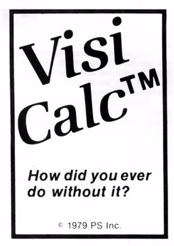
We take spreadsheets for granted, too, but chills. Literal chills.
]]>
Without the path bar, the columns are now taller, but the vertical scrollers remain the same height as before, leaving vertical gaps, a ridiculous amount of space between the bottom of the scrollers and the bottom of the columns, looking silly and amateurish.
It’s impossible to talk about craft without talking about embarrassment, and pride, and shame, and lust, and a lot of other words – all tricky to describe, all fluffy. So, I tried to interrogate my feelings.
First, it was embarrassing that it broke. I’ve been there: you build a complex system, and forget about some lesser-known state. That’s why it’s important to invest in whatever it takes to shine a light on those states: quality assurance, automatic screenshotting, tests, and so on. Sometimes it’s simple hacks – like half of your team having scrollbars visible. And when you notice a bug, you try not to just fix it, but to rebuild it to be stronger (“leave the campsite in a better place you found it”) – be it by fixing the cause and not just the symptom, adding unit tests, changing practices, and so on.
But it also felt embarrassing how it broke. It feels clear there’s some manual calculation going on somewhere, and someone forgot to add this new change to it. One of the tricks I learned over time is that a well-designed system designs itself, but it takes effort and imagination to make a system resilient in this way. Here, if there was some abstraction of “adding stuff to the bottom,” then you wouldn’t have to worry about adding extra math. The system would take care of itself in many of these corner cases you will forget about.
I don’t want to shame (see, that word again!) individual people at Apple because I don’t know if it’s the lack of talent, or the whole system being wired in a way that doesn’t reward forward thinking or the kind of invisible work that needs to happen in those spaces. But the embarrassment should be there – if it doesn’t exist inside Apple, then that’s perhaps the sign of a real problem.
]]>
Anecdotally, this is named after Molly, an engineer’s daughter who was invited to a datacenter and promptly pressed a big red button, as one would.
Then she did it again later the same day.

You might recognize molly guards from any aerial combat movie you ever watched:


And some vestigial forms of molly guards exist everywhere in civilian hardware, too: from recessed buttons, through plastic ridges around keys, to something like a SIM card ejection hole.


Of course, molly guards happen in software, too: from the cheapest “are you sure?” dialogs (which sometimes move buttons around or disable keyboard activation to slow you down), through extra modifier keys (in Ctrl+Alt+Del, the Ctrl and Alt keys are the guards), to more elaborate interactions that introduce friction in places where it’s needed:
But it’s also worth thinking of reverse molly guards: buttons that will press themselves if you don’t do anything after a while.
I see them sometimes, and always consider them very thoughtful. This is the first example that comes to my mind:
Here’s what became a standard mobile pattern:

These feel important to remember, particularly if your computer is about to embark on a long process to do something complex – like an OS update or a long render.
There is no worse feeling than waking up, walking up to the machine that was supposed to work through the night, and seeing it did absolutely nothing, stupidly waiting for hours for a response to a question that didn’t even matter.
It’s good to think about designing and signposting those flows so people know when they can walk away with confidence, and I sometimes think a reverse molly guard could serve an important purpose: in a well-designed flow, once you see it, you know things will now proceed to completion.

If you’re an engineer, I can sense you might be getting frustrated, as most bullet points I listed look like extra work. I agree with you. It is. This post is as much about process, as it is about culture and the incentives it establishes. The best places I’ve worked were filled with shared trust and treated bugs as a joined responsibility of everyone, rather than a black-and-white division into “filers“ and “fixers,” with the ultimate end goal always being user’s experience – nothing else.
I also understand this dives right into an age-old tension between manufacture and craft. Bug-fixing processes have to be well-oiled bureaucracies with very specific rules so that they don’t turn into a pile of vibes and Brownian motions. But design (and, by extension, a lot of front-end) doesn’t work like that. Design needs room for taste, for careful exceptions, for escalation of immesurable things, and for a certain flexibility in even the basic definitions.
If it’s a tiny, but embarrassing bug, or a flow killer, or a thing that bothers your most valuable group of users, or something appearing in a well-trafficked place – it is no longer tiny. If it’s working as intended, but it feels buggy to the user – it ought to be a bug. If it’s a long-standing bug, it should be considered as cumulative damage already done, not “oh, this has been like this for a long time, no one cares.” If there’s a shaky repro, but the bug feels important, you need to work from principles or analyze the code. If it’s something no one mentioned externally (ergo: why fix it?), consider a lot of bugs rankle but never get reported, particularly if your company doesn’t project an external presence of caring about feedback and acting upon it. cough cough Apple cough cough cough cough cough dies coughing
Of course, designers have responsibilities in the process also, among them mutual respect and understanding of engineering, clarity of communication (particularly about things that are hard to reason about mathematically), seeing patterns that could be grouped into bigger bug bundles to make fixing more efficient, (occasionally!) helping figure out a fix if the obvious fix isn’t available, and shared understanding with their team about what actually matters. There is always a thousand details that could be better, but for every thousand only a hundred might actually be worthwhile. Flooding the bug process with irrelevant minutiae that won’t realistically ever be fixed is not very helpful.
This is the only way I know of to capture the full spectrum of bugs that ruin software – from front-end to back-end, from visual/interactive quality to works-or-not functionality, from what can be measured to what never will be. And this is not just about designers, of course. It’s not even about any non-engineering function. Design serves everyone; if your bug-filing UI or your process or your definitions are not well-designed or -balanced, I strongly believe you’re also hurting engineers on your team. And you’re definitely hurting your users.
]]>
I am pretty sure this is nothing new for heavy command-line gurus (and heavy Raycast users, and so on), but I found it delightful to see someone so excited about creative uses of the terminal, and it made me realize how much time I do waste going through the browser, then Google Search, then scrolling. I am sure tightening some of these loops would feel great.
There is also something interesting in the argument about terminal being the ultimate “reading mode” of any website, chiefly because it cannot be anything else.
Mostly, this and Strudel before make me excited to see some new (to me) stuff happening with text-based user interfaces.
]]>But it also made me think. I still strongly associate macOS shake with “wrong password,” meaning “you’re doing something wrong” – something the system has been teaching us ever since the late 1980s NeXT computer, whose windowing manager it inherited. Am I careful about the motion vocabulary and the semantics of shake, or am I simply overthinking it? Sometimes it is hard to tell.
(By the way, is it okay for me to link to random work by strangers, or is it weird? Don’t be afraid to let me know. One thing I want to practice on this blog is various ways to be a critic, in the sort of Roger Ebert sense.)
]]>
Turns out, it is basically a unique human-readable encoding of a 32-bit digit, I’d guess particularly for ease of voice/phone support communication. (Otherwise I imagine copy/paste would work well?)
Asana has been doing it since at least 2011:
What is novel in Asana is the form these IDs take. In most other applications, a customer-facing ID is usually a long jumble of numbers and/or letters. There are lots of small, subtle drawbacks to representing a number to a human this way, and so for the sake of curiosity—and to add a little levity to an otherwise frustrating situation—we tried something different.
Imagine representing 32 bits of information (numbers up to 4 billion) as a sentence instead of a jumble of digits. One possible sentence structure can be: count + adjective + plural noun + verb + adverb, e.g. “6 sad squid snuggle softly.”
I am very curious what data gets encoded this way since 32 bits is not really a lot. That detail, however, is not covered in the post.
]]>When the project succeeded, her work had dissolved into the project’s infrastructure. The doc was just “the doc.” The tracker was just “the tracker.” The alignment was just how things were. People forgot it had ever been otherwise. That’s the thing about good coordination. I’ve realized that when it works, it disappears. You can’t see it precisely because it worked.
Even though Pandya didn’t call that out, it’s worth highlighting that his “founder friend” example wasn’t a woman by pure chance; often the invisible work becomes the second shift of women in the workplace. And then:
The problem is that recognition follows narrative. When a project succeeds, credit flows to the people whose contributions are easy to describe. The person who presented to the board. The person whose name is on the launch email. The person who shipped the final feature. These contributions are real, I’m not diminishing them. But they’re not more real than the work that made them possible. They’re just easier to point at. Easier to put in a slide. And I think that’s where the unfairness starts, slowly, without people really noticing.
However, I disagreed with these parts:
There’s no framework that fixes this. You can’t design a rubric that captures “held the project together.”
Wait, why not? This is a similar challenge to quantifying design contributions (some of which might not clearly map to KPIs or sometimes even OKRs). You can’t measure being in the flow, true user satisfaction and frustration, or world-class-adjacency of taste. But it doesn’t mean you cannot design a system or a rubric that recognizes and talks about them.
]]>This book, I’m pretty sure, is the first to look at maintenance in general. It asks: What can be learned if you think about all the varieties of maintenance at the same time? I doubt if there are any non-trivial “laws” of maintenance to be discovered. All I can offer here is to muse across a representative sample of maintenance domains and see what emerges.
Very excited to give it a go, somewhat worried about “Part One” appearing in the title, disappointed in Stripe not caring enough to ask one woman for a blurb.

This is incredible – a story of a museum exhibit that replicated an experience of being a tech support person for a videogame company some time in the early 1990s:
You knew hint lines existed, right? 1-900 numbers, long-distance charges, hoping whoever answers actually knows what they’re talking about. They had incomplete documentation, contradictory notes, whatever the previous shift scribbled down. Nintendo’s Power Line is probably the most famous example. There’s a few great videos floating around about them.
The team invented a few new games (“We weren’t just making a game about hint lines. We were making the games that would’ve required hint lines to exist in the first place”), a few personas, and put together a 300-page realistic binder:
The entire story is so worth a read.
Looking back, we think ACMI said yes because we pitched infrastructure, not nostalgia. If you’re old enough, you probably remember that hint lines existed. We wanted people to experience what it was like to be part of that system.
[…]
Next time you tab over to a wiki page or watch a YouTube guide, spare a thought for hint line counselors of the early 1990s, armed with incomplete documentation, good intentions, and hope that the person on the other end was asking about a game they’d actually played. They were unsung heroes of gaming’s most chaotic era, and now, for a few minutes at least, you can experience their particular brand of helpful desperation firsthand.
The exhibit is still available at ACMI in Melbourne until March this year, “along with a life-size usable corporate cubicle (with a dead plant!) and matching hardware straight from the ’90s.”
You can also play it online, although the team warns: “Online is not the intended experience. Flipping through the physical artifact is half the fun.”
This, by the way, is why ACMI is one of my fav tech museums.
]]>
If I remember the story correctly, this was neither a bug, nor an Easter egg, but instead a joke’y punishment for not delivering the correct asset on time.
]]>Email is where the metaphor made its jump from atoms to bits. “Inbox” was borrowed legitimacy. It sounded like that wooden tray, so it inherited its psychology. But the wooden tray had a constraint: physical space. A desk could only hold so much. The digital inbox had no bottom. Still, mostly real obligations. Humans writing to you, expecting responses.
This all resonated me, although only to a point. I long stopped paying attention to those unread counters in Gmail and even though I know they exist, they feel wholly meaningless. And I personally would prefer my RSS reader to work more like email, because worrying that I cannot catch up if I wait too long and old entries get recycled is actually adding stress for me.
But I’m thankful for someone else pushing back on the barrage of red dots and fake urgency, and just thinking about it all is worthwhile. I’m very open to the idea of building something that eschews numbers to begin with, and for trying different operating models. (I deleted Threads from my phone after it was pushing me toward the algorithmic timeline filled with outrage, which was detrimental to my mental health.) I could even imagine choosing different RSS feeds to have different rules – this one “cannot miss,” the other one “casual.”
I also want to talk about the essay’s presentation.
The site makes heavy use of scroll effects. Okay, heavy subdued use, but like most of these, this is presentational rather than semantic. In this story at least, it feels a bit more thoughtful and it does feel like it enhances the experience and atmosphere, starting with the ticking number at the very top.
Yet, there are challenges. First, it does seem like there’s a lot of subtle movement going on and at some point that becomes a distraction. Also, I don’t know if it’s a bug or a particular stylistic choice, but things do not reveal themselves until they are almost off the screen. As an example, this is not a screenshot in the middle of animation – this is the page in a resting state, where the bottom is impossible to read:
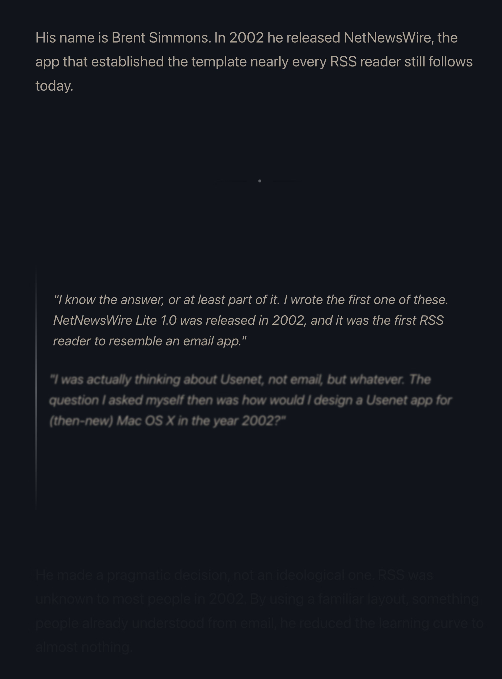
This property, combined with the fact that all these are always reversible (something that even the recent Death to Scroll Fade page that ridiculed these avoided) makes the essay fiddly and harder to read than it needs to be.
To author’s credit, there is an alternative static version provided and linked to at the very top. But that version is also styled differently, and has more of a “terminal” look.
Thinking out loud and building a set of principles out of these observations, I would personally do it this way:
I imagine it must be a confluence of many things, not just this one. Shorter means faster even with amazing keyboards. Shorter also means the commands travel quicker over the slow modems of the era. The downsides were limited: the early nerdy user base of Unix could handle the extra confusion.
On the other hand – no pun intended – I typed on the keyboard on the picture and I can confirm it is absolutely, positively atrocious, with the tallest keys you have possibly seen:
At any rate, it’s a good a reminder of the power of motor memory, and the difficulty of change management. Even the worst keyboards imaginable are so much better now, and the modems so much faster. And yet, the short and confusing commands remain to this day.
]]>What makes the AI chatbots and agents feel light and clean, here and now in 2026? Is it an innate architectural resistance to advertising, to attention hacks, to adversarial crud? No — it’s that they are simply new! The language models in 2026 are Google in 1999, Twitter in 2009. Their vast conjoined industry of influence hasn’t yet arisen … though it is stirring.
And I believe their architecture makes them more susceptible to adversarial crud, not less. I suppose we’ll see.
It’s interesting and useful to imagine — really visualize — the chatbots and agents in ten years or twenty … barnacled with gunk … locked in a permanent cat-and-mouse game with their adversaries … just as a platform like Google is today. In 2036, you send your AI agent out into the internet, and it returns battered, bedraggled, inexplicably enthusiastic about a bargain flight to Bermuda.
This is no criticism — just an observation about the way things go.
The AI community tends to say “this is the worst this will ever be” in response to criticism, but in a very learned sense, in many aspects it is also the best it will ever be.
Or maybe, to steal words from another person smarter than me, Ted Chiang:
I tend to think that most fears about A.I. are best understood as fears about capitalism. And I think that this is actually true of most fears of technology, too. Most of our fears or anxieties about technology are best understood as fears or anxiety about how capitalism will use technology against us. And technology and capitalism have been so closely intertwined that it’s hard to distinguish the two.
I remember The Master Switch being an excellent book that taught us how to spot and anticipate these patterns. It might be worth a re-read.
]]>
It serves as a bit of design history and even critique of early Mario games, and then in the middle it turns into an analysis of the Mario port on Game & Watch – an obsolete technology even in the 1980s, and something that could have been an easy cash grab, except someone cared.
Translating Mario’s mechanics to a much inferior tech is an interesting design challenge, plus there’s just this universal pleasure of seeing someone go extra. And the video has a nice ending message, too.
]]>
I think cerebrally I understand the subtle difference between Show and Always Show, but is that difference worth it? Because at some point the repetitiveness and heaviness of that top section is casting a huge shadow over the rest of the menu.
I have an internal rule for adding a new menu item that happens to result in the longest string yet: think about the volume – the literal amount of pixels – you’re adding to the whole surface. Big menus are scarier, wide menus separate items from their shortcuts, submenus become harder to jump into, and so on. The economy of words can benefit in more ways than just the obvious ones.
But what made me a little nervous were the two grayed out options. What does it mean for something starting with Always Show to be grayed out here? What does it mean for something to be grayed out and enabled? My guess is that someone wired these without thinking too much about all the states, but it results in a stressful tension. Software should be making it very clear about what is under my control, and what is not.
Lastly, and this is almost funny: Full Screen is either F or ⌃⌘F, in all standard Mac apps. This alone is already confusing, as is Apple’s entire horrible Globe/Fn strategy (this is a story for another time), and I verified they both work independently in Chrome. How did they get conflated into one shortcut from hell is probably a really interesting bug somewhere – but also a sign no one is seemingly paying attention.
]]>I learned a lot, and I never thought I’d walk away from the video appreciating the craft of text encoding. Also, really good storytelling!

That’s it. That’s the tweet. On this blog I generaly want to capture the meaning of well-made things, deeper thinking, going beyond cheap sugary delight, the discomfort of rigor meeting joy and craft coliding with function, and the “why” of it all – and a lot of that is actually all here, too, as long as you keep clicking on things.
But: sometimes it’s also just so nice simply to look at beautiful letterforms for a while.
(Also available on Masto and on Pixelfed.)
]]>1.
Column view as a concept and when done well deserves to be in the UI hall of fame. It flew and still can fly high in the Finder, and it was the unsung hero of both the iPod and the iPhone. It’s really fun to fire up NeXTSTEP 0.8 in Infinite Mac and see its first incarnation.
2.
Apple decided not to ship the auto-sizing columns a few years ago, hiding it under a “defaults write” incantation as a sort of a beta, but then seemingly just launched it this year without any changes. There are some charitable explanations – perhaps the beta was hard crashing Finder and the released one no longer does? – but in the current zeitgeist I’m feeling that it’s something more like this: the people with taste who were stopping it from getting launched in the bad state were either sidelined or are no longer there.
3.
And it is a bad state. It’s a first draft made public. Like anyone who deals with layouts learns over time, things like this one need careful min and max widths to have certain good pleasing and stable visual rhythm. They might even need a scale or a grid on top. And the fact that the width accommodates only visible objects doesn’t seem to make sense. The top hand doesn’t know what the bottom hand is doing, and it feels the feature is incompatible with itself.
This feels like an old Unix windowing feature, a sketch of an idea for GUI nerds who get excited about just the cool concept alone, ignoring the execution. Although, to be fair – this is opt-in and buried as the last checkbox inside a pretty obscure window. This might still be GUI nerd territory.
4.
So Apple really did think we’re going to love Liquid Glass, huh?
I imagine this, in a nerdy view deep inside settings, might be more of a fun nod, but it made me curious – does Word still use a floppy icon?
Yes, it does! Right next to the icon-less AutoSave toggle, deep within a veritable kowloon walled city of interface elements.
And yet, maybe I should chill with the jokes – NN/Group revisited the save icon in July of last year and surprise! People still understand them.
83% of participants associated the floppy disk icon with saving. […] Another 13% described this object literally with responses such as “disk,” “disc,” or “this is an SD card for storing information.” These responses were not coded as “save,” but still suggest familiarity with the image.
What a fascinating journey! The icon didn’t change at all, but its perception went from being a literal representation of a familiar object, to a skeuomorph once floppies were replaced by hard drives, to then a symbolic representation of physical media in general (a lot of people think it’s an SD card – or perhaps even that floppy disks and SD cards are one and the same), to increasingly just an abstract symbol that represents saving as a concept, registering similarly to the circular arrows for syncing, and an arrow pointing south for downloading.
NN/Group is itself kind of a floppy disk, trying to walk a fine line between their legacy and reinventing themselves. They’re dismissed by many as old-school, academic, boring enterprise software aficionados, relics of a different era. I see some of that and often disagree with them, but I also sometimes appreciate their rigor, reliance on user studies, and outright dismissal of fashion in UI design. I want to revisit their site in more detail and see how I feel about it today, 30 years after Jakob Nielsen’s books rocked my world.
]]>It’s strange to talk about those shortcuts, because the world is divided into two groups: people who have never used any of these because they are the scariest shortcuts that induce RSI if you just think about them, and people who have used them for so long that their fingers do all the work. Either group would struggle with writing the above paragraph – as did I, needing to watch my hands first, and then take notes.
But: why do the shortcuts start with 3? After all, ⌘⇧1 and ⌘⇧2 don’t seem to do anything.
That wasn’t always the case. Turns out that once upon a time Apple was trying to create a larger universe of nerdy shortcuts for your Mac. The effort is so old – they were introduced in 1986 – that ⌘⇧1 was added as a quick shortcut to… eject the floppy disk. And, since you could also have an external floppy drive, ⌘⇧2 was assigned to eject that, and the shortcuts for screenshots followed in sequence: ⌘⇧3 to save the screen, and ⌘⇧4 to send it straight to your printer. (Even then, there was already Caps Lock thrown into the mix, too, switching between the entire screen and the current window.)
Early BASIC programmers knew to separate their line numbers by 10 because there will always be a line you want to insert in between, but keyboard shortcut designers do not have that luxury.
And so the nice system backfired immediately. Some Macs started coming with two built-in floppy drives, but still allowed you to plug in an external one. What would you press to eject that?
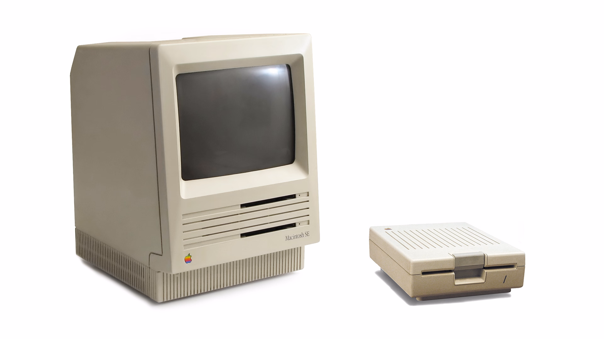
Well, of course it had to be ⌘⇧0, since ⌘⇧3 was already taken.
(In an absolutely delicious bit of rhyming, the 0 key itself is on the “wrong” side of most keyboards – except Hungarian – because it was added to keyboards before the 1 key was! It felt more natural to put it after 9 than right before 2.)
Things were quiet for a while. Floppies disappeared over time. Only in 2018, Apple evolved the old Grab app that it inherited from NeXT into a Screenshot app, and assigned it a new shortcut, ⌘⇧5. That was a nice improvement – video recording, a very helpful timer, a few smaller options, and a bit of a GUI thrown atop for convenience.
There are a bunch of system and change management lessons in here, but I want to talk about something else I just learned about.
Acorn 8, a graphic app, has a delightful screenshotting feature parked under ⌘⇧7 that does something incredible: it takes a screenshot, but does so in a way where windows are separate layers, grouped by app. It’s amazing; you can re-compose stuff afterwards, reveal covered stuff, remove windows, even change the wallpaper. A mouse cursor arrives too in its own tiny layer, like a cherry on top.
I’m sharing this both because I gather people who read this blog take a lot of screenshots – but also because this is software craft. I know “delightful” is (mis—? ab—?)used to refer to beautiful but slow transitions, and cute but distracting UI copy, but this is the stuff of true delight: using newly abundant technology to actually do something useful, and rewrite the rules of something that hasn’t been touched for ages, in a way that feels magical. There is still room for improvement – notably, you cannot just fire and forget a screenshot straight into your filesystem – but I find this kind of stuff inspiring.
I also know what you’re thinking: hey, what happened to ⌘⇧6? I’m not going to tell you. It’s probably not that hard to google it, but maybe you’ll enjoy trying to guess like I did. What was a feature of Macs that arrived after 2018 that Apple would want you to forget about even more so than the floppy disks?
]]>
If you don’t want to watch the video and try to figure it out alongside contestants, you can read more about it here, and also see it in action.
Karateka was made by Jordan Mechner and I bet his name will come up again.
]]>
To anyone working on front-end, I encourage you to toggle this setting to “Always,” and convince half of your team to do the same. Your macOS will now pretend you have a mouse connected, and show more traditional scrollbars, all the time.
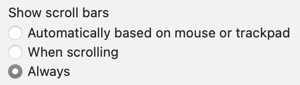
Why? Because you might already be accidentally generating spurious scrollbars without realizing. Here’s something I just spotted in Coda today:
This scrollbar serves no purpose, so it will become visual noise for a lot of your users. But when you yourself use “shy” scrollbars, you might not even realize.
Of course, the scrollbar is just a symptom of a bigger problem – an accidentally scrolling surface that will be janky to everyone regardless of their scrollbar visibility status.
Always-visible scrollbars make it easier to spot these, not to mention also being helpful in spotting:
This is the page for non-English programming languages that is shown at some point. Quite a bit of stuff in there.
Oh, also, in Polish (my native tongue), spitting is “tfu.”
]]>This one – stretching of the control center – made me incredulous. The performance and physics of it all are good and fluid, but this feels like absolutely the wrong thing to do here. I think it’s as designed, but it feels buggy to me. Maybe I’m oversensitive to stretching type and shapes like this, but I can’t stand how icky it feels. I am not sure I have seen another place in iOS 26 where elements would stretch in such a cheap way:
And this one – tapping on the album cover to make it show and hide – is bad in perhaps every possible way. It feels designed poorly and engineered poorly, like an HTML approximation of a real thing. All sorts of bad curves and sudden switches, slight reorientations of UI, even some flickering of interface elements at the bottom. It feels so rough I would probably just do a hard switch, no transition, until I got this right. After all, no animation is better than bad animation, and this is not responding to fingers in real time (when the user controls the “speed,” and you absolutely need a transition):
Ultimately I don’t know if this is “as designed,” or rushed, or what are the causes. But It’s interesting and a bit hard to realize that these days even animations in iOS 26 – once, I believe, a staple of good design and execution – are all over the place.
]]>Once killed, a notorious monster shouldn’t respawn until after the next monthly tally, but lately defeated notorious monsters in Limbus have been reappearing early. That’s because, Square Enix said, “the server-side data recording the defeat status of notorious monsters is unexpectedly being cleared.”
Thus, there’s only one way to guarantee no players are robbed of hard-earned Limbus loot: Square Enix is dispatching Game Masters to personally murder every notorious monster in Limbus so the FF11 servers can properly verify that they’re really, truly dead.
“To achieve this, Game Masters will visit each World in sequence and defeat each motorious monster individually,” Square Enix said. “We apologize for the inconvenience.”
I know this is not a bug fix per se, but it’s interesting to be doing some bug cleanup from the inside.
]]>
The app didn’t last – it couldn’t last – but it was a fascinating statement.
In a different corner of the internet, Michael Leggett, one of the former Gmail designers, created Simplify – an alternative “shell” to Gmail:
Hundreds of improvements (small and large) to streamline, simplify, and enhance Gmail’s design and functionality. Hide the features you don’t use, customize the ones you do including setting the list and message width and fonts.

It seems this attempt is not running afoul of any Google rules. I enjoyed reading about the project more on its website, especially this bit:
Bad design can occur for a number of reasons including but not limited to:
- Our needs as users are not well understood, prioritized, or aligned with the company’s goals.
- Entropy: The natural decline of products over time as the vision decays or blurs and new features are conceived without consideration of the whole and added faster than the system’s overall design and architecture can evolve to support them.
- Good design is hard. Good design is more than making a product pretty. It is about having the right capabilities in an intuitive, respectful, and well-crafted offering. I hope to expand on this topic in future posts.
I know ad blockers and “reader modes” exist, but these alternative shells go much further and change the original app’s design. I wonder what other examples of that are out there.
]]>I started wondering: what would be the conceptual equivalent of this in software? My best guess would be iOS offering to fill the one-time code from a recent SMS:
This is what it has in common with the Moylan Arrow:
Curtosis on Mastodon unearthed the original 2019 Twitter thread from one the creator of the iOS feature, Ricky Mondello (link to XCancel), which I‘m reproducing here:
The idea for Security Code AutoFill came out of a small group of software engineers working on what we thought was a much more ambitious project. It wasn’t a PM, it wasn’t just one person, and it wasn’t what we set out to do initially.
It started as a small side idea we had while designing something very different. We jotted it down, tabled it for weeks, and then picked it up after the “more ambitious” project wasn’t panning out. It was hard, but I’m so glad we changed focus.
Even with a gem of an idea, it was still just an idea. Ideas are obviously super important — they’re necessary, but not sufficient. Here, the end result came from the idea, teamwork, and execution.
Years later, I’m still so proud of the team for making this feature happen. The team combined expertise from several areas to ship magic that worked on day 1, while asking nothing of app and website developers, without giving anyone your text messages. This still inspires me!
To every one of the folks who made this happen, I’m still in awe. Y’all are the best. <3
Addendum: FAQs
- “SMS is bad.”
↪ I know.- “MITM.”
↪ I know.- “FIDO is better.”
↪ It’s complicated, but acknowledged; I totally get it.- “Android did it first.”
↪ Nah. Details matter. Privacy matters. And clipboard != AutoFill.- *negativity*
↪ Not now. :)
I asked others on social and here are some other contenders I liked:
You can check out Mastodon and Bluesky threads for more ideas, if you are interested.
]]>In order not to make it too reductive, I’m also linking to the original essays for those who want to follow up:
The worst feedback you can get from a client is “Wow. It looks like you worked really hard on this!” Stop using your work like a time card. If you did it right, it looks like it was effortless. It looks like it’s always existed. And the client will probably be irritated that they paid you for 30 hours of work to do something that looks like it took an hour. Which it did. They’re just not seeing the 29 hours of bad design that got you to that one hour of good design. And for the love of god, please don’t show them those 29 hours of bad design. A presentation is a shitty place for a sausage-making demonstration, and you’ll just come across as a defensive, unsure person needing validation.
—from 13 ways designers screw up client presentations. This sounds like a version of “My kid could’ve painted that” argument.
Learn how to steal. Be aware of your history. Design is the oldest profession in the world. You’re not the first person to tackle whatever design problem you’re tackling. See how others tackled it. Take the best solutions you find and improve on them. Don’t burn time solving things from scratch. Make use of what others have learned.
—from 10 things you need to learn in design school if you’re tired of wasting your money
The world needs fixing, not disrupting.
—from 8 reasons to turn down that startup job
And:
]]>“The way you get a better world is, you don’t put up with substandard anything.”—Joe Strummer
This is a condensed list at the time of writing, as the site itself doesn’t make it easy to see it:
There are themes here: “the interface doesn’t remember my preference,” and “things move around as I interact with them,” and “some process gets clogged up,” and “a thing gets stuck and doesn’t respond to interface actions.”
What I appreciate about this is that none of this is very “visible” stuff, but the insidious things that add up and bother on the daily basis, chipping away at your flow first and sanity second – which the site tries to quantify via a formula:
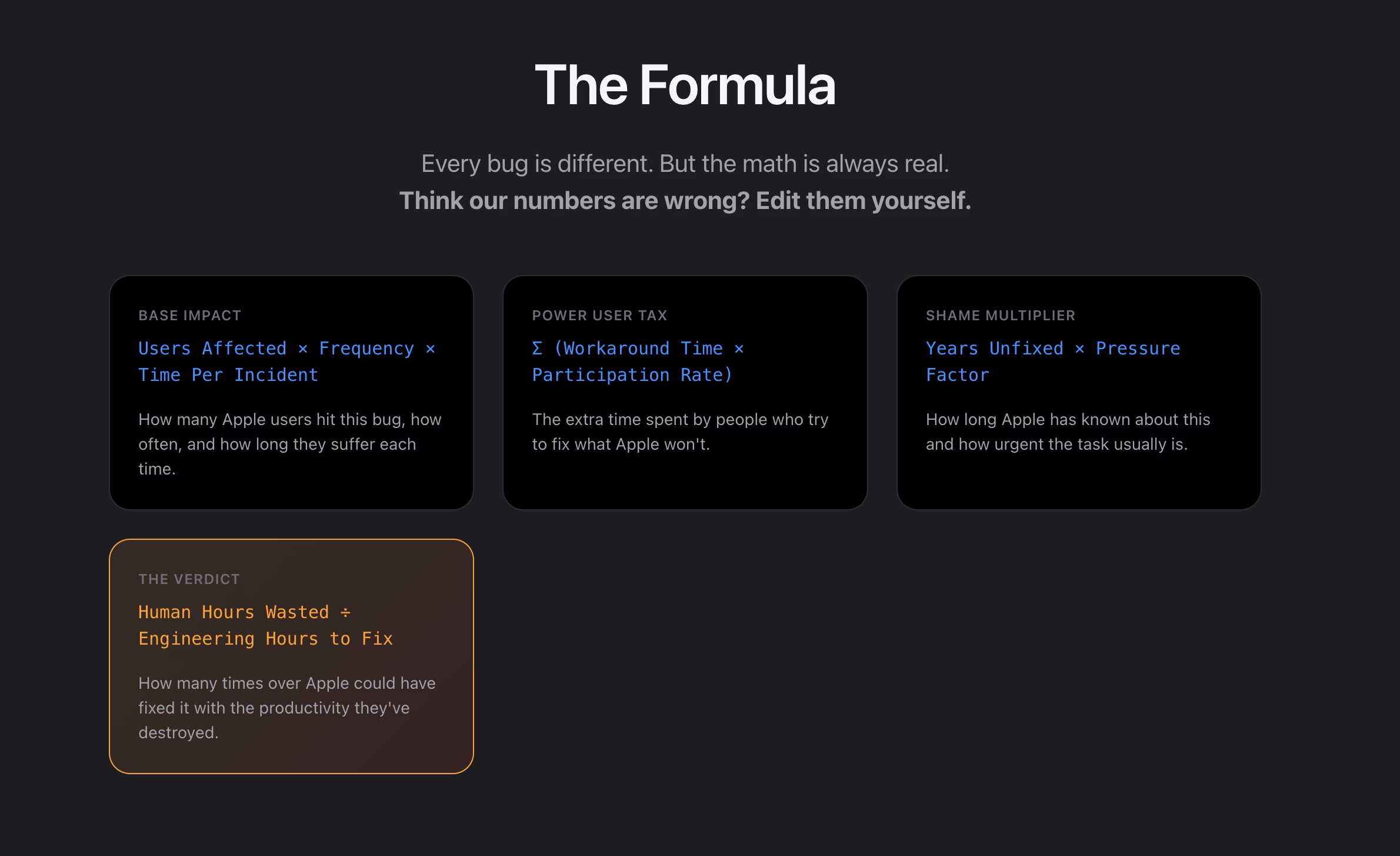
I think this is really interesting, even as a satire.
I found it’s really hard, if not impossible, to justify design or experience bugs using the same frameworks as other engineering bugs. As Mike Swanson wrote: “You cannot easily measure the resentment. Or the rage clicks when they smash a button to dismiss another […] pop-up.”
A lot of it is utterly subjective. Various small frustrations add up in non-linear ways. A lot of it doesn’t subscribe to binary “data loss or not” or “does it function or not” classifications. A lot of it feels heavy to fix in terms of context switching, so it’s timeboxed and then discarded when the time box overflows.
I have seen engineers say “Oh, it’s a long-standing bug, it’s been like this for 3 months” as a justification to deprioritize something, while to me it feels like that should be an accelerant. The users have already been suffering for 3 months!
So maybe metrics like these could actually help? Quantifying at least the blast radius (affected users + usage per day) seems valuable, not to mention the embarrassment of seeing something like “9.1 years unfixed by Apple.” (And yes, internal embarrassment and shame should also be a metric.)
This would be harder to do for creators of the site, but easier inside Apple: I would also try to quantify vocal user frustration. One of my tricks when thinking about bugs has been “Notice when your users are really angry about invisible stuff.”
…for example someone going on and on about Finder.
]]>
But more modern media, like SSD drives, don’t show that window. The best case scenario is that you get a dialog box like the 1990s never ended:
It gets worse. Often, you get zero help in identifying what the “programs” actually are. (The word on the street is that it might be stuff like Spotlight indexing, which you can’t really control.)
More often than not I just click Force Eject or jank the drive cable out, which feels really unpleasant. I would guess many people do the same.
So at this point we are two steps worse than the original CD experience, which… wasn’t even that great! A pretty clear improvement on this already exists elsewhere in macOS, and could be reused here – “hey, you don’t have to do anything, just give me a second while I finish up here.”
(Can’t help but notice the discrepancy of visual styles of these windows, and even the inconsistency between calling things “applications” vs. “programs.”)
Reported to Apple as FB21787458.
]]>Lem argued that we are just not ready for an actual meeting with something truly alien. That the most open-minded of us are close-minded on a cosmic scale. That sci-fi made us think that aliens will look like human with prosthetics when good, and insect-like creatures when evil, but sci-fi needs to be self-constrained for all the same reasons; showing us something actually inhuman will immediately render it utterly incomprehensible.
He wrote about it in Eden, and Solaris, and The Invincible, and Fiasco. The last of these is a book I was once so angry at that I threw it at the wall.
It also happens to be my most favourite book, ever.
Anyway. This is a diagram for a single-button flashlight called Andúril 2 (larger version):
I saw it for the first time earlier this week. I was speechless. Maybe a little bit in awe. I know I’m supposed to hate this, but this feels so profoundly… alien, that I don’t know if anything I know applies here. I don’t want to judge it by the wrong set of rules. I want to understand the dividing lines between the UI and its explanation. I want to study it more.
Oh, and because I was curious too – this is the flashlight:

This is of course competence porn, made even better by the dry Polish lektor-like delivery. But it’s also a puzzle. I watched this so many times. There are so many great UI lessons in here:
I found myself thinking about how you’d design something that feels real-time, but also needs to be resilient against typos, and has a distinct “commit” moment (which is what I think those yellow flashes are); some of the best moments in the video are the quick fixes that aren’t narrated.
Ultimately, this also shows how powerful and underrated plain text can be as interface. It’s a bit like designing straight in CSS, operating at the weird intersection of motor memory, creativity, and abstraction. (Is there a CSS editor that feels more like this?)
On top of all of this, the act of building the track this way is also how the finished track would sound like. Amazing stuff.
Remember all these jokes that went like this?
[God looking at a pug dog for the first time] What the hell did you humans do with my bad ass wolf I gave you?
Imagine sitting the creators of the typewriter in front of YouTube and having them watch this video.
]]>
But this fun 11-minute video from 2017 by Retro Game Mechanics Explained doesn’t stop there. It shows, step by step, exactly what is going on when you reach level 256, and how each one of the glitchy things appear on the screen.

It’s a little mesmerizing, like watching a building demolition in slow motion.
]]>
Ross designed Input, a coding font superfamily which was very inspiring to me in the day, and taught me that coding fonts could be a place of surprising creativity and innovation.
First of all, Input has four width options: from regular through Narrow to Condensed to Compressed – this not only allows to avoid the “blocky/squareish” nature of many coding fonts, but also, pragmatically, to squeeze in more stuff on mobile screens.
Secondly, since a lot of coding environments didn’t (and maybe still don’t) allow for fine-tuned typography settings, you can bake them into a font upon download – choose a different default line height to be there in the font itself, or have your favorite style of zero just hanging there in the default slot.
Thirdly, serif versions of Input coexist with sans serif, and so does italic, and you can mix them together.
But most important thing comes at the end: you can imagine coding in non-monospaced fonts! What seemed like blasphemy before made so much sense once I put it to use – I still code in Input Sans Narrow (non monospaced) to this day:
Of course, since the release of Input in 2014 a few other coding fonts did interesting creative things in this (mono)space. But to me this will always be the original that opened my eyes to what’s possible, and the talk captures so well a lot of deep thinking that went into the font. To quote Ross:
]]>Type design is design and design is about solving problems.
At any rate, two of the 5 posts have to do with our trust in software.
Number 1 from Max Leibman:
No, I do not want to install your app.
No, I do not want that app to run on startup.
No, I do not want that app shortcut on my desktop.
No, I do not want to subscribe to your newsletter.
No, I do not want your site to send me notifications.
No, I do not want to tell you about my recent experience.
No, I do not want to sign up for an account.
No, I do not want to sign up using a different service and let the two of you know about each other.
No, I do not want to sign in for a more personalized experience.
No, I do not want to allow you to read my contacts.
No, I do not want you to scan my content.
No, I do not want you to track me.
No, I do not want to click “Later” or “Not now” when what I mean is NO.
Number 5 from JA Westenberg:
]]>RSS never tracked you.
Email never throttled you.
Blogs never begged for dopamine.
The old web wasn’t perfect.
But it was yours.
One particular thing that stood out to me was a discussion of shame and embarrassment and pride that all come with shipping software. And looking to Apple itself for direction that the company is not really providing, as many of their apps are not using the new Liquid Glass interface – or when they do, they use it in ways that are inconsistent or disappointing.
Some other good themes:
Also, this:
]]>A fair criticism of Apple over the years is that sometimes fixing 50 little misaligned text boxes or divider bars… using your time to do that, is time better spent than adding another user feature.
We went to quite a few stores in the week or so after the introduction, and found that, without exception, every Mac’s floppy disk had a garbage name! They were all named something like ”;lkakl;rt;klgjh”, as if someone had just randomly typed characters to see what would happen. Which is exactly what they did.
In the Finder, the startup disk would appear on the desktop, in the top-right corner, ready to be opened. The Finder would initially select it; once selected, typing would replace the current name, following the modeless interaction model that I had learned in the Smalltalk group from Larry Tesler. This meant that whatever anyone typed when they first came up to the Macintosh would end up renaming the disk.
On the early Mac, just typing with any item selected renamed it, which caused all sorts of trouble.
The eventual solution for renaming that survives until today was: click to select and then click again to rename… but don’t click too fast, because that’s double-clicking, and that means something else. Windows, starting in Windows 95, did something similar, but also put rename under F2 – so at least you didn’t ever have to wait.
I liked the emergent behaviour from some graphic apps which put rename under ⌘R. It’s not that hard to make Finder work that way – see below – but I have always been curious why Mac or Windows didn’t steal this solution.
(Added later: People reminded me that of course Enter also renames, and does so immediately. I wonder why it slipped my mind in this context – possibly because in any other list or similar place, Enter would be the equivalent to opening? Maybe I’m discovering in slow motion how unusual Finder can be in its details compared to conventions we established after.)
]]>2008, 58 minutes
The house is a masterpiece. It is perched on a hill overlooking Bordeaux. It’s made of glass and concrete and seemingly nothing else. It has pipes cleverly hidden to the side, a cantilevered roof that seems to defy the laws of physics, and a beautiful center elevator platform for a wheelchair-using owner who commissioned it by telling the architect – Rem Koolhaas, by the way – “I do not want a simple house. I want a complex house, because the house will define my world.”
The house is also a nuisance. The platform gets stuck. The back staircase is frustrating to navigate. Parts of the physics-defying roof started to rust years ago. The glass needs cleaning and very occasionally shatters whole as the house slowly sinks into the hill. In the summer, the garden door gets too hot to touch. In the winter, rain and snow leak between holes in the walls – holes whose very presence cannot fully be explained.
The documentary is sort of a human-centered flip side of How buildings learn, the absolutely fascinating book written by Stewart Brand (this is the good part; the book is really smart and you can learn a lot from it) and designed by Stewart Brand (this is the bad part; the book’s typesetting is so terrible I literally cannot stand to open it). The movie follows Guadalupe, the person who takes care of the building and sees it not in the first day’s pristine light, but a decade after it was finished, and years after the figurative cracks showed up, and then literal cracks, too. She knows it so intimately that she struggles in explaining it.
My design team watched this documentary during an offsite. I couldn’t attend the showing for reasons I no longer remember; afterwards multiple people came to me and told me “You should watch it. It’s actually about you.”
I watched it yesterday as I’ve been thinking a lot about this recently. Towards my later years at Medium, more recently at Figma, and increasingly when it comes to UX design as a whole, I feel like a caretaker, a living historian, a person tasked with the sometimes-sisyphean work of preserving the past but not gatekeeping the future, tending to something mostly taken for granted, and knowing something so intimately that you develop a sense of it that is increasingly hard to explain to others. “I don’t know how I know it, but bet $20 this is related to this,” I hear myself saying at work with strange regularity. (I’m far from always being right, but it still surprises me how often I get to be.)
Caretakers burn out, of course. It happened to me a few times. You can take too much care. You can fly so close to the details you forget the color of the sky. There’s enough minutiae for all of the minutes in every day.
And even outside of burnout, things can get weird. Medium’s editor then and Figma’s editor now feel like strange beasts, so complicated that it exceeds any single person’s understanding. One learns about their moods and the good days and the bad days. One can try to placate them, but only partially, and learn to understand them, but only partially. One develops a strange relationship with them, and only gets to observe them even as others assume one controls them; I once gave a talk about a singular keyboard shortcut, one of possibly 5,000 details that could each be a subject of its own conference talk.
But it can also all be wonderful, and beautiful, and meaningful, being what I sometimes jokingly describe “caretakers of undo” – the phrase itself a shibboleth, as I’m always watching whether someone thinks it derogatory or laudatory – and carrying with you that calmness and quiet satisfaction of keeping the strange beast alive and perhaps even happy.
It doesn’t matter that Guadalupe cannot explain how the building’s award-winning architecture works, or why one staircase is designed so differently than the other. The best parts of the movie is watching her own shorthand with the house, that special years-in-the-making universe of tips, and tricks, and hacks, and nods of understanding, and frustrations attenuated by the passage of time, and quirks internalized so long ago that they their sudden disappearance would today itself register as a quirk.
You can develop a relationship with a sophisticated piece of software, like you can with a strange house that has a life of its own. “I want a complex house, because the house will define my world,” said the owner just before his untimely passing, but the house defined someone’s world, anyway.
The house is not beautiful because of the stories of people inside – we never get to see them, by the way, and there is only a 30-second quiet glimpse at the building actually being lived in, at the tail end of the movie. The house is not beautiful because it was designed by a starchitect, or because of the views, or the clarity of its form, or the cantilevered roof, or the cleverly operated portholes. The house is not even beautiful because of all its flaws, although you could find beauty in them, too.
The house is beautiful because you show up every day and try to stop it from getting worse, and occasionally, you show up and make it better.
There won’t be a documentary made with you in it, so no one might ever know. But you will.
John Wallace’s Tangible Media Connection’s initial appearance might not feel very well-crafted, but jump to any page (for example this one) and it’s astonishing how great the photos of the objects are.
They’re great not just on their own (it’s really hard to photograph metals and plastics!), but also consistent with each other when it comes to angle, style, and – most importantly – scale. I am not sure if I have ever seen on online museum do this before. It’s very well worth checking out.
The other example is Neal Agarwal’s recent Size of Life. The whole website is delightful, with subtle music and sound effects, great handling of keyboard navigation and swiping, and so on. And the way it resizes objects and uses transitions to always keep you oriented is something a lot of other interfaces, even for productivity apps, could learn from.
Of course, now I wonder what the first website would feel like with the user interface of the second.
]]>I spent a lot of time in the 90s working on Y2K. It wasn’t a huge panic. It was just a slice out of everything else we spent auditing code. It wasn’t “spend 80 hours a week fixing this.” It was just boring. Incredibly boring. And we made it be ok by being bored and fixing stuff.
And the one thing I never thought would happen was that people would say it was never a problem. Oh good grief, it was a problem. All over. We just fixed it. Like we thought grownups should do when there’s a problem.
There are some good responses to the post and the original post it quoted. This one was brilliant in its vulgarity:
My analogy for this is that I work to maintain a kind of public sewer system. You never think about sewers... until you’re up to your neck in shit.
This isn’t just about Y2K and COVID, of course. It’s also about the invisible work of people who make well-behaved menus, and all the other things like that.
]]>I wouldn’t be so angry, but I use – or at least see – these all the time. I wouldn’t be so angry if we hadn’t learned how to make GUI menus well 30 or so years ago.
I don’t want to pin it all on browser makers; if the designers and engineers cared above, there are ways to make great menus in custom JavaScript. But I wonder why the web tech didn’t evolve quicker to provide well-built and stylable and accessible primitives for this kind of stuff. I would love to understand more why that didn’t happen. Even scrollbars and sliders still feel unfinished on the web, and those are much easier than multi-level menus.
Also, Gemini:
Are the mechanics of menus on google search page working well?
In terms of technical execution, the mechanics of Google’s menus are a masterclass in Interaction Design (IxD). They are designed to feel “snappy” even on low-powered devices, using a blend of instant feedback and carefully timed animations.
Skynet would probably love Papyrus, too.
]]>I just spent an hour or so simply scrolling through David Aerne’s Bluesky feed, and I felt it was just so much fun for me. David is interested in color and works on various small refined tools – one recent example is OKPalette – and reposts other people who work in this space, but is also very generous with sharing his creative process around tools and their details.
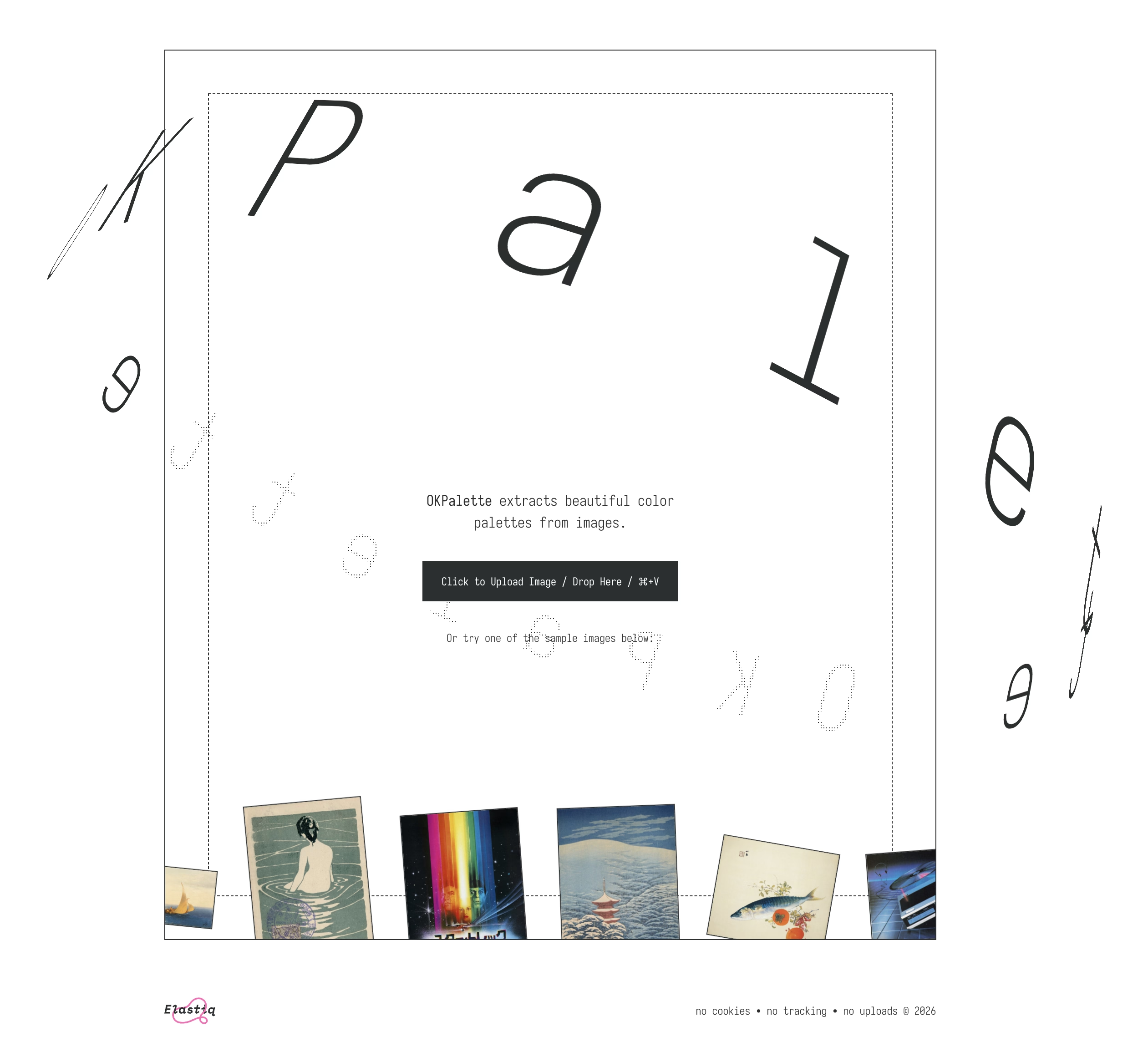
I’ve always been more of a “functional” designer and less of an “artist” (please excuse labels in progress), and this kind of stuff feels like connective tissue and expands my horizons.
Check out David Aerne’s work on Bluesky – no account is required.
Also, I’ll always welcome recommendations of other people to follow! (Just please: not on x.com).
]]>
It taught me many things and it clarified that things were more complicated than they seemed. Windows Vista (widely seen as failure) perhaps wasn’t so bad, and 7 (quoted by many as the best Windows ever) was not that far away from Vista, down to its internal version number being 6.1 to Vista’s 6.0.
It’s also interesting to reflect on this today, when macOS is having its own Vista moment.
There is also a follow-up video on Windows 8, the possibly most consequential Windows release of that era, with product decisions that reverberate still today.
Main takeaway: An entire book could be written and a lifetime of lessons learned from Microsoft’s “.1” releases.
]]>If you’ve ever read about “choice architecture” and nudging, this will feel familiar. The modern language for it was popularized in the late 2000s, and the core idea is simple: how choices are presented changes what people do, even if nothing is technically forced.
Then product teams go one step further. Instead of just shaping choices, you can shape timing. Prompts start showing up in the middle of workflows because that’s when the user is “most engaged.”
The industry also has a whole discipline around persuasive design and how to move someone from intention to action with prompts, friction removal, and well-timed triggers. B.J. Fogg’s behavior model is one of the more cited frameworks in this space.
Some nudges are genuinely helpful. But the same machinery that helps you discover a feature can also be used to push you into something you didn’t come here to do. And once the machinery exists, it gets reused.
I am finding myself wanting to quote most of it.
You cannot easily measure the resentment. Or the rage clicks when they smash a button to dismiss another “did you know” pop-up. You cannot easily chart the moment a user thinks, “I used to like this product, and now it feels needy.” You cannot easily quantify the slow erosion of trust.
I have long been frustrated by how the “growth” interfaces haven’t really evolved past cheap and loud pop-ups and defaulting to “let’s just show it.” One of the behaviours that bother me a lot that’s not listed in the post is, for example, installing an app and receiving one or even more “here’s what’s new” onboarding callouts. Hey. I just installed you. Everything is new.
Anyway, maybe one more quote:
]]>Optimize for trust, not just return visits. Short-term engagement can be increased by annoyance. Long-term loyalty is harder and more valuable. The best products I use don’t constantly remind me to use them. They quietly do their job so well that I come back when I need them. That’s what tools are supposed to do.

Neil Panchal writing in 2020 about a cool little page called diskprices.com:
The performance of this website is stellar. It loads almost instantly. And the list (although it’s not sortable) gets the job done, it is sorted by price already which is the most important attribute.
Diskprices.com deserves the UI/UX award of the decade. We’ve lost our ability to design user interfaces laser-focused on the user. Instead, we have purple gradients, scroll jacking, responsive bullshit, emojis, animations, and many other things designers do today. The utilitarian approach of Diskprices.com is refreshing, although the contemporary designers cast it off as ‘brutalist design’, thereby marking it as a statement of fashion.
But both the creators of the page and Panchal might be getting this wrong:
Do you need a graphic designer?
No. This site is designed to maximize information density, accessibility, and performance. More whitespace, colors, and icons won’t help.
I think this is incorrect. The creator of the page is a graphic designer, that just happens to be the perfect graphic designer for the job.
]]>But this paused me in my tracks:
“Intentional pagination instead of infinite scrolling is progress with awareness.”
It made me realize that the only implementation of infinite scrolling I know is basically pretending the page has already been there the whole time… if it’s done well, and if you move slow enough, and if you don’t pay attention to the scrollbar, it really feels like the page goes on and on forever.
But… it doesn’t have to be that way. You could turn off the smoke or hide some of the mirrors. You could uncouple the gesture from what follows. You could add milestones (in the traditional sense of the word) after every X results. You could make the scrollbar react differently. Instead of frictionless scroll, you could force the user to bounce off of a bottom of the page in a similar vein as pull-to-refresh forces them to bounce off of its top.
I’m curious now. Did anyone ever experiment with infinite scrolling that feels… closer to pagination?
]]>I hope seeing everything in single, searchable place offers a unique perspective.
(The details of the zoomable UI are a bit wonky in practice, but one can imagine fixing all that.)
[For] the extra work to create a custom SF Symbol, our experience is 8-10 hours per symbol. This is also an expert level task: lots of knowledge on how SVG control points work and how to maintain compatibility across different sizes and weights.
If you’re paying a designer to do this, the cost will be somewhere in the $1000-2000 range. For Apple this is an easy cost to absorb, for smaller developers it’s a big “nope”.
And, of course in the Mac menubar (and now iPadOS) you need a lot of them.
Another subtle example of how out of touch Apple Design is with day-to-day development.
So not only is the overiconification of menus in macOS and iPadOS a bad idea, but it’s also expensive. You could make an argument that it would push people into reusing SF Symbols – ergo “consistency” – but that would land better if we haven’t already seen even Apple is struggling with that on their own (previously, previously).
]]>What are you favourite well-made apps or sites? Phones and computers alike.
Doesn’t have to be “pretty,” but well-made according to whatever definition works for you.
I specifically made it kind of vague, and these are the answers I got. I grouped them into categories and added links. I am excited to dig into these and study them, but wanted to share a raw list as well in case this inspires some of you, too.
Thank you to everyone who participated! (Numbers in circles like ② or ③ mean more than one person nominated a given site or app.)
Info sites:
Interactive explainers:
Personal sites:
Work and tasks:
Art/Games:
Creative:
Podcasts:
Social:
Commerce:
Writing and note-taking:
Music:
Travel:
Food and health:
Text editors:
Data transfer:
Other nerdy tools:
I didn’t know where to put these:
Meta:
Sensitivity is how finely you perceive—noticing friction, asking why a screen exists, catching the moment something feels wrong. Standards are your internal reference system for what “good” actually looks like. Both can be trained.
The post is great and I nodded all the way through. But I found the linked Medium post very hard to parse – like it was written by AI for LinkedIn – and I haven’t yet opened Rick Rubin’s relatively famous book quoted inside because I am worrying it might be too pretentious.
So, perhaps I can offer a rare caveated endorsement: click on Roger Wong’s post, but not sure it’s worth clicking further.
]]>
Reading the Wikipedia entry after watching the video adds extra color to the mystery, turning it more squarely into a “software quality” story:
]]>Some scientists were initially skeptical that such an error could exist, since a signature was present in various global terrain data sets, such as the bathymetric data from the General Bathymetric Chart of the Oceans, which reported an elevation of 1 metre (3 feet) over the location of Sandy Island. Some data sets derived from satellite imagery indicated that sea surface temperatures were absent in the location, suggesting the presence of land.
It is rare to see an interface clean up after itself this way. This flew by quickly and wasn’t communicated very well, but I believe this changed my new tab page from this…
…to this:
Now, I said “surprised” and not “delighted” not just because the implementation felt a bit rough. I am also suspicious of the motivations, as Google’s sister iOS app played very fast and loose with this surface, literally moving the search bar from under my thumb in order to create room for features I would never use and could never remove. I suspect this is a preparation for something else that would take the place.
But until that day comes, this was an interesting gesture, and it’s really welcome to see a new tab harking back to the simplicity of Google from days past.
]]>It was actually kind of fun to see it all over Hong Kong on LCDs of varying quality.


Turns out this was Neko! A “screenmate” application from the late 1980s that made its way to various software platforms and apps since.
I liked the idea that somewhere in the intercom factory someone wanted to add a little delight to a very pedestrian (no pun intended) surface, and that’s why now we have Neko all over Hong Kong.
(I liked it so much I recreated it and added to the bottom of my site.)
]]>Start spending time in the online photography sphere and you’ll start to notice a small but undeniable undercurrent of lament of its loss to this day. Find an article about Adobe hiking their subscription prices because they added AI for some reason, and amongst the complaining in the comments you’ll invariably find it: “I miss Aperture.”
Kennett goes deep into two specific details: the HUD-like UI that travels to the photo, and the technically impressive loupe. It’s worth checking it out just to reflect on the importance of execution; ostensibly those features exist in Adobe’s Lightroom (Aperture’s main competitor), Photos, etc. But Aperture designed them in particularly memorable and impressive ways.
Back in the early 2010s I used Aperture, too. I was rooting for it. I felt like it was designed, and Lightroom merely existed.
It reminded me of the 1990s when I felt the same about Netscape 4 over Internet Explorer 4. There was something about Netscape’s feel that appealed to me more. The way buttons were designed. The way they responded to clicks. The way pages loaded. All these little nuances. This was perhaps the first time I appreciated one app over another for things I didn’t know how to measure, or perhaps even describe.
Aperture vs. Lightroom feels like a similar story, because for all my appreciation for Aperture, I remember it being slower than Lightroom, and the noise reduction (much more important 10+ years ago) was worse, too. In a small way, it was a relief that Aperture was discontinued, because it saved me from a tricky choice: better designed vs. technically superior.
But: I miss Aperture, also. Maybe it would’ve caught up technically today and it would’ve been the best of both worlds. To this day, I use Lightroom (now Lightroom Classic). If it’s filled with UI quirks, it’s mostly bad ones. If there is beauty in it, I no longer know how to see it. It’s a tool in the most reductive sense of the word. My photos deserve more.
Also something I learned from Kennett:
]]>“Shoebox” apps are apps that contain the content you use with them, as opposed to document-based apps which work with content you manage as a user. It’s an extremely common design nowadays, but less so back then — early pioneers of the shoebox app were iPhoto, iMovie, etc.

I never particularly liked those “cute” app updates that were all the rage some… 10 years ago? Or app updates that are too generic. I always felt the updates should be informative, and I occasionally like seeing what’s actually being fixed, and sometimes learning from it.
The post above is about a game called Dwarf Fortress that I have never heard of, despite it going on since 2006. In that game, actual descriptions of bug fixes often feel better than those creative app updates. Some examples:
PC Gamer some fun ones in 2016, or you can just go to Dwarf Fortress Wiki and explore on your own.
The game seems fascinating, by the way.
]]>It reminded me of this disambiguation detail in Finder in a way: a tiny but thoughtful detail at the right moment can go a long way.

In Kraków last year, I saw a great variant of this: A tram waiting at the terminus would show exactly when it departs, so you can choose to rush when it’s close, or to run a quick errand if it’s not.

(I know a lot of countries have extremely user-friendly transit systems where those details were hot news 30 years ago, but I do not take them for granted.)
]]>Now it all became clear. One of the female sockets must have deformed when I first reconnected the CD-ROM burner. This forced the two pins into the same hole and shorted them out. Later when this cable was plugged into the JAZ drive, the pins, now bent to go into one hole, deformed the female connector on the JAZ drive. Again pushing the separating plastic over the hole. Plugging another good cable into this newly damaged socket caused the pins of the new cable to be forced together and short, and when this new cable was inserted into the good SCSI socket on the new JAZ drive it did more damage to it. Before I knew it I had four damaged sockets and three bad cables.
I believe the cables and sockets looked something like this:

The story ends with:
I am only glad the [hardware] virus was contained and did not spread to the rest of the world! Can you imagine if this sort of thing happened in a big computer assembly plant?
Turns out, it did actually happened at a computer assembly plant, in 1997.
]]>This 17-minute video by Msushi covers “one of the most loved and broken glitches in Portal 2” and the strange relationship the community has in following a bug to its conclusion – which, in this case, is not fixing it, but creatively using it to shave of speedrunning time. (There is an element of mastery there too, with spawning and despawning, but I don’t want to spoil the surprise.)

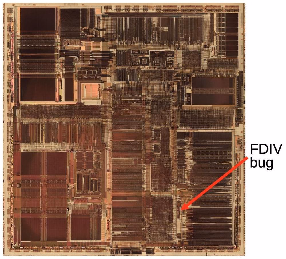
Also, an interesting detail of what ended up being Intel’s self-own:
]]>The problem might have quietly ended here, except that Intel decided to restrict which customers could get a replacement. If a customer couldn’t convince an Intel engineer that they needed the accuracy, they couldn’t get a fixed Pentium. Users were irate to be stuck with faulty chips so they took their complaints to online groups.
At the bottom, I will also be collecting other implementations I see that are interesting alternatives to my approach.
You can tap to see it and then swipe back the moment it shows. This is the slow path.
There is a faster path. Reeder enables you to slide right or left on the item. You get nice haptic feedback, and many apps support this kind of an interaction.
But there is an even faster path.
You can tap to see it and immediately swipe back. Your thumb is already there on the left anyway, and the distance is a lot shorter now.
Like every advanced gesture this takes a bit of practice, but I noticed I started doing it instinctively, without even thinking.
This happening required two small design details: The original slide transition to be interruptible at any moment, and the app to support swatting/draging the incoming item away even if my finger was nowhere near it. Both are clever, and both feel very welcome, because they enabled this emerging (to me) behaviour that made going through the list snappy without me even realizing.
This might be a good modus operandi: Think of the slow interaction. Think of its fast version. Then, think some more.
Nicely done, Reeder team. (Or, if this is a default iOS behaviour, nicely done, Apple!)
]]>
A 16-minute video from Ahoy from last year about Chris Sawyer, creator of Transport Tycoon and Rollercoaster Tycoon games from the late 1990s.
The video focuses more on the economics of the industry and some technical details, but what’s interesting to me was how tight those two games felt in terms of UI. They have a shared custom GUI, they are assembly-coded, and they felt perhaps like the last instance of a graphical user interface where it felt there was nothing standing between you and the pixels.
I know those are games and not productivity apps, but they can be inspiring for those, too. You can download OpenTTD, which is a modern recreation of Transport Tycoon Deluxe that doesn’t require emulation, and it still captures the snappy and tight feeling very well.
I’m thinking about it in particular because the web took a lot of that away. The web loves latency and loose interactions and reflow and temporary fonts and CSS leaks and text sticking out of the box and many other papercuts. It’s nice to be reminded of the world where things were closer to the metal, and how that felt as a user.
]]>If you want to add a photo to an album, you normally have to choose from a list of albums:
However, once you do that one time, a new menu option appears. It’s effectively “Add again quickly to the album you just chose” (Fiałka is the name of my cat):
That skips the album selection altogether. It’s always only just one album you used more recently, so it’s relatively simple… but so helpful. You often, after all, want to add more stuff to the same album, and it saves you choosing the same album over and over again.
This is great because it flattens the option space to zero options, which mirrors how we all think when we’re focused. It’s tunnel vision exactly when you want it.
I have always been a fan of both “repeat”-type actions and smart “recent”s, and consider them a truly underappreciated secret weapon. Those little savings really add up over time – in saved time, in less tedium, and in avoided mistakes. (Imagine not only having to choose the same album for 30th time in a row, but also… making a mistake doing that and tapping on a wrong one! Then the frustration very quickly compounds, as you have to recover from something that felt completely avoidable.)
I always respect designers of interfaces that invest in functions like these. There is also an anti-corollary to this, which is: if there’s only one option, consider not even asking. Slack seems to excel (derogatory) here:
The second one is somewhat defensible since it’s a settings dialog you enter at your own will, although the active “Re-generate answer” when I haven’t done anything (and nothing can be done) feels overbuilt.
But the first of these always appears on a way to other settings (like adding emoji), and it’s even worse than the Remember me? examples because it repeatedly stops you for absolutely no reason at all.
]]>I liked this book. I consider Cory Doctorow a good, smart writer. He can put together one good sentence after another (“this is why the roads leading to Amazon depots are littered with sealed bottles of human urine”), he can tell stories of boring things in riveting ways, and he can connect various themes and events.
This last bit was a (positive) surprise. The book is a tour of what felt a more vast universe than I imagined. Turns out, the reasons for enshittification are complex and spanning many systems. There are case studies – most you’ve probably heard of – but this really feels like a book in that each one comes with extra depth: details, detours, history. The book travels through a lot of places and teaches quite a few things: computer history, arbitration laws, stock market, history of unions. I would not be surprised if everyone reading this finds a jumping off point to dig deeper into a certain area.
I also didn’t mind the tone – angry, but not too angry, blunt, but not cynical, with an entire section at the end dedicated to “now we rebuild” and some examples of what we’re already getting right.
Only two small complaints:
The book loses a bit of steam at the end. It might be simply that suggesting improvements is naturally harder than riveting stories of Things Gone Poorly, especially if those improvements are systemic and legal. But maybe it could just be a bit shorter.
Cory Doctorow also loves coinage, which – well, justified, seeing how the word that became the book’s title helped the idea travel! But there’s a lot of others words around: enshitternet, disenshittification, twiddling, chickenization… There’s this sentence in the book: “There’s something genuinely wonderful about workers who counter-twiddle their bosses’ apps and escape reverse-centaurism.” There are more like it. At this point, this feels like just bad UI.
But those are smaller things. Overall, this is worth a read. To me, it added a lot more higher-level understanding of systems and processes that lead to bad software (not an altitude level I find myself in), and packaged it nicely into a story.
I’m going to finish by listing a few passages that particularly stuck with me.
Page 34:
Companies don’t treat you well because they’re “good” capitalists and they don’t abuse you because they’re “bad” capitalists. […] Companies abuse you if they can get away with it.
Page 51:
Enshittification – deliberately worsening a service – is only possible when people value that service to begin with. Enshittification is a game of seeking an equilibrium between how much people like the thing that locks them to the service (often, that’s other people) and how much they hate the management of that service.
Page 106:
The death of competition […] doomed regulation. Competition is an essential component of effective regulation, for two reasons: First, competition keeps the companies within a sector from all telling the same lie to its regulators. Second, competition erodes companies’ profits and thus starves them of the capital they need to overpower or outmaneuver their regulators.
Page 129:
That long delay after you reach a web page but before it shows up in your browser? That’s the “surveillance lag,” the delay while all those [advertising] auctions are concluded.
Okay, so maybe I don’t mind all of the newly minted words and coined terms. This one is sharp.

It was, I’d argue, a small mistake for Apple to stop putting a visual affordance in the lower right corner of windows to show where to click to resize the window. It was a bigger mistake to change the scrollbars on MacOS to look and work like those on iOS — invisible, except while you’re actually scrolling (by default, that is — savvy Mac users keep them always visible). The removal of the resize indicator happened long ago, in Mac OS X 10.7 Lion, released in July 2011.
I can recall at least one place in macOS where you can still see the resize grabbers – it’s in column view in the Finder.
I still think sometimes of old Windows where all the 8 affordances for resizing were clearly visible. I know Windows 3.1 was generally kind of ugly, but I liked how they aligned with the title bar and the buttons:
By the way, don’t love Gruber’s “Dyehoe” thing in the title. Feels Trumpian.
]]>It’s perhaps more technical than what I usually link to, but shows what can happen if someone really cares about performance. What’s interesting to me is that the author posits that it’s actually not an old website that is fast because it’s old… it’s actually kind of a melange of various techniques throughout the decades, from vintage solutions like spriting images, to more modern like JavaScript’s page history API, or pre-caching DNS.

Just visiting the website and clicking around can be inspiring because it reminds one that we gained a lot of computing power and network speed over the last decades, but most websites squander it. Not this one.
And it’s sad this kind of approach of a website appearing and not changing (no reflow, no pop-ups, no endless spinners, no infinite scrolls) feels so rare.
However, two caveats:
At around 7:35, Wes says “nothing else moves”… Oh yeah, it does. It’s perhaps my curse that I notice these things.
Also, the homepage now has an animated, delayed green banner you can see at the photo above. I hope they’re not losing their way.
]]>Wikipedia has a pretty dry set of those. The most exciting one there is annotated with [citation needed], and the message seems to be: by the 1980s, this was no longer possible. Even in the earlier version of this idea, Halt and Catch Fire, the “catch fire” was an exaggeration. Before then? Sure, I bet some user actions could damage the computer, but computers themselves, with their high-voltage vector CRTs, electromechanical parts, and even liquid mercury tanks early on, were not that hard to damage.
Unsurprisingly, there are more modern versions of “killer poke,” too. At this point, the best they can do is crash or hang your operating system, but they are still chased, and coveted, and mysterious.

This 10-minute 2021 video from Mrwhosetheboss is a fun story of a wallpaper that could crash your Android OS. I’m not going to spoil the surprise, but it’s not what I expected – although the moment you see the wallpaper in question, you might figure it out.
It’s a fun video, and of that good kind that actually teaches you something.

#bug-deep-dive
]]>Since upgrading to macOS Tahoe, I’ve noticed that quite often my attempts to resize a window are failing. This never happened to me before in almost 40 years of using computers. So why all of a sudden?
I understand this might be the casualty of the absurdly large border radii in the new macOS.
The little video in the middle made me laugh:
(I do think there is room for gestures triggered “outside” a window, and we’ve seen rotation and some specific flavors of resizing or cropping work this way in drawing and design apps across the last few decades – but one has to be careful. Often, those are secondary and/or for power users.)
]]>
A 6-minute video from JHR about the 1980s British game Jet Set Willy, a big prize for its completion, the bug that made it unplayable, the copy protection, the hackers, and the mess of it all.
]]>Michael Leggett announcing it in 2009:
This feature can’t pull back an email that’s already gone; it just holds your message for five seconds so you have a chance to hit the panic button. And don’t worry – if you close Gmail or your browser crashes in those few seconds, we’ll still send your message.
There’s so much cleverness hiding in here: recognizing that this particular flavour of l’esprit de l’escalier exists, shifting time from the past to the near future, the repurposing of the undo branding, the fallback if things go wrong.
There was, I imagine, even the challenge of having to forget about the previous version of this feature elsewhere, which were the awful emails with RECALL: in the title, which I think maybe only worked in Outlookk, if at all? (Everyone else suffered like green bubble people do today.) I don’t know. Sometimes the biggest hurdle to a great idea is blocking bad execution you already know from your head. On the other hand, sometimes someone else’s bad execution can be motivating.
I even think that not using ⌘Z for this was a clever idea. ⌘Z without text editing context/focus can be really tricky. Do you remember when Safari had ⌘Z to bring back last closed tab before they came to their senses and used ⌘⇧T like Chrome?
It is sometimes harrowing when you want to click it Undo Send and just miss it – keyboard is more precise here – but not sure ⌘Z would register here. Even Esc would be tricky.
I miss when Gmail was in the “young and open to trying new things” phase.
]]>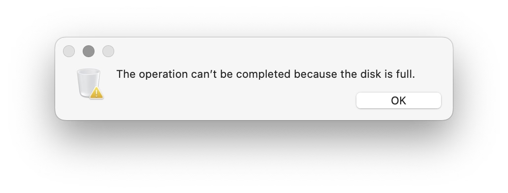
Same thing right after, when trying to tag some existing items, for which I don’t imagine any new space should be necessary:
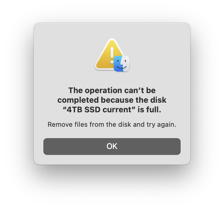
Also, why are these dialogs so different?
I feel like not so long ago there were literal books making fun of bad dialogs like these.
Reported to Apple as FB21509633.
]]>Doesn’t work so well on mobile, but it’s fun on desktop. I recommend zooming the page to 200%.
2024, 4 episodes ~50 minutes each
During my year at Code For America, I saw many glimpses of truly bad technology – slow courtroom computers, infuriating interfaces, obsolete specs, and the inevitable layer of remote access GUIs atop it all that made everything worse. As much as I hated some of the consumer apps on my top-of-the-shelf iPhone back then – I saw things that were a lot more harrowing.
This British show from 2024 dramatizes the UK Post Office scandal I just learned about, in four one-hour episodes, and highlights how those kinds of things actually affect most people who aren’t tech-savvy.
As a TV show, it’s gripping and well done. Toby Jones is marvellous, and Monica Dolan, whom I didn’t know of before, is a standout. The many awards wone here are deserved.
Unfortunately, for the purposes of this blog, the show is lacking something: either the other side of the story (what were the systemic or structural problems that allowed this to happen inside The Post Office and Fujitsu?), or the technical details of the bugs (those are barely even mentioned to begin with). The exemplary last episode of Chernobyl solved this brilliantly in the courtroom, connecting the human drama with the technological and scientific underpinnings. I missed something like that here.
Still, the core (sorry, pun really not intended) of Chernobyl is not about the AZ-5 button or the positive void coefficient, and the Horizon scandal shouldn’t be reduced to bugs either. Overall, it’s not an easy watch, but worth seeing this to remind ourselves of powerlessness of people against both bad technology and bad systems, the challenges and power of collective action, and how much damage bad software can really do.
In America, the show is available on iTunes and on Amazon Prime.
Put the little captcha box in the middle of the screen and that’s it. Nothing else feels necessary. A great example of an insecure interface.
Between 2000 and 2015, 736 subpostmasters were prosecuted by the UK Post Office, with many falsely convicted and sent to prison. The subpostmasters were blamed for financial shortfalls which actually were caused by software defects in the Post Office’s Horizon accounting software.
Some of these bugs sound absolutely horrendous, and remind me of Therac-25:
The Horizon IT system contained “hundreds” of bugs. Some of those that came to light were named after the post offices where the bug first occurred. These bugs included: the “Dalmellington bug”, where the system would enter repeated withdrawals in the ledger every time the user pressed Enter at a frozen interface screen; and the “Callendar Square bug”, where the system would create duplicate database entries in the ledger.
This bit feels absolutely crucial and it seemed to me we have learned this lesson decades ago:
And while the technology had changed, the contract between the Post Office and subpostmasters, who owned their own businesses but were agents for the Post Office, remained the same. It stated that any accounting shortfalls were the responsibility of the subpostmasters unless they could prove otherwise. But without the chain of evidence created by paper-based accounting methods, proving the losses were not their fault was near impossible for many.

Paul van der Laan on Mastodon:
Did anyone ever notice that Avenir LT has some serious errors in the descender lengths of p and q in certain weights?
Florian Hardwig adds:
It’s one of the things that got revised in Avenir Next. But it’s bonkers that it hasn’t been fixed in the “legacy” Avenir that’s still being sold – and bundled with Mac OS – after all these years.
Downthread there’s an original Avenir drawing that for some reason I found very evocative:
Bear (the note-taking app) does something interesting: after a button press, it replaces the onscreen QWERTY keyboard with a “funpad” or a “function keypad” (like StreamDeck or Figma Creator Micro). This achieves a similar result to a scrolling toolbar above the keyboard (see: Apple Notes), but in a different way. I haven’t seen anything like this before, and I think it’s really clever and it has worked well for me in practice.
(It also cleverly closes itself upon some actions like introducing a divider, but stays put for bolding, indentation, etc.)
It’s very good.
my car door’s freaking out
it seems to be forever in the concrete barricade
I wonder how I’m ever gonna drive away
this really is isn’t my day
the sparks are flying
people dying
metal frying
and I wonder if there’s more to life
or if I’ll find that this is really it
this game is a piece of work

I just saw a version of it in Nova, the text editor:

Today, I published a photo essay about my favourite tech museums. A lot of it doesn’t have to do with software, but in general it’s about craft and good user experience in this specific context.
If you are interested specifically in software, the ACMI part has some of good examples of integration of software in invisible, delightful ways.
In my opinion, Apple took on an impossible task: to add an icon to every menu item. There are just not enough good metaphors to do something like that. ¶ But even if there were, the premise itself is questionable: if everything has an icon, it doesn’t mean users will find what they are looking for faster.
I always liked this kind of an exercise:
There’s a game I like to play to test the quality of the metaphor. Remove the labels and try to guess the meaning. Give it a try:
Also, this must hurt:
Microsoft used to know this.
Nick Heer at the excellent Pixel Envy, commenting on the above post, adds:
This is a gallery of elementary problems. None of this should have shipped if someone with power internally had a critical eye for consistency and detail. If Apple deems it necessary to retain the icons, though I am not sure why it would, it should be treating this post as one giant bug report.
h/t my friends Scott and Ezra. I previously linked to Nikita’s work about syntax highlighting.
]]>(Apologies for a shoddy video.)
In 1991, just days before the final deadlines, Akira Nishitani, one of the graphic designers of the absolutely seminal arcade game Street Fighter II realized they misspelled the world “Warrior” as “Warrier.”

The typo was there for months and no one noticed. But the moment it was noticed, the graphic ROMs were already burned and impossible to change, and the code was due in three days.
What would you do? I’ll let you click through to read, but I really enjoyed this short story.
]]>My go-to examples? Apple’s Remote Desktop which always throws this thing up on connection:
And this in Photoshop upon saving a PNG file, which has been there forever:
I never change these options. These are flow-killers; trees have grown to maturity as I have spent collective hours in those dialogs over the years/decades, even though they serve no purpose for me.
(The worst part might be if you forget this dialog waits, and move on to do other things, and the operation you thought was completed never actually finishes.)
]]>I was delighted by the Laws of UX website when it came out. The site was beautiful (it still is!) and it felt important to bring some of this stuff to designers earlier in their careers.
But the book based on the website was largely a disappointment, and seems like a good case study of an unsuccessful adaptation – it felt this was pushed to become a book without editorial help and without thinking too much about what makes for a good book.
The book lost a lot of what made the site great – it’s a pretty generic-looking production with flawed typesetting, an uninspired cover, and poorly sized and reproduced images. But chiefly, I also feel the book showed there is limited rigor behind the whole premise; the writing feels academic in the sense that it’s a little boring, but academic writing at least can be precise and follow process. Not here. The laws of UX are not “laws” in the traditional sense and the combination of “laws” presented, as well as examples of them in use, feel really arbitrary and sometimes at odds with the entire premise.
I felt disagreeing with the book often. For example, I feel the chapter about Doherty Threshold feels is teaching the wrong lessons (100ms is not enough for a bunch of things!). Or the advice on gradually deploying changes (Jakob’s Law) is missing a core component of maintenance and how to approach the contingent of users who will never graduate to the new interface if given a chance to stick with the old one.
I also started worrying that the book doesn’t fully understand how design works. From the very first page:
This project was somewhat unique in one specific way: I was being asked to justify a number of design decisions to project stakeholders, without any data to support them. Normally, when you have quantitative or qualitative data available to draw upon, this is pretty straightforward task – but in this case the data wasn’t available, so the process of justifying the decisions would have to be a little different.
This is… This is not what design is. This is never true. You rarely have the data – and if there’s data, it’s never netural, always at the mercy of people collecting it and people interpreting it.
My friend summarized it well – “design is not mathematical” – but at various moments the book suggests it’s as simple as knowing a certain “law” and applying it. This is perhaps most visible in the Aesthetic-Usability Effect chapter, which touches upon craft without really understanding it.
On the positive side: I think what the book is trying to do feels important and appreciated. Some of the stuff like Fitts’s Law or Doherty Threshold and Jakob’s Law are good to know about, they are still relevant, and can serve as useful tools in your toolkit as a designer.
I also learned some new things from it! I have never heard of shape coding before (turns out I’ve been practicing it without knowing, so learning about it was validating), and never really thought about the equivalent of heat maps for mobile.
Also: I don’t think this book is for me. I get a sense this is a volume for a very different group of UX designers, maybe even people at companies where UX design is not at all established as practice. There is a lot of stuff like explaining personas and basics of user testing and even ethics that feels somewhat out of place and like it’s padding the content – but I can see how that could be valuable. However, I still wish the book didn’t oversimplify a lot of things like I think it does. I believe there’s a way to do it while still keeping it accessible and not overwhelming.
But today, I would rather recommend the beautiful poster that seems more true to what the website was trying to aim for.
In terms of how I would improve the book:

This feels like such a 1990s way of doing things: throwing a dialog box and washing your hands away from the responsibility to make things smoother and more fludi.
It’s not hard to imagine a better solution that returns you to rename mode and keeps the name you entered so you can refine it, or even something that eschews the dialog box altogether, and does something simpler like a password shake or a little callout.
Reported to Apple as FB21509667.
]]>
This feels like the opposite: an actual personal font announcement of Shantell Sans that made me feel things. From Shantell Martin:
When I was 20 or 21, I found out that I was dyslexic. When I started my art degree at Central Saint Martins in London, I was in an environment where it felt like the majority of people were dyslexic. I was instantly part of a cool group of creative people. However, I was disappointed about the amount of teachers who had never spotted my reading challenges. Instead of supporting me to learn to read and write, they punished me.
What I liked about this post is that it hands the mic off to other involved people: Stephen Nixon who “produced” the typeface, and Anya Danilova who took care of the Cyrillic side. It’s a simple technique, but I feel much more effective than doing the “oral history” a.k.a. “journalistic” approach of different people having various quotes interspersed. It can work, but only if you do it really well. Almost no one does it really well.
There’s just so much to love here. The motion graphics are actually useful, informative, and allow you to learn things! Even the “in use” photographs are delightful and don’t feel arbitrary.
Just well done all around.
(Also, I hate Comic Sans, so having something new in the same vein will be genuinely useful.)
]]>I don’t know if I disagree with everything here, but there’s a lot of great stuff in there, and a lot of food for thought.
Highlighting everything is like assigning “top priority” to every task in Linear. It only works if most of the tasks have lesser priorities.
I thought the mention that comments should be visually promoted, not demoted, was particularly insightful.
Also, the idea that light themes are not popular because the colors are duller… this is very interesting. It could be so interesting to try a light theme with very prominent chiefly at the periphery of Display P3.
I have never been very invested in syntax highlighting because I find the UI to change it in text editors is usually pretty harrowing, but now I’m interested.
]]>
Obsidian (or, at least, the suggested Obsidian Apple Notes import plugin) – functional, informative, precise, but a bit on an uglier side:

As the meme goes, why not both?
]]>Chapanis began interviewing pilots who had crashed B-17s and B-25s and a pattern emerged that turned his attention to the controls within the cockpit. As Fitts said ‘the intense effort to produce new weapons, the race against time in industrial production, and the magnitude of the program required to train men to operate these new machines resulted inevitably in many instances in which the final man-machine combination failed to function effectively.’
What Chapanis found when inspecting the cockpits of these planes were two identical toggle switches side by side, one for the landing gear, the other for the landing flaps. These controls were also similar in size and shape. […]
He modified the landing gear control by adding a wheel-shaped knob and a wedge like shape to the wing flap control. Now pilots could feel and easily map the shape to the intended purpose. […] Chapanis had solved a real life and death issue with one brilliant insight.
Chapanis was a contemporary of Fitts of Fitts’s Law fame.
I forgot this was called “shape coding,” or perhaps I never knew that? I have employed and sometimes pushed for a similar thing, but I called it making sure things have “distinct visual signature” or something like this. I think “shape coding” would be a more appropriate term.
The article shows one simple UX example – I would love to learn more about who’s employing this deliberately. It is, after all, the opposite force to consistency, and I’m always interested in negotiating with consistency.
]]>I’m sure that, in the right place and time, transparency effects of Liquid Glass can be visually pleasing. Not only is this the wrong time and place, but those with visual impairment can no longer remove or even reduce these effects, as the Reduce Transparency control in Accessibility settings no longer reduces transparency in any useful way.
I have heard so many bad things about Liquid Glass specifically on Tahoe that I’m holding on and not updating at this time. Something tells me I might have to skip a version or two altogether, which feels unprecedented in the modern Apple times.
]]>So it’s nice that Buttodown warns you about it.
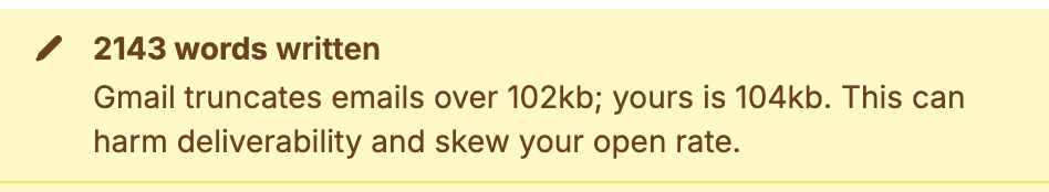
I miss the old tradition in Windows where many commands had underlined letters, and you could simply press Alt and that letter to jump to it:
If I remember correctly, eventually this got simplified so that the underlines were only there when you held Alt (although I bet there was an option to keep showing it all the time).
Opening Windows 11 today, it feels like the system got less elegant. I can still press Alt and stuff happens, but it doesn’t look nearly as good or tightly integrated, and the two alternate entry points (Alt and the keyboard shortcuts) become muddled:
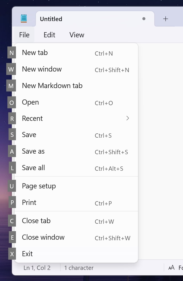
In the meantime, on a Mac, in various places apps reinvent the wheel by their own thing.
I just saw this in Nova, the code editor, which is very thoughtful; those shortcuts only exist within this dialog (and one wonders if they couldn’t just be letters without modifiers)?
A little more old-fashioned from Photoshop, and the same question: could they just not be digits, without requiring ⌥?
Previously, I mentioned yet another idea from DevonThink.
I appreciate these gestures toward moving faster via a keyboard, but I wonder if we lost something that already used to work well in old Windows.
]]>
A funny 12-minute video by Chris Spargo about why traffic signs in the world are standardized only to some extent. This was interesting to me generally in the context of Europe being more iconographic, and America being more “word-y” in their sign design, which extends to devices, keyboards, and (presumably?) software.
The story why [the old STOP sign] got replaced by the American version is also the story why the rest of our signs still look different, and why they probably always will.

Sometimes Finder takes a really long time to update the list of files after something changed it.
All my screenshots go to a specific folder. In these videos, you can see me taking screenshots with ⌘⇧4 while looking at the folder where they arrive.
The first one is fast – just as fast as it should be. The ones after that arrive with a few seconds of delay that feels completely random.
But this is nothing compared to this, just a few minutes later, where the delay was over 50 seconds. Nothing changed. The computer was not under load.
This happens routinely and feels completely random.
There is also, as far as I know, no way to force a re-sync with a keystroke or a button or a pull-down gesture, which could be at least a way to manually alleviate the symptom (if not the cause).
Hearing what others told me and based on prior experiences, I don’t have high hopes for any of this, but I want to be a good citizen. So I am filing bugs with Apple for all of these. I do not believe I can link to this directly, but the report I filed for this one is FB21444299.
]]>There’s a common assumption that when you translate something from English into another language, there shouldn’t be any English left when you’re done. Otherwise it would be an incomplete translation, right? And you’d feel like you got cheated out of the money you spent on translation, right?
If you’re translating into Japanese, then that assumption is wrong. English makes up a significant portion of the Japanese language today, and on top of that, English has been a major part of Japanese video games since the very beginning.
I have been thinking a lot about translation ever since in the 1990s, both Windows and Mac OS have been translated to Polish, and while Windows felt okay, people at Apple used more “proper,” but often strangely archaic words for the Mac OS translation that were absolutely readable, but made the Mac felt a bit… I don’t know… medieval? (I saved both of the translations and put them up online long ago. They are still online.)
It is so hard to explain unless someone knows both languages in question, but so important to understand all these little nuances to get it right.
In the world of typing, for example, right-to-left writing systems are not just “going the other way,” but also have to accomodate LTR snippets. Similarly, is perfectly fine in Japanese to see Western words – not just next to Japanese writing, but sometimes inside it. For those working on these, it must be annoying that you already have to do more work with more complex writing, encodings, and stuff (most languages to me feel more complicated than English) – but now you also have to include entry points for other writing systems.
The issues of translation are fascinating to me. Please send more if you see them.
]]>A Linotype assembly elevator with the gate closed. This is the center of an operator’s attention as the mats tumble down and are arranged automatically in lines. The spacer bands adjust themselves to fill out the line but only so many letters can fit in any measure, proving the old trade adage that “type is not rubber.” Modern photocompositors have lenses that can distort the image of the letters to fit where they couldn’t. Today, type is rubber.
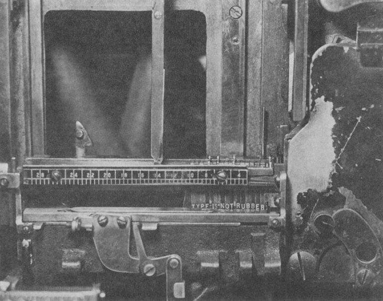
If you don’t have an iPhone, here’s a short video where you can hear them. I’m guessing Apple sees the default ringtone as sort of an audio brand, and wants to invest in it more.
The only thing I don’t like are those names: It feels each one is following a different naming scheme.
(Side note: I am 180° from Gruber’s take on new Apple TV sonic logo. The previous one was better – recognizable and interesting. The new one is bland, milquetoast even. It instantly reminded me of the Windows 95 startup sound.)

September 6, 2014, was a landmark day in speedrunning history.
I like Summoning Salt’s videos about speedrunners because they manage to add a great dose of storytelling to what otherwise would be boring, mundane events, and this one about Punch-Out is no exception. It’s Rocky meets Moneyball, in a way.
This pairs well with the previous review of the “Pilgrim in the microworld” book because speedrunning feels very connected to mastery and to quality – whether it’s because of the old-fashioned grind to be better, or by exploiting all sorts of glitches in the game to shave off sometimes milliseconds. The video above is in the former category, or what speedrunners would call “glitchless.” It’s also just really fun to watch. (The book wasn’t fun to read.)
If you’re new to learning about speedrunning/glitchless, this video about “rolling” in Tetris (which itself is kind of mindblowing), and then this one about new Tetris developments from aGameScout are a great entry point.
]]>This could have been an essay.
When I first learned about this book from Jacob Geller’s video just months ago, I thought this was another example in the vein of The Power Broker – a perfectly Marcin-coded book that somehow escaped me knowing about it for decades.
“Pilgrim” is from 1983, and is a story of a pianist discovering the classic videogame Breakout, and trying to perfect his own gameplay.
I love so many stories of videogame mastery, because at times they feel the closest we got to Doug Engelbart’s dream of incredibly effective machine operation somewhere deep below the threshold of consciousness: You and the computer becoming one, eyes and fingers forming feedback loops so perfect they cease to be noticeable.
Here I am alone in a pitch-black hotel room, a middle-aged man with some time to kill, getting ready to check out some jazz clubs in Greenwich Village, in possession of an early cretinous offering from a gold rush grab bag of tuby thingies coming our way from hundreds of decision-making puzzle peddlers throughout the new electric “entertainment” industry. And now instead of playing the game it‘s packaged up to be, I‘ve gotten into more or less occupying myself by outlining invisible triangles across the screen of a TV doodling machine. What am I doing?
Unfortunately, as you can maybe already sense, the book is an overwritten, ponderous, and pretentious mess. “Beach reading, it ain’t,” quipped a Kill Screen reviewer in 2013. But there are some interesting parts in it.
Before, the piano was the quintessential human instrument. Of all things exterior to the body, in its every detail it most enables our digital capacities to sequence delicate actions. Pushing the hand to its anatomical limit, it forces the development of strength and independence of movement for fourth and fifth fingers, for no other tool or task so deeply needed. This piano invites hands to fully live up to the huge amount of brain matter with which they participate, more there for them than any other body part. At this gnetically predestined instrument we thoroughly encircle ourselves within the finest capabilities of the organ.
Then a typewriter, speeding the process whereby speech becomes visible, the extraordinary keyboard for sequencing and articulating perhaps awaiting a still truer sounding board, strings, and tuning, a still more suited canvas for thought.
Then TV.
This arrives at page 26. Alas, it’s kind of downhill from here.
The author visits Atari (imagine that!) to learn that the programmer of Breakout doesn’t really understand what makes Breakout so alluring. The game perhaps lucked in to being so imminently playable, and then replayable.
I’m interested in designing for mastery. We should not rely on luck that separated a classic like Breakout from a hundred other games from that era that felt awful to play and were immediately forgotten.
Sure, Sudnow definitely takes Breakout way too seriously:
Maybe I can remember the five shots by putting pieces of tape on the TV cabinet to mark each paddle destination, I say to myself, even though it seems that would undercut true learning. It’s bad practice to learn the piano by writing the names of the notes on the keys, much better not to use a code, to grasp the layout of things by their own looks and feel. And I can’t carry Scotch tape to a Breakout tournament.
But in a way: why wouldn’t you?
In fact it’s already happening. I’ve found myself playing with the cursor on my word processor just for the hell of it, seeing if I could track it across screen and get it to stop at every comma in the text.
The word processor (or any other app you use often) operating at the speed of fingers unlocks superpowers, and then some.
There’s one experience in particular at the word processor that gets me downright angry at times. There’s no more of that room for finger breathing while you awaited a carriage’s return. You reach the end of a processed line of text and if your word becomes too long for the margin while there’s still alloted space to get it underway, it splits in the midst of your articulation and your voice instantaneously reappears six inches to the left, a quarter of an inch lower. The computer can’t know what you’re about to write, not yet, not a word or even a letter in advance, has to wait and merely calculate how things are going in order to then “decide” where to put the sound. ¶ Before, you felt a big word welling up, hit the carriage return, lifted off from the keyboard just a bit, reorganized your grasp, and dug back into the improvisation with a renewed rhythmic mobilization to continue. And some of the things you found to say, you found because you said them that way.
This was a fascinating tidbit, this reflection on how small interactions can change the nature of creative process.
If this book was cut to 20% of its size, those fascinating tidbits would stand out more, and the book would still be of value today.
But despite this complaint, I miss people writing about using computers this way. Such a big chunk of my struggle with computers today is fighting with it because I expect a better connection between my fingers and what’s happening onscreen.
I wish more designers understood how important that is.

A fun and short video from Juniper Dev about how Undertale is a fantastic game despite being fantastically poorly written:
When you make dialogue in a video game you have a distinct file that has all the possible text that can pop up in your game. This is usually a CSV file, or a JSON, and you can think of it as basically a database for text. So then at different parts in your code, you extract specific parts of this file, and that’ll depend on what character you’re talking to, if you have a certain item, whatever, and that’s one of the most efficient and common ways to do it.
But the way that Undertale handles dialogue is much worse. All of the dialogue in the entire game, every text box that pops up, is handled in one massive if statement. […] case 737 out of what must have been at least 1,000 lines.
This reminded me a little of my first week with my personal computer, when I didn’t yet know you can write IF X <> 3 THEN, so I spent half a day writing statements like IF X = 1 OR X = 2 OR X = 4 OR X = 5…
Vibe coding was there long before AI.
]]>It’s charming in a sort of early-web kinda way, but still holds up – at least on bigger screens. I even ran it on my iPad and it worked.
Every so often, a wonderful thing happens: someone young enough to have missed out on using computers in the early 1990s is introduced to the Windows 3.1 “Hot Dog Stand” color scheme.
I can’t figure out whether Gruber’s take (“That’s Microsoft.”) is also a subtle jab at Apple in the year of Liquid Glass.
Also, great first comment under the original post:
I assume “Plasma Power Saver” served an actual purpose - it was intended for users of “portable” machines having a gas plasma display. Early ones were monochrome (orange) and I guess the actual color hue didn’t matter so much as the intensity.
Early plasma displays were genuinely fascinating.

It used to be that when you dragged an item off the Dock and dropped it, the icon would disappear in a puff of smoke and make a satisfying noise. The animation was strangely primitive against the backdrop of the slick user interface of what used to called Mac OS X.
I too wondered why that animation was weirdly amateurish, almost like a placeholder. Well,
One of the most talented engineers on the team took out a piece of paper. I wish I could say it was a napkin to make the story better. ¶ On the piece of paper, he drew a series of five frames. The intention of the designer was that these drawings would stoke further discussion. That it would get cleaned up and refined later. ¶ But that never happened. It shipped as is. And the rest is history.
Also when looking it up, I found a mention of a fascinating bug that exposed the origin of the animation as a sprite.
I just got my first Windows laptop in ages, and a little nervous to dig in, given the burgeoning reputation.
(My secret: I used to admire Windows in the 3.x and 9x and 2000 era because I always thought its keyboard operation was a lot better than Mac OS’s.)
]]>It’s about TV clock idents and what they meant to me growing up – possibly the original “loading state” in my life.

Of course, really, nothing compares to the absolutely banging BBC News “loading state”, which is fantastic, infinitely memeable, and brilliant even before you realize it cleverly incorporates the historical Greenwich Time Signal in it in a way that absolutely gives me chills.
Best comment under that BBC News theme: “As a swiss, this makes me proud to be british.”
What is it about Brits and extraordinarily perfectly timed music? Here’s Pet Shop Boys and Casting a shadow, made especially for and matching the total solar eclipse in 2000 to within half a second.
]]>“You can’t undo this action” is scary and kind of… untrue? But I’ve stopped reading by then. I press Enter and it saves me a trip to a complex project settings dialog box I always forget the location of.
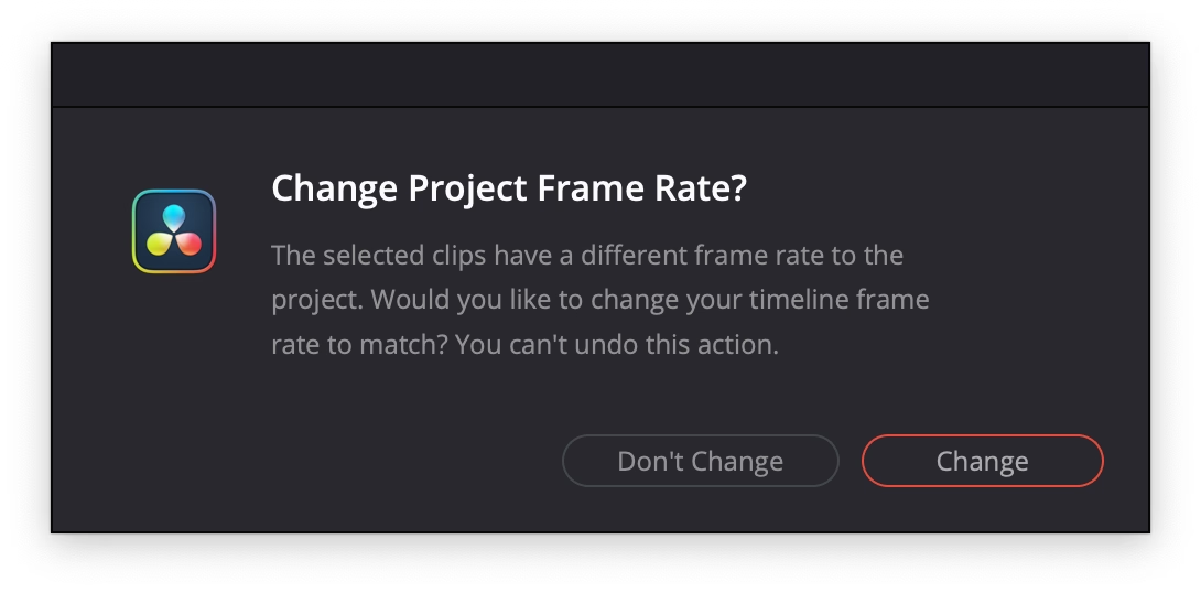
From the vantage point of 2025, optimization is clearly no longer a priority for the tech platforms. Google’s search results have gotten worse. Google doesn’t care. Facebook is awash in AI slop. It welcomes the slop. Amazon is filled with fake products and fake reviews. All of these companies still dominate their categories. Degrading the user experience isn’t costing them. The motivating belief that these companies had to optimize, or else they would be out-competed, no longer drives Silicon Valley behavior. Optimization was an era. That era has ended.
Hidden inside that essay is also a link to The Resonant Computing Manifesto, with this good paragraph:
]]>Most of us got into tech with an earnest desire to leave the world better than we found it. But the incentives and cultural norms of the tech industry have coalesced around the logic of hyper-scale. It’s become monolithic, magnetic, all-encompassing—an environment that shapes all who step foot there. While the business results are undeniable, so too are the downstream effects on humanity.
But the new fonts—and the odd assortment of paraphernalia that came before them—assume that dyslexia is a visual problem rooted in imprecise letter recognition. That’s a myth, explains Joanne Pierson, a speech-language pathologist at the University of Michigan. “Contrary to popular belief, the core problem in dyslexia is not reversing letters (although it can be an indicator),” she writes. The difficulty lies in identifying the discrete units of sound that make up words and “matching those individual sounds to the letters and combinations of letters in order to read and spell.”
(via Daring Fireball, whom I quoted for the title, via Jens Kutílek, whose fonts I use)
]]>
I recently joined Mintlify as a part-time design engineer. […] I started a daily thread sharing UI fixes and improvements that I was shipping. I also invited people to share any UI bugs they noticed.
People responded. I fixed things in near real-time. It was fun and I learned a lot.
I enjoy little posts with updates like this.
(However, a small thing: I wouldn’t use text-shadow this way. It’s veering into the territory of faux bolding, and looks bad. And, in this case, it feels like it’s not solving a problem.)
]]>First, anyone who says that the “door close” buttons in elevators are routinely “not even hooked up” shouldn’t be trusted. The world is full of many elevators and I’m sure some can be found with mechanically non-functional door close buttons, but the issue should be infrequent. The “door close” button is required to operate the elevator in fire service mode, which disables automatic closing of the doors entirely so that the elevator does not leave a firefighter stranded. Fire service mode must be tested as part of the regular inspection of the elevator (ASME A17.1-2019, but implemented through various state and local codes). Therefore, elevators with a “door close” button that isn’t “hooked up” will fail their annual inspections.
Also, this bit was delightful:
]]>The software, as I recall, came from the school of industrial software design where a major component of the interface was a large tree view of every option and discoverability came in the form of some items being in ALL CAPS.
]]>Edward Tufte has this visual rule that 1+1=3: With a single line on the screen, you have just that single object, but adding a second line does something interesting, it adds a third ‘object’ on the screen, the negative space between the two. All good visual designers deeply understand this effect.
In UX design we have a cognitive equivalent. If you have two buttons, there is a third ‘object’ created: the decision a user must make on which button to tap.
The millisecond you hover over the back button, the app says “you should be using the keyboard for this”:

I am not sure you often see tooltips on buttons, with keyboard shortcuts only:
Every select menu – even those with literally two options – has an inline search:
Party like it’s 1983! Or 1982! Or 1967!
Also, unrelated, love the clarity of this panel. This is what’s synced. This is what’s not.
Google Maps is dying a tragic, public death by a thousand cuts of slowness. Google has added animations all over Google Maps. They are nice individually, but in aggregate they are very slow. Google Maps used to be a fast, focused tool. It’s now quite bovine. If you push the wrong button, it moos. Clunky, you could say. Overly complex. Unnecessarily layered. Perhaps it’s trying to do too much? To back out of certain modes — directions, for example — a user may have to tap four or five different areas and endure as many slow animations.
Funnily enough, I feel that way about Apple Maps. I abandoned is since small things felt heavy, mired in superfluous swipey animations that felt like driving a 1960s car. Luckily, this was at the time Google Maps redesign its tiles to match Apple’s, so I got what I wanted to begin with, although in a slightly shady way.
I miss Sublime Text and might take it again for a spin (VS Code and Atom felt slow, Nova is delightful but also struggles in performance, even on simple things).
I miss Notes feeling lightning fast.
]]>This posture lends itself to a practice where designers have an attitude of “I need an icon to fill up this space” instead of an attitude of “Does the addition of a icon here, and the cognitive load of parsing and understanding it, help or hurt how someone would use this menu system?”
It seems a necessary ingredient of introducing icons to menus is thoughtfulness and guidance around when the icons are necessary/useful and when not.
It doesn’t help that the Tahoe icons seems to mess up indentation. (I haven’t updated to Tahoe and might skip it altogether. Even just the planetary-scale rounded corners are something that feels very broken.)
]]>
An absolutely eviscerating 18-minute walkthrough of Apple Music for macOS Catalina, from a few years ago. More funny than anything else, but a reminder to test the “boring” edges of your app – like a state with a lapsed subscription, or coming back after a few months.
There’s no way to drag and drop. […] If I want to add this to here, I have to go through this bullshit, and when I do, it takes seconds again.
Also, an ode to a well-functioning back button, and well-behaving loading states. Those things add up so quickly.
(My debugging brain understood what populated the confusing History entries – I bet it was the early play sequences that went through a bunch of stuff without playing.)
]]>
I gave a talk about the craft of pixel fonts at Config last year, and this fresh YouTube video by Noodle seems to be a great and quirky companion to the whole issue of “how did pixels look on old CRTs,” including many examples from modern games.
]]>(The main worry here for me would be that it’s distracting if you already know the shortcuts. I haven’t noticed it disappear if you use it, but maybe it does after a while.)
So I started it up, selected new game, played the intro section. It’s a fairly well-known section - you arrive at the train station with a message from Breen, a guard makes you pick up a can, and then you have to go into a room and... uh... I got stuck. I wasn’t dead, I just couldn’t go anywhere. I was stuck in a corridor with a guard, and nowhere to go. Bizarre.

Fascinating quick walkthrough of Strudel on TikTok from DJ_Dave (sound on!). Sometimes you see an interface and you immediately just sense how efficient and fun and powerful it is, without ever touching it.
Very bretvictorian in a way. Also related: a recent video from Benn Jordan walking through obscure music software used by Aphex Twin.
]]>VisiOn loves to beep at the user. It beeps every time a menu option is chosen or an on-screen button is clicked.
If you are tired of the noise, you’d appreciate that Application Manager has an option to replace the sound with a “visual beep”. It is implemented as a flashing area of 32x16 pixels around the mouse cursor. Every time the flashing is about to happen, an image “below” the cursor is preserved in RAM to be restored after the “visual beep” is over. However, the memory allocated for this bitmap is never freed. It takes between 200 and 1000 clicks to fill the RAM with useless copies of the mouse cursor, and then the system crashes.
If you have never heard of VisiOn, The Digital Antiquarian has a fun walkthrough that also happens to be the first chapter of an excellent series about the history of graphical user interfaces.
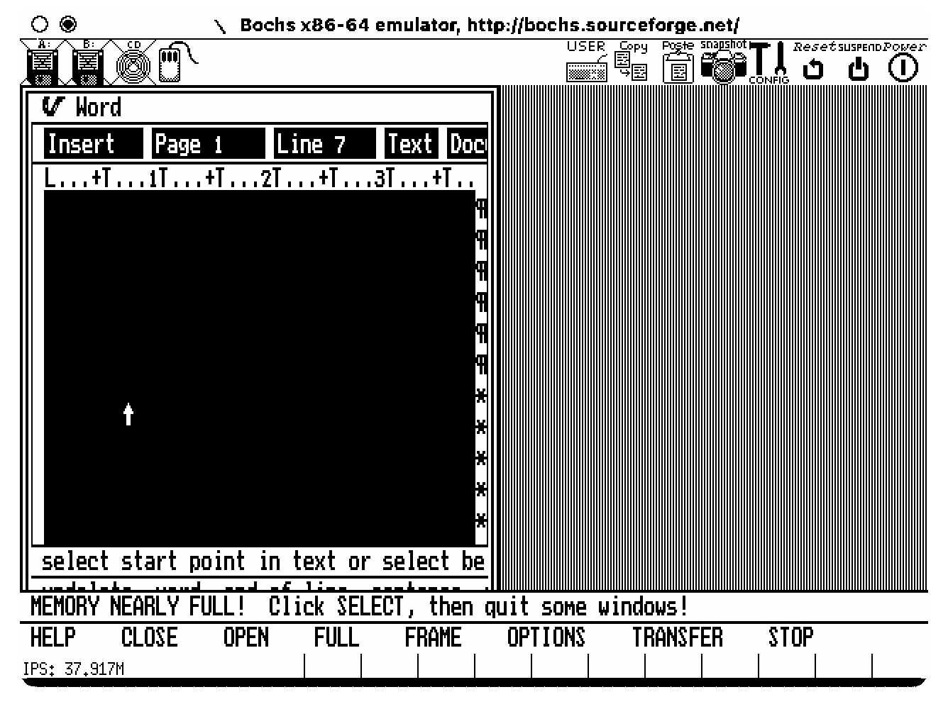
It reinforces my belief that teams need a culture that values attention to detail when building products. Tiny annoyances so often get neglected as we rush to ship, but the consequences accumulate, souring the whole brand. It’s not a long journey from “Ugh, these AirTags…” to “Apple has lost their way…”
But in my experience, those rough edges seldom go unnoticed by someone, somewhere, who was unable to stop the momentum of a product release for such an “insignificant” flaw. Or, even more consequentially, they did not feel it was safe to do so.
I want to quote so much of this essay, so I’m going to do just that.
]]>I’ve always felt that culture is made of the accumulation of small acts of gracious leadership: acknowledging moments of bravery during a retro, teasing out a reticent comment during a product review, and on and on. It can come from other places too, but it is most effective when it comes from the top.
If you’re leading a team remember: Never criminalize pride in craft.
I think the fact that Liquid Glass is worse on MacOS than it is on iOS is not just a factor of iOS being Apple’s most popular, most profitable, most important platform — and thus garnering more of Apple’s internal attention. I think it’s also about the fact that the Mac interface, with multiple windows, bigger displays, and more complexity, demands more nuanced, more expert, interaction design skills. Things like depth, layering, and unambiguous indications of input focus are important aspects of any platform. But they’re more important on the platform which, by design, shoulders more complexity.
A great read – harsh, but deserved. It’s good to punch up. I don’t have a lot of context on Alan Dye, but the parts that resonated the most was appreciation of the craft of interface and interaction design for complex things. iOS has had occasional sprinklings of great interaction design, especially in its physics-based gestures that blossomed since iPhone X. macOS feels abandoned in this regard, with even hard-won victories like fast Finder and great user preferences deteriorating.
]]>But here’s what modern UI design looks like: There’s always a confusing title; it doesn’t quickly tell me what to do or what it wants me to understand; beneath that there’s a subtitle, explaining the title again; beneath that there’s several sentences that restates the title and subtitle but simply jumbles all the words around to make it justify its existence; then the button—there is always a button—and it asks me to “Confirm” or “Apply” but as to what I’m confirming or applying I have absolutely no idea unless I go back to the text and fight my way through it all again.
Kept nodding through this whole essay. I don’t love nervous user interfaces that share their own problems and insecurities with their users. I love confident interfaces that know exactly what to say, and don’t outstay their welcome.
]]>